Visily is an AI-powered UX/UI wireframing tool that appears to be on a meteoric rise.
Pitching itself as “the future of collaborative design”, it claims to let users “create stunning software wireframes & prototypes from hand-drawn sketches [and] app screenshots”.
It’s featured on Product Hunt—with its fair share of extremely favorable write-ups—and lists Microsoft, Amazon, Verizon, Accenture, and other global giants as clients on its homepage.
But is it all it’s cracked up to be? We’ve written this blog to find out.
We’ll start by giving you a quick overview of what Visily is, the need it was created to meet, and the features it has—with a bit of experimentation.
Finally, we’ll explore a few of the alternatives to Visily before we wrap things up with some key takeaways.
You can use this clickable menu to skip ahead to a certain section:
What is Visily?
Visily is an AI-powered UX/UI wireframing tool that describes itself as the quickest way for anyone—whatever their skill level—to build beautiful mocks, wireframes, and prototypes.
(In this blog post, we don’t go into any detail on what wireframing is, but if you’re new to the craft, you can check out Jaye Hannah’s comprehensive guide What Is A Wireframe?)
Why Visily?
In a nutshell, Visily AI exists because creating wireframes can be tricky for non-designers. And that’s not to say it’s always a piece of cake for designers either—the combination of complicated UIs and multiple requirements can make wireframing tricky for the pros, too.
To the outsider, it seems likely Visily’s founders spotted what they thought was a gap in the market for a product that could speed up the wireframing and prototyping process, especially for non-designers.
In line with this, on Visily’s Product Hunt page, they claim to have “helped thousands of non-designers such as founders, product managers, business analysts, and software developers quickly build their app UX”.
They’ve also brought AI into the mix, hoping that gives they something extra their competitors don’t offer.
But what can Visily AI actually offer? Let’s explore some of their features and functionality.
What can Visiliy do?
Visily talk about their six main features. While some of these—like prototyping—are fairly standard, others are at least somewhat unique to their product:
- Screenshot to Design: By a distance the most attractive of Visily’s features, this lets you upload screenshots of any app or website’s designs and transform them into editable wireframes. Doing this allows you to speed up the wireframing stage massively. We’ll share our thoughts after trying it out later on in the blog, but there’s no denying it’s seriously impressive technology.
- Sketch to Design: As you’d expect, Visily’s Sketch to Design feature lets you take what you’ve created with pen and paper and convert it into a customizable wireframe, again saving you a lot of time in the process.
- Prototyping: Visily’s prototyping is aimed at helping you move quickly from wireframes to “hyper-realistic”, interactive prototypes. As you’d expect, you can simulate screen transitions, button clicks, and other interactions that form the experience and connect components to their destination screens.
- Magic Themes: This feature lets you easily customize the look of your app according to pre-made themes. As well as this, you can extract your own themes from a website or image or even create your own based on keywords.
- Text to Design: Allowing you to instantly generate editable designs based on a simple text prompt, this feature sounds extremely promising—but it’s not currently available. There is an option to sign up for its waitlist on their website, though.
- Lo-fi // Hi-fi: This toggle lets you switch smoothly between simple low-fidelity wireframes and hi-fi versions.
Now that we’ve explored what Visily can do let’s get a bit more hands-on and look at getting started with Visily and testing out some of these features.
How to use Visily
We spent some time creating an account with Visily, getting started, and experimenting with it. Overall, it’s fair to say that Visily has an easy-to-use UI that is both fairly intuitive and well sign-posted.
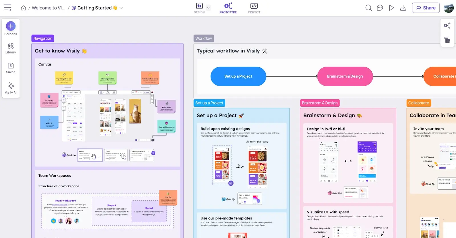
After creating your account, you’re invited to join a “Getting Started” board, where you’re greeted with a standard four-step product tour that introduces some of the very basic functionality and concepts.
Visily gives you three options—or “modes” as they’re called in the UI—to work in:
- Design mode: this includes “Simple lo-fi design” for quickly sketching layouts and flows and “Polished hi-fi design” for designing detailed and polished UIs. This mode is where a lot of the early work and iteration takes place.
- Prototype mode: this is for adding triggers, actions, and targets to link screens together and build a functioning prototype. This mode is for seeing how the screens come together in a prototype for feedback and more iteration.
- Inspect mode: this lets you select elements to see their CSS attributes. This mode is useful for handling the more technical aspects and requirements of your work.
We started in design mode. And—if you’re a regular user of Miro—Visily’s design mode will probably feel very familiar.
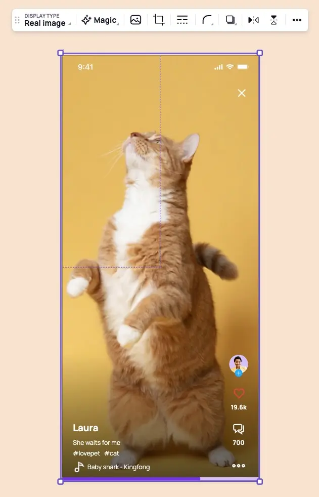
Similar to Miro (and many other design tools, of course), when you select an element or group of elements, an editing toolbar appears just above the selected element. From there, you can do basic actions like replacing or cropping the image, editing its border, corner radius, or drop shadow, and exporting or copying it.

Visily’s floating toolbar appears on selecting an element to offer a range of actions
The same toolbar also opens up more advanced actions, including one of Visily’s most talked about features—converting it to a wireframe or “Screenshot to Design” to be consistent with Visily’s own marketing terminology we used in the previous section.
Testing the Screenshot to Design feature
Naturally, we tested out this feature.
Impressively, it only took two or three seconds to convert the selected image into a wireframe.
But what we found most interesting was that it offered two different types of output, not-so-imaginatively-named “Output type 1” and “Output type 2”.
In Visily’s own words, this is what each of the options offers:
- “Output type 1: Closely match the uploaded screenshot with basic shapes, texts and images”
- “Output type 2: Loosely convert the screenshot to Visily’s smart components and project theme”
To expand on this a little, they recommend using type 1 if ” you want the output to closely match the uploaded screenshot instead of following the current project’s styles and using Visily’s smart components.” Alternatively, they suggest opting for type 2 if you want to “prioritize easy customization and consistent styles” rather than an “exact match with the uploaded screenshot.”
Overall, we found the feature did what it promised, quickly converting the screenshot into two different wireframe options. As well as this, how Visily described the two different types of wireframes was an educational point for new users—again reinforcing the ideas of customization, smart components, and themes.
Visily’s other important features
Going back to the board, we find a sticky menu on the left that is the starting point for many of the common flows. From there, you can select from four menu options:
- Screens: A starting point for many flows, this option opens up a context menu with further options to “Add empty screen”, “Choose templates”, “Convert from screenshot”, and “Convert from sketch”.
- Library: This opens up Visily’s library, which consists of elements, templates, and icons, that you can use to help you on your design journey. The elements are divided into three categories “Basic”, Smart Components, and “Notes & Flows”, while the templates contain everything from cards and forms to charts and website blocks.
- Saved: This gives easy access to saved elements and components, that you can categorize into groups.
- Visily AI: This opens up Visily’s AI features including “Screenshot to Design”, “Smart Table Data Fill”, and “Theme Generator”.

Visiliy’s UI will feel familiar to Miro users
To summarize, Visily’s UI feels familiar and makes it easy to find actions and complete key tasks. It’s responsive—it doesn’t leave you waiting around while images are converted to wireframes. On top of this, it offers new users a helpful but concise onboarding.
In other words, Visily’s UI ticks off a lot of key usability points. This high level of usability means the product has a very low barrier to entry, which is key to attracting those non-designers users (PMs, business analysts, marketers, writers, entrepreneurs, etc.) who could ultimately decide its success or failure.
Now that we’ve explored what Visily is, what it offers, and how you can use it, it’s time to take a very quick look at alternative tools for wireframing and design more broadly. Aka, Visily’s competitors.
Other wireframing tools
Although Visily markets itself as having a unique offering and position in the market, in truth, the wider space for design tools contains some huge and incredibly well-funded players, like Figma, Sketch, and Miro.
Tools that are primarily aimed at quick and easy wireframing, like Balsamiq, Whimsical, and InVision Freehand, add another layer of competition. If you’re interested in getting a more comprehensive view of the wireframing tools out there, take a look at our blog The 8 Best Wireframing Tools Every UX Designer Should Know.
If Visily is to be successful in the long term, it will need to distinguish itself from these competitors but also draw users from their customer bases. That might be the users’ primary tool if they can oust wireframing competitors or—in the more likely scenario, especially in the case of Figma, Sketch, and Miro—as a secondary or even tertiary, complementary tool.
Let’s have a quick look at three of the big players in the industry:
Figma is now the wireframing and prototyping choice of the majority of designers. Its vast expansion since it arrived on the market in 2013 led to Adobe splashing out $20 billion to acquire it in September 2022, a move that wasn’t without controversy. Figma made its name for being the first all-in-one design tool based in the browser (although a desktop app if available too of course). Its layers panel keeps all the artboards and UI elements in one place to make it easy to organize complex designs. Figma is an incredible tool for lone designers but also offers real-time collaboration for bigger teams. Interestingly, Visily offers a plugin for Figma, so users can convert screens and elements made in the former to editable Figma wireframes.
Sketch is one of the most successful wireframing tools there is. It harnesses a combination of artboards and vector design shapes to let you quickly create wireframes on a pixel-based canvas. Like Visily and most other similar tools, it offers a feature that lets you easily reuse UI elements once they’ve been created.
Miro is a visual workspace that’s the closest of the three to a digital whiteboard. As well as being handy for wireframing, it’s excellent for ideation, workshops, and easy collaboration. Like Visily it has a very user-friendly, intuitive UI and it’s probably easier to use—or at least easier to start using—than the likes of Figma and Sketch. Miro has a wider range of uses than Visily, but doesn’t have the same AI-driven features for wireframing that Visily boasts.
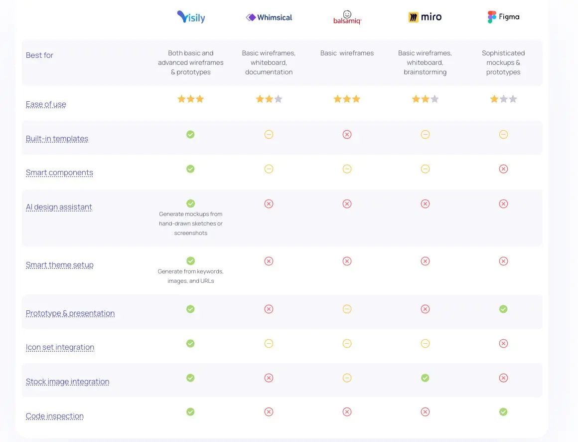
Judging by the feature comparison table Visily has on their website, they’re confident their unique features are enough to make them an attractive option for many users. We’ll be keeping a close eye on their product and progress over the next few years.

Visily market themselves as offering much broader features than competitors
So, now we’ve had a quick look at alternative wireframing tools, let’s wrap things up with a few key takeaways.
Key takeaways
After experimenting with Visily, we can say that its features generally offer what they claim.
Most of them are useful and could speed up the design process for many non-designers but—with the likes of Figma, Sketch, Whimsical, Miro, and many more competitors in the same space—it’s difficult to say whether these features alone are compelling enough to give Visily the traction it needs for long-term success.
What will help, though, is its UI. Built on familiar patterns and following many of the key UX principles, it has a high level of usability and, consequently, a low barrier to entry. This means Visily’s user base could be considerably wider than many of the more traditional design tools that are aimed at designers and adjacent roles.
And, while it’s unlikely you’ll use Visily in isolation for your design process, it could be a useful tool for those of you who are new to UX design or looking for a shortcut to create wireframes, mocks, and prototypes. At least very least it could be worth registering for a free account and seeing what all the hype is about.
Explore the world of UX or UI design more with our free short courses. Or speak directly with a program advisor.
Did you enjoy this article? You might also like these
