If you’re learning how to become a UX designer, understanding the different requirements of a range of platforms and interfaces and the user’s needs within those platforms is key to creating a positive user experience and launching a successful product. Users no longer access websites only via a home PC.
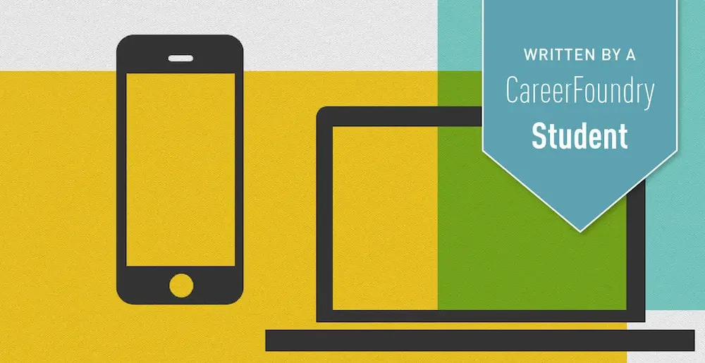
With the unprecedented popularity of mobile phones and tablets, UX designers are required to understand how, where and why these platforms are used, as well what is achievable and works well within these new limitations.
In this blog post, I’ll be covering the value of knowing your user’s intentions, why we should optimize for mobile, designing for multiple screen sizes, and the importance of designing ‘for good’.
Ready? Then let us begin.
Have you ever wondered why the ULR for Don Norman’s website is jnd.org? At the very bottom of his bio he explains. He says that jnd stands for ‘just noticeable difference’. It originates from an experimental branch of psychology called psychophysics which focuses on the study of sense, sensation and perception. A just noticeable difference is the amount something must be changed for the difference to be noticeable (detectable at least half the time).
These small interactions that when done well often go unnoticed are going to make for better experiences for our users. As more people use more devices to do more things, the user experience must be integrated across all platforms, allowing users to get stuff done in a way that is timely, efficient and pleasant. So, with these little differences in mind, let’s take a look at a few things we should keep in mind when designing for web and mobile.

Know Your Users And Their Goals
Who are your users? What are their interests? What do they value? What do they want to accomplish? What are their goals?
Once we know what our users would like to accomplish we can design obstacle-free workflows for them, guiding them through each step of an interaction. Well designed workflows will guide users in a familiar direction. Users will be able to anticipate what to do next and remember what they have just done. Keep in mind, although there are times when workflows will be guided by the design, ideally, they will be guided by user expectations.
Knowing our users allows us to design an interface that will meet their needs.

Optimize For Mobile
The number of mobile users long ago eclipsed the number of desktop users. Nearly everyone has a mobile. We are now designing for two groups of people. The first, people who perform their daily tasks on more than one device. The second, individuals who rely solely on their mobile phone for work or personal business… or fun.
There are a couple of things to keep in mind when designing for mobile. The first (and most obvious) is we are working with significantly reduced screen real estate so we must make informed decisions as to what to use it for.
Second, mobile phones are transient devices so our users will likely be interrupted while they are using their mobiles. We need to make it easy for them to pick up where they left off, whether on their mobile or on another device.
Lastly, because of the increased cost-interaction on mobile (the effort needed to complete a task) we must make it as easy and straightforward as possible for our users to complete the task(s) they came to accomplish, quickly… and ideally, with as little typing as possible.

Design For Multiple Screen Sizes
What kind of website and mobile platform should you design: responsive, adaptive or maybe a combination with a native mobile app?
While a responsive system is built on a flexible grid system that allows pages to scale with the size of each screen loaded on, adaptive design uses the principles of progressive enhancement to optimize for the various screen sizes. A responsive mobile site will appear largely the same on a responsive website; it will be designed differently and have a new URL on an adaptive site. A native mobile app lives on the phone.
According to Raluca Budiu, a Senior Researcher at the Nielsen Norman Group, neither a mobile-dedicated site nor responsive site is necessarily best. Sometimes the former provides the best experience and sometimes the latter. Once again, it depends on our users’ goals.
If you have a social media site like Twitter, then you will likely want to design a native mobile app, as social media is a tool that people use on the go. However if your site is a blog, then a responsive site might work just fine across all platforms.
Regardless of which you choose, remember to prioritize your content and maintain parity or similarity across devices.

Design Interfaces With Likable Personalities
Unconsciously, we treat our devices and applications as sentient beings. We have a tendency to attribute human characteristics to them. If you’ve ever found yourself saying not-so-nice words to your computer you may already know what I mean. On the other hand, maybe you’ve occasionally found yourself smiling at your computer (or phone). A much nicer feeling, almost a sort of endearment.
If interactions were respectful, generous and helpful…like a considerate human-being there would be no need for harsh words. Smiles or a sense of accomplishment might even take their place.
Allen Cooper, UX pioneer, asks us to think about the interfaces we use and ask ourselves: “Are they quietly competent and helpful or do they whine, nag, badger and make excuses?”
In his book, About Face, Allen Cooper shares 16 characteristics of considerate interactive products. While these largely pertain to actions that take place behind the scenes, we can design for them. Here are a few we can start with:
- Take an interest – Once the user has entered her name and contact information the first time, that information should be saved and can be used to pre-populate fields in the future, showing consideration to the user by saving her time.
- Strategically use color and UI elements – These should indicate to users what they can and can’t do, where they should start and how to get there.
- Write good copy – Copy should convey the values and essence of your brand and even a bit of personality. It can be used to interact with users in a friendly and personable way, build trust, induce a smile, or build a user’s self-confidence.
- Use error messages as a teaching tool – If a user misunderstands what to do be sure to inform him how to avoid making the mistake in the future in a way that is empathic.
- Design for intermediates – The majority of our users will be intermediates. Design navigation in such a way that it’s easy for beginners to find what they are looking for and quickly transition to intermediate-user status. Place less-frequently used items deeper in the navigation where advanced users will be able to find them.
- Strategically use color and UI elements – These should indicate to users what they can and can’t do.

Design For Good
Last but not least of our UX constraints is designing for good.
Aza Raskin calls it designing for the right behaviors. In his talk at UX London, he gives an interesting example of how much influence designers have on people’s lives now.
“It took phones 75 years to reach 50 million users. It took radio 38 years. It took Facebook 3.5 years. It took Angry Birds 35 days. So our designs can reach people faster than ever before.”
What we do is powerful and has a huge impact on the world. We should be very thoughtful about what we are putting out there. What we design has the potential to simply be more clutter or to add real value to people’s lives.
We are facing some tough challenges today like climate change, declining health due to poor diets, and unrest around the world, to name just a few. What we do as designers has the potential to change people’s behaviors for the better. According to Aza, behavioral change is the area where design will have the greatest impact in the future. His efforts are changing behaviors that impact our health. An app called Be My Eyes connects blind people with volunteers via video chat. Reframing Studios has developed an app called Temstem that is helping people recover from psychosis.
Conclusion
Have you had a great experience on a mobile site that you’d like to share? Where do you think we’ll be accessing the web from in the future? Let’s start the discussion in the comments below!
If you’d like to learn more about UX design and what you can do to make an impact in the field, check out our free UX design email short course, or our mentored UX design course, to get started.
Did you find this interesting? You might also enjoy: