Sometimes it’s not enough to understand what a wireframe is, how to create a wireframe, or the best wireframing tools to use.
Whether you’re a new/aspiring UX designer or a seasoned professional, there are times when you need to go beyond your own knowledge and practice to get inspired.
We’ve gathered 9 of our favorite examples of app and website wireframes from across the web. Drawing from Dribbble, Behance, and individual designers’ portfolios, we’ll share each example along with what type of wireframe it is (app or website) and what we love about it. Here they are!
- Fitted app
- Inflection website
- Kyte app
- Fiscal website
- Sundayz app
- JazzBurger website
- Swipy app
- Breadbox website
- Perfect Properties app
1. Fitted app
UX designer and CareerFoundry graduate Michelle Lock provides a glimpse into two sets of wireframes she created for a fitness app. First, we get a look at the initial sketches:
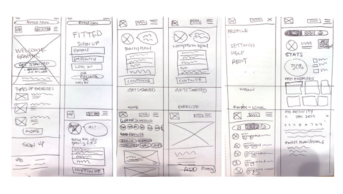
Image credit: Michelle Lock
Michelle follows this with a look at a more developed wireframe, which—by the looks of the tools she lists in her resume—she created in Sketch.
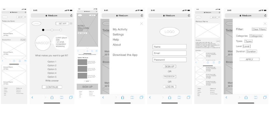
Image credit Michelle Lock
2. Inflection website
Design leader Miriam Braimah gives us a glimpse into the process of creating Inflection—a community safety web portal.
Miriam used Sketch to create this wireframe and we love that she included design notes and used some simple color coding to note active elements on the screen—highlighting the user flow.
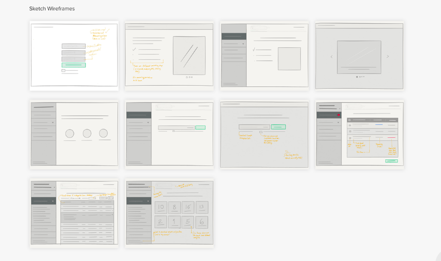
Image credit: Miriam Braimah
Learn more about this case study and other industry-leading work on Miriam Braimah’s website.
3. Kyte app
Looking at another design leader’s portfolio, Jamal Nichols gives us a side-by-side comparison of his mid-fidelity wireframes and the final design of the home page of the Kyte car booking app.
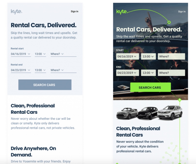
Image credit: Jamal Nichols
With his expertise in UX writing, Jamal takes a clearly content-oriented approach that we appreciate. This comparison is a clear illustration of both the importance of copy in formulating a central message, and the kind of influence final design might have on that copy.
Find out more about this project and other thought-leading initiatives at Jamal Nichols’ website.
4. Fiscal website
Terezija Katona and PopArt Studio’s Fiscal website case study gives another great example of what website wireframes should look like.
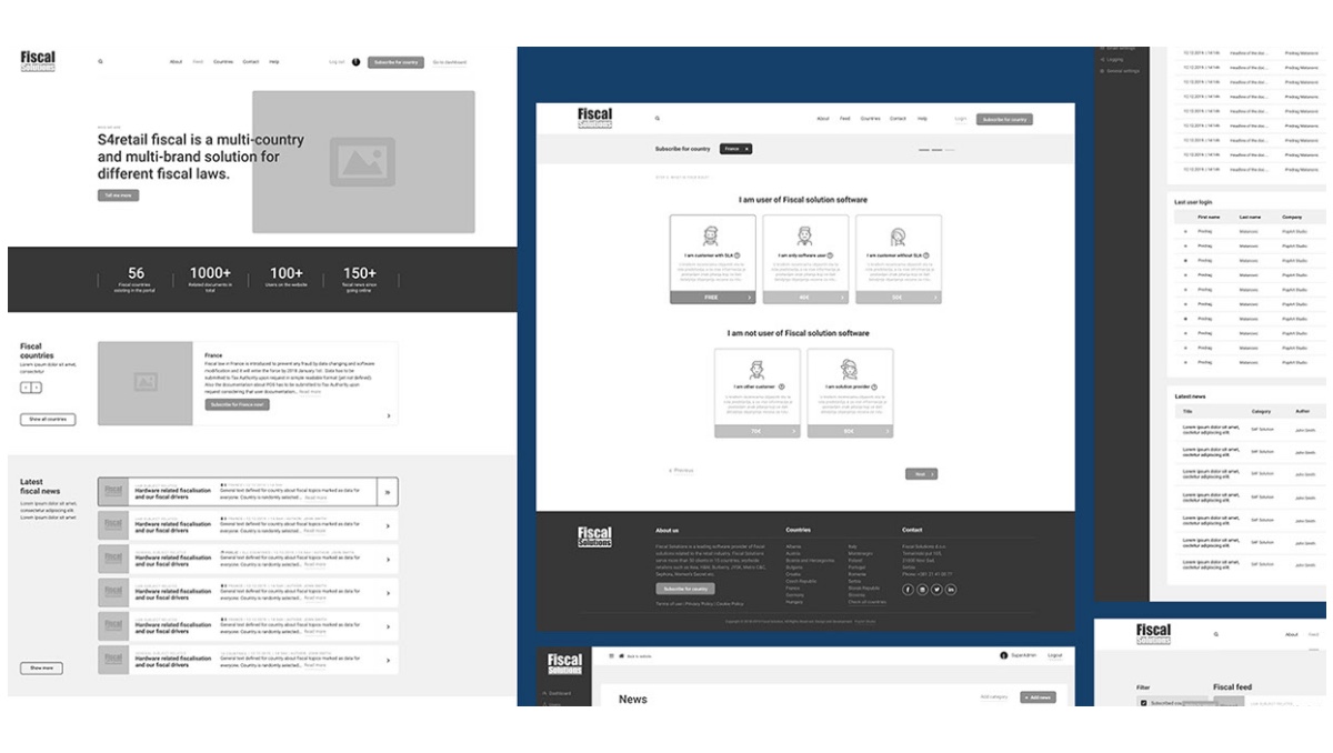
Image credit: Terezija Katona/PopArt Studio
This wireframe includes graphic elements and copy that are quite close to what might appear in the final product. The designers created it in Figma and we love that they took three questions into the wireframing process related to the user journey and to information architecture (and particularly how their information architecture and other elements could lead to more subscriptions). To look at these questions and their process in more detail, check out the Fiscal case study on Behance.
5. Sundayz app
Anami Chan’s Sundayz app case study is one of our favorites. Not only does she give a full overview of her design process, but she also shows us the evolution of her wireframes—from early sketches to the final product.
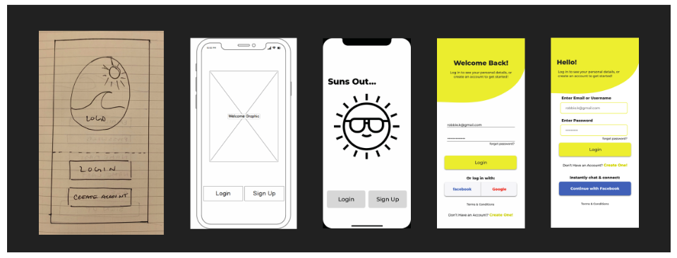
Image credit: Anami Chan
But if you’d like to see one set of wireframes at a time, she’s also made those available.
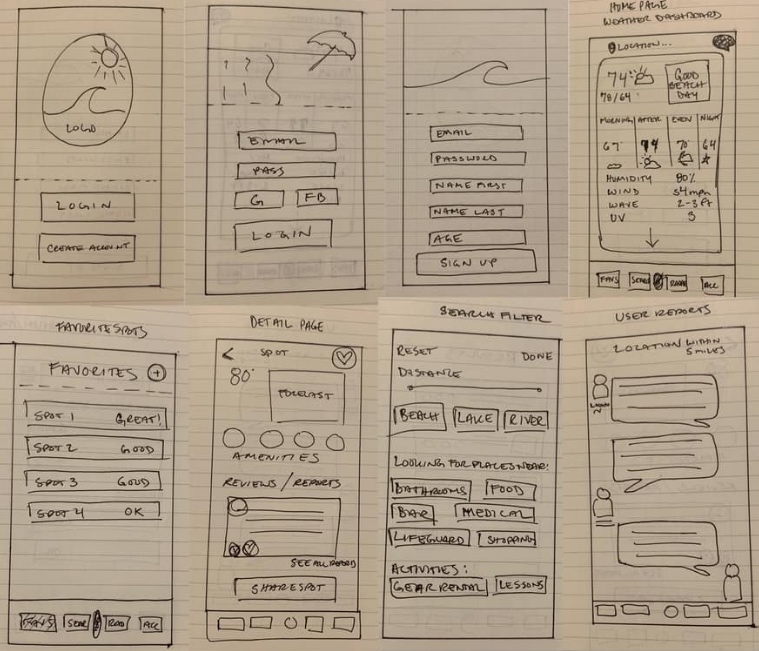
Image credit: Anami Chan
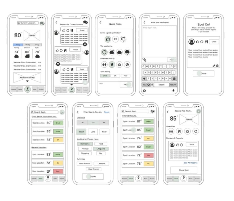
Image credit: Anami Chan
To have a look at the full case study, visit Anami’s portfolio website.
6. JazzBurger website
UX/UI and web designer, Roman Vasilovski used Figma to create this website wireframe—beyond a simple sketch, and closer to the final design than other wireframes you might see. The design has a clear awareness of the user journey—walking us through from the homepage all the way to checkout.
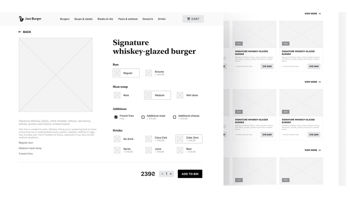
Image credit: Roman Vasilovski
What we really appreciate about this wireframe is the attention given to copy so early in the design process. While this may not be the exact copy that ends up on the final product, the designer has incorporated more than the traditional “lorem ipsum” placeholder copy that neglects the importance of factoring the copy into the design (not just the other way around).
To look at this wireframe and the designer’s process in greater detail, check out the full JazzBurger case study on Behance.
7. Swipy app
UX/UI designer and CareerFoundry graduate Risa Nakajima gives us a comprehensive look at her wireframes for Swipy—a German vocabulary learning app. As we move through the development of the app design over time, you can see where Risa’s ideas evolved.
Here, we get a look at her initial sketches:
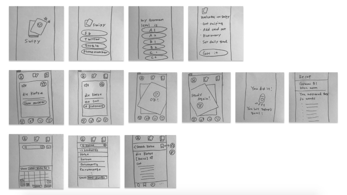
Image credit: Risa Nakajima
Followed by the mid-fidelity wireframes:
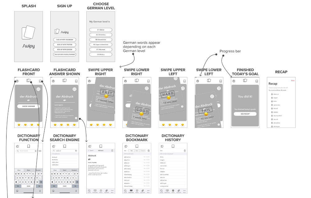
Image credit: Risa Nakajima
And after she dives into the UI design for the project, Risa shows us her final, high-fidelity wireframes:
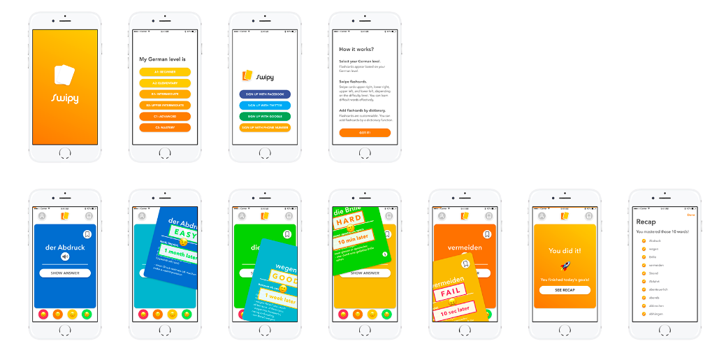
Image credit: Risa Nakajima
Have a look at the Swipy case study in Risa’s portfolio.
8. Breadbox website
UX/UI designer Ellie Deshaies also shares her initial sketches and digital wireframes for the Breadbox website—helping users collaboratively manage recipes and plan meals. What we love is how this transformation shows both the importance of visualizing design solutions as you go along and just how much your solutions will evolve as you go.
Here are the initial sketches:
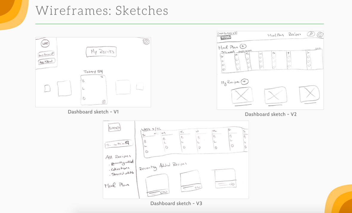
Image credit: Ellie Deshaies
And look at the evolution to the digital wireframes she created in Figma (check out the changes to the dashboard):
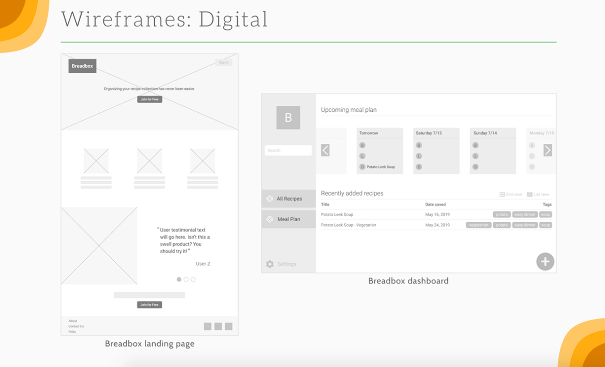
Image credit: Ellie Deshaies
9. Perfect Properties app
Last, but not least, we love that UX designer and CareerFoundry graduate Frank Mojica shows us four iterations of his wireframes for key screens in his Perfect Properties app.
Watch the evolution of the designs for the landing and search pages as we go from initial sketches to the final design!
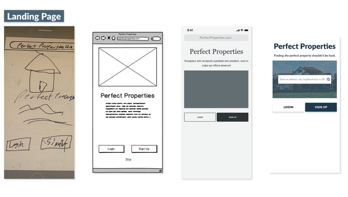
Image credit: Frank Mojica
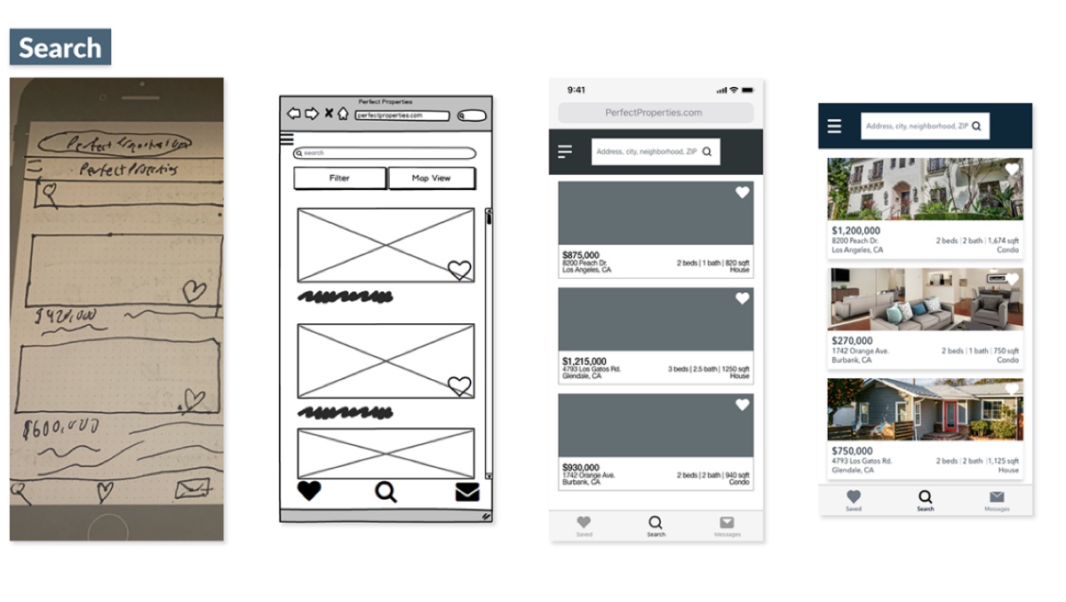
Image credit: Frank Mojica
Finally, you can check out the full Perfect Properties case study in Frank’s portfolio!
Learn more about wireframing
There you have it: nine of our favorite examples of website and app wireframes to inspire your own design process. Now, with these examples in your back pocket, learn more about wireframing with these guides:
