Beautiful, effective design is a key element of UX. Art provides us with something gorgeous to look at—good design does this while serving an additional function.
A strong design offers users an attractive and effective proposition. And while a great book cover or movie poster may look like a wild piece of art or an untamed splash of creative genius, it will actually be governed by a strict set of rules: The principles of design.
What are the principles of design?
A principle of design is a rule that governs how design elements should appear on the page or screen. Working together, these principles of design are necessary to create pieces of design that are both functional and aesthetically pleasing.
These rules work behind the scenes to make sure a design is stable, balanced, and successfully delivers its message. All while still allowing the visuals to pop.
Intrigued? This piece will highlight the seven key principles of design to remember and analyze how they apply to us in the world of UX.
To jump ahead to a certain section, you can use this clickable menu:
1. Alignment and balance
Alignment and balance refer to the distribution and symmetry of the design elements in your piece. In UX design, alignment and balance are important elements to create structure and improve readability.
All pieces of design carry weight, which can be held in the size, quantity, texture, or color of objects.
It always seems wrong when the distribution of pepperoni is focused entirely on one side of the pizza. Likewise, if all the weighty objects appear in one corner of your work, the piece will appear strange and lop-sided.
Symmetrical design offers more balance, distributing elements on either side of an imaginary central line.
If this seems a little square or boring, equilibrium in the piece can be achieved by aligning contrasting items in different areas of the page. One large object, counteracted by many smaller ones, for example in this painting by Henri Matisse, Dance:

Source: Wikipedia
This asymmetrical approach can also lend the design movement (more on that later).
The London Tube Map is a masterclass in aligning and balancing a notoriously wonky and disproportionate system onto the page.

Source: Transport for London
2. Contrast
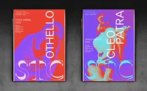
The principle of design, contrast, is usually associated with stark or complementary pairs of colors. It can also refer to fonts, shapes, and other elements that create space and difference in your design.
The consistent effect of contrast is to make your design elements “pop”, or jump out from the page and grab the reader’s attention. This popping effect is key to UX design, as it can be used to draw the user’s attention to desired elements, keeping them on track.
Contrast can be achieved by picking colorways that work harmoniously together (find out more in this article about color theory and color palettes).
A well-chosen typeface can also contrast engagingly with the subject matter.
This modern rebranding of Washington’s award-winning Shakespeare Theater Company utilizes contrast in fluorescent colors and clashing fonts, to great effect:

Source: Shakespeare Theatre Company
3. Emphasis
Emphasis is a vital part of design, as it communicates to the reader which elements of the piece are most important. In UX design, this is absolutely critical; important elements must be emphasized accordingly, or you risk baffling and losing your users.
Emphasizing a slogan or image in your piece will create a focal point that draws the viewer in. This (often brief) moment of attention is your chance to tell the story of your product.
Emphasize a meaningless or inconsequential piece of the design, and you may well lose this fleeting chance to tell your product’s story.
Emphasis can be achieved in a variety of ways, including:
- Scale (larger = more important)
- Positioning (central vs. peripheral)
- Highlighting using color or texture
- – Lines – and → arrows ←
- Underline or bold
Simply put, a successful design needs a clear message, and this message must be emphasized.
Classic Sainsbury’s packaging from the 1960s and 1970s was particularly strong in this department:


Source: Sainsbury Archive
4. Movement
Leading on from emphasis, the principle of design, movement, refers to how the reader’s eye travels around the page.
If a book’s title is the most important element, how is the viewer’s attention led from that to the second most important element (the author’s name, for example)?
Engaging, fluid movement from one element to the next allows for a narrative to be built around the design.
Conversely, if at any point the user becomes lost, or doesn’t know where they are supposed to be looking, this suggests a failure of movement—and the message will tend to be lost on the audience.
With UX design this is almost doubly important. Good movement will allow the user’s attention to trace a logical path across a multitude of moving elements and pages.
Movement can be created in a design by using lines that trace paths between different focal points. Sweeps of color and diagonal or curved lines tend to add dynamism, which leads the eye on a journey.
Literal images of moving objects, or repeated sets of shifting images—like a horse in a zoetrope—create an effect of motion that the brain seeks to process and complete. Using these tricks to your advantage will allow audiences to smoothly reach all the elements of your design in the correct order.
The Cern logo and movie poster for Vertigo are excellent examples of this.

Source: Cern

5. Proportion
The principle of design, proportion, refers to the size and weight of different sections in a design, and how they relate to one another.
Consider your composition as split into distinct sections, rather than as a whole. If it’s in proportion, these sections will be positioned and ranked logically, displaying good visual hierarchy.
In UX design, proportion can be seen as a product or mark of well-executed alignment and balance, emphasis, and contrast.
MIller’s Law is also a good way of understanding proportion in relation to UX. Miller found that reams of data were made easier to consume by sectioning them off into distinct groups or “chunks”.
The homepage of the Adidas website uses proportion to display its products in an impactful and memorable way:

Source: Adidas
6. Repetition
Some of the best designs only use two colors or repeat the same word over and over.
It may seem like the oldest trick in the book, but repetition is impactful and can be employed to convey a multitude of deeper concepts (check this 2008 Penguin edition of Walter Benjamin’s “The Work of Art in the Age of Mechanical Reproduction”:

Source: Dandad
In UX design, repetition can also be understood in terms of consistency and brand identity. Jumping between unrelated color palettes and fonts may feel radical and fun, but it can make for a confusing and ultimately off-putting user experience.
7. White space
Last but not least, don’t be afraid of white space! Without it, many of the tricks and tips we’ve outlined above wouldn’t be possible.
Utilizing white space can allow your elements to breathe, helping you play with alignment and balance, contrast and movement. White space is essential to UX design – without it things can seem overwhelming and cluttered.
And in the right hands, white space, or negative space (the gaps in and around an element), can provide a stroke of design genius. Look no further than the lauded FedEx logo for a classic example of this:

Source: Creative Review
The cover for Reni Eddo-Lodge’s “Why I’m No Longer Talking to White People About Race” is another contemporary, iconic use of white space.
Source: Waterstones
Key takeaways
The principles of design are crucial considerations for UX design, as poorly conceived design can lead to users becoming confused, lost, and disengaged with the product.
A good designer understands how to deploy these principles in tandem—reinforcing, supporting, or even causing dissonance with each other—in order to create the desired effect.
The principles of design give us a lot to think about, and a lot to consider in our own approaches. Here are some key takeaways to think about as you continue your journey in UX design:
- The world of design is central to our everyday interactions with products, interfaces, art, and our belongings.
- Good design is actually rooted in a defined set of principles rather than existing in an unfettered creative space.
- Alignment and balance, contrast, emphasis, movement, proportion, repetition, and white space can all be employed to create aesthetically pleasing, effective design.
- A successful design is not only beautiful—it needs a clear message, and this message must be emphasized.
- UX adheres to this same set of rules.
- Don’t be afraid of repetition, simplicity, or white space.
- Don’t be afraid of breaking the rules.
If you want to learn more about creating awesome designs, check out the following articles:

