If you’ve heard the word skeuomorphism, you’ve likely seen the Google results page for ‘skeuomorphism.’ It’s just about the most Googleable word out there. Maybe that’s even how you arrived here! If you’re new to the skeu, I’ve got you covered.
In this article, I’ll answer three questions:
- What is skeuomorphism?
- How has skeuomorphism been used in design?
- When and how can UX designers best use skeuomorphism?
1. What is a skeuomorph?
Simply put, a skeuomorph in digital design is a representation of a physical object on a screen. To understand how it fits into user experience (UX) design, let’s take a very short (I promise!) detour to the origins of skeuomorphs.
Historically, a skeuomorph is any representation of a physical object that uses a different material than the actual object itself. The word started being used around the 1890s to describe ornamental representations of objects in art and architecture. An engraving on a door handle or a painting on pottery that looks like a real object would be considered a skeuomorph.
Skeuomorphs became part of product design well before digital design exploded. A classic example is an electric tea kettle that uses the shape of a traditional stovetop tea kettle. There’s no functional reason why this shape needs to remain, since the heating mechanism is different.
But since most people have learned at some point how to use a traditional tea kettle, the shape now hints at the new product’s function and makes it easier to use. It provides similar affordances to a traditional teapot.
Note that skeuomorphism is a consideration that lands in the intersection of UX and UI design.
2. Skeuomorphs in design: A play in four acts
Act 1: Skeuomorphism as the Hero
Skeuomorphs became even more central to design when computers became consumer products. Software companies developed the graphical user interface so users could click buttons and menus, rather than having to enter direct commands into a terminal.
To help users understand how to interact with this interface, designers turned to real world metaphors like skeuomorphs. Think about the trash/recycle bin on your desktop, the folders that organize your work, and even the desktop metaphor itself!
Many people give Apple credit for taking skeuomorphic design to the next level. Apple are generally considered pioneers of digital user experience, and skeuomorphs are a big part of this. Steve Jobs was a champion of skeuomorphism as a way to help users interact with products more intuitively. He gets a lot of credit for introducing the desktop metaphor to the masses, as well as realistic looking controls for everything from iTunes to calculators.
Act 2: The Angry Skeuomorphic Pitchfork Mob
Ok, so there was no actual angry mob of people wielding digital pitchforks (as far as I know, at least). However, a lot of people in the tech world did eventually become fed up with the heavy use of skeuomorphism in interface design, and a backlash built in the mid 2000s.
Rumor has it that Apple’s Scott Forstall may have even gotten the metaphorical axe due to his unwavering commitment to skeuomorphism after Steve Jobs’ death.
One of the big arguments against skeuomorphism was that it isn’t the most efficient or effective way to communicate information. An iPad interface in the 2010s used a vivid bookshelf illustration with actual book cover art to bring ebooks to life. While the visual metaphor worked, it sacrificed both the readability of the book titles and the number of books that could fit on the screen.
Opponents of skeuomorphic design argued that these trade offs weren’t worth it because users no longer need a realistic bookshelf with books to understand how to click on an ebook. And they kind of had a point.

This realistic bookshelf became a poster child…er…poster shelf (?) for skeuomorphism’s detractors.
Act 3: Flat Design
In response to overuse of skeuomorphs, the past 8-10 years have seen the rise of a less realism-based design approach called flat design. This style replaces objects, shadows, and other more lifelike elements with two-dimensional shapes and buttons.
Flat design advocates argue that it allows for more efficient, simple, and elegant interface design. It’s based on a classic grid system that can make flat interfaces orderly and beautiful.
Check out some great examples in our complete guide to Flat Design.

Radio Milwaukie’s website uses a tile layout that has become synonymous with flat design. 2D image tiles become jumping-off points for different features, and all elements on the page lay flatly against one another without any dimension.
The flattest of flat designs, though, can cause some usability issues. The Nielsen Norman Group, a leading voice in usability research, has done research that shows that users sometimes struggle to navigate interfaces that use purely flat design. One issue they’ve observed is that users sometimes can’t tell which elements on the screen are interactive (i.e. clickable).
This leads to a minesweeping approach in which users hover the mouse all over the screen, looking for when the cursor changes into a hand. So if efficiency is your metric, you probably need a combination of flat and skeuomorphic design.
Act 4: Flat 2.0
People have more recently found their way back to a middle ground: a largely flat design with some real-world traits to assist users when needed. NNGroup recommends that if you do use a flat design approach, it’s a good idea to include some minimal realistic elements. For instance, shadows can help users figure out when one element is “in front of” another and suggest interactivity.
Skeuomorphs also have a significant role in this Flat 2.0 landscape, but it’s a more understated role than in the past. Designers need to be smart and strategic about how they use skeuomorphs.

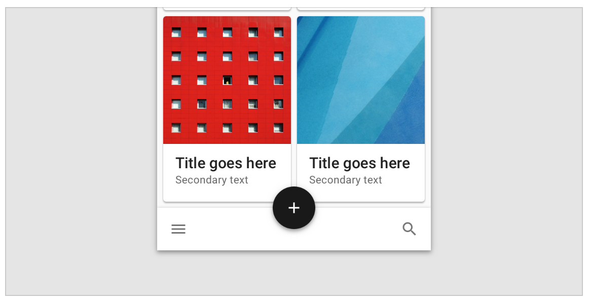
Google’s Material Design is an excellent example of this largely-flat-with-subtle-visual-cues approach. Subtle shadows illustrate how “shapes can direct attention to important elements and show how surfaces relate to one another.”
3. Skeuomorphism Best Practices: The Rules of the Skeuomorphic Road
So when and how should you use skeuomorphic design elements to achieve maximum effect? Here are some guidelines.
- Don’t overuse skeuomorphs. Too many objects can clutter and complicate an interface. Overemphasis on realism can also create usability issues, as in that Apple bookshelf example. So pick your spots wisely.
- Serve a function. From a UX perspective, every skeuomorphic object needs to support smoother user interaction. NNGroup even distinguishes skeuomorphism that “supports a metaphor to help users understand an interface” from purely aesthetic realism.
- Don’t complicate known interactions. Skeuomorphs should make complex interactions simpler, not vice versa! If you’re designing a common function, leave skeuomorphs out of it. Reserve them for new or confusing interactions users might not know.

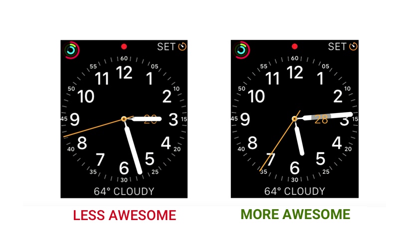
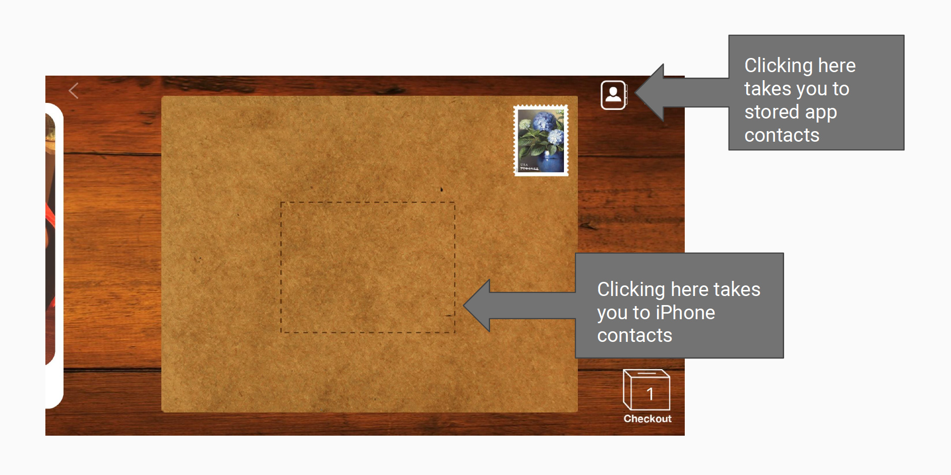
Felt lets you digitally send a real letter to a friend. Making you tap the address part of an envelope image to add an iPhone contact is a cute way to extend the metaphor, but it causes a potential usability issue by complicating an otherwise commonplace task. - Use magic. The digital world isn’t constrained by real world limitations, so make your digital objects better than the real objects they represent. This video shows how you can make a skeuomorphic watch better than a real one by making sure the minute hand never comes in front of an important label. Just design away the problem; it might even be cathartic!

The digital watch interface on the left faithfully recreates a real watch, including the unfortunate case in which the watch hand blocks the date. The watch on the right eliminates this problem with digital magic.
Skeuomorphism in design: Wrap-up
Users have come a long way from needing skeuomorphs to form elaborate metaphors for every action they can take in a digital environment. The flatter approach to design has brought great improvements, but skeuomorphic design can still be a super valuable tool to help users understand key interactions. Using it wisely will definitely boost your design game and improve the usability of your product.

