Design is an innovative field full of opportunity for designers to showcase their creativity and ingenuity. However, it is not without its rules and guidelines.
Many design techniques are full of calculated and tested strategies that help keep things eye-catching, yet effective.
One of these tried and true methods is the rule of thirds. The rule of thirds is a simple guideline that UX designers and other creatives use to align images, text, and components of an image or webpage, in a way that creates balance and is in line with how the viewer’s eye naturally scans the field.
This comprehensive guide will leave you with a great understanding of what the rule of thirds is, how to use it, and examples of how it’s used in different mediums. Here’s what we’ll cover:
- What is the rule of thirds?
- How is the rule of thirds used for design?
- Five great examples of the rule of thirds
- The rule of thirds in UX design
- Key takeaways
Let’s get started!
1. What is the rule of thirds?
The rule of thirds is a method of breaking up an image or design into different sections using columns and rows that form a grid. The grid consists of three evenly-spaced rows and columns to make nine equal boxes that fit over the image. The grid on your phone’s camera is a great example of this. For convenience, we’ve included some examples below.
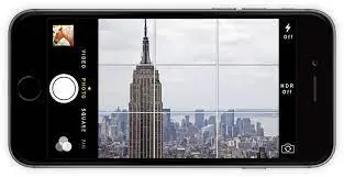
To make a grid using the rule of thirds you must first know the dimensions of the image you will be using. Once you know the height and width, divide each evenly by three and place marks at these intervals on the top, bottom, left and right sides of the page.
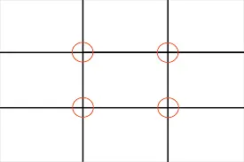
Next, draw four straight lines where you marked the intervals, two horizontal and two vertical. For instance, if your image is 24 cm wide and 15 cm tall, you would make lines from top to bottom at the 8 cm and 16 cm mark as well as from left to right at the 5 cm and 10 cm mark.
If you notice in the examples, the lines in the grids intersect at four crucial points. These points represent the areas where the human eye naturally falls when viewing an image or design.
The asymmetry created by using three columns and rows (as opposed to an even four) follows the innate way people scan a design and makes it easier to create dynamic and pleasing compositions.
2. How is the rule of thirds used for design?
As with most things in design, there are rarely any hard-and-fast “rules” as most things are open to change based on the designer’s intuition. Therefore, when using the rule of thirds in design, it’s best to treat it as a guideline as opposed to a set rule.
With that being said, there are many ways designers incorporate the rule of thirds into their design process. Most commonly, it’s used as a guide for arranging elements, aligning text, and positioning images and icons in a way that the user can easily interpret and digest.
Furthermore, the natural asymmetry of the grid creates dynamic designs with a sense of flow as opposed to symmetric ones that suggest stillness and rigidity.
The rule of thirds helps designers take the guesswork out of deciding where to position key elements and information.
By positioning main features and critical details on or close to the four points of intersection, designers can have greater confidence that the viewer’s eye will instinctively notice and flow between them in an effortless and enjoyable way.
In case you haven’t worked it out yet, the rule of thirds isn’t a temporary trend, like skeuomorphism or flat design or flat 2.0: it’s here to stay. If you’d like to learn more about what to expect from the future of design, UXer Maureen will fill you in in this video:
3. Five great examples of the rule of thirds
The rule of thirds can be found in photography, web design, architecture, cinema, and more. To give you an idea of what the utilization of this rule looks like in different mediums, we’ve compiled a short list of some great examples.
STAAK web design layout
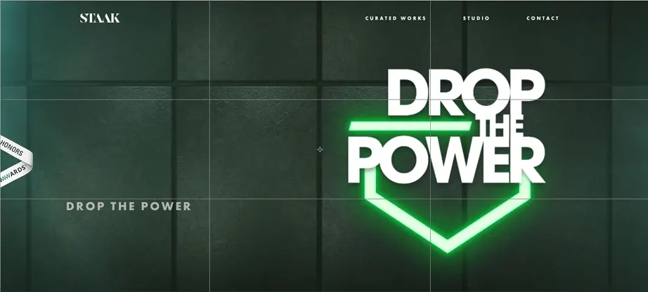
This London-based design studio has implemented the rule of thirds really well in their web page design.
Using the grid, they’ve determined where there should be negative space and where to place their attention-grabbing text. The eye naturally travels from the more graphic title text to the subtle descriptive text on the bottom left.
Activewear advertisement

The photographer of this photo did an amazing job using the rule of thirds to create a sense of movement and action.
Although the medium is static, the placement of the runner gives the viewer the idea that there is motion from a point A to a point B. It is dynamic, uncluttered, and balanced.
Austin’s Children’s Center homepage
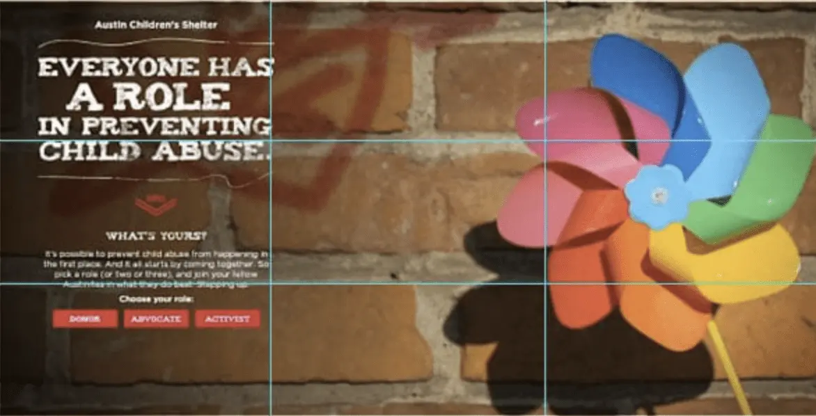
It’s clear to see how the designer of this webpage for a children’s hospital has used the rule of thirds to place the heading, descriptive text, the image, and the call to action.
Here they have chosen to have negative space in the middle with the title and calls to action very close to the hot spots on the left-hand side.
CompanyFolders print design

The print on this physical folder is a great example of how the rule of thirds gives a great sense of balance to designs. At a quick glance, the viewer’s eye is drawn to the company logo, the image, and the text on the bottom right.
Furthermore, while many examples show the rule of thirds grid being applied over landscape-style layouts, this image shows how it can be formatted for portrait layouts as well.
The Avengers still frame
With a more dynamic medium like film, the rule of thirds can be used to draw the audience’s attention to key aspects that help with storytelling or to make it more visually appealing.
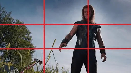
In the image below we see Thor lined up perfectly with the hot spots on the grid, as well as his hammer very close to the hot spot on the bottom left.
The placement of the objects in the frame ensure viewers’ eyes notice them and give clues as to what may happen next.
The rule of thirds in UX design
The rule of thirds is a great tool for photographers, film directors, and architects alike. However, when it comes to UX design, the rule of thirds is utilized with a slightly different goal in mind.
While UX designers do rely on the rule of thirds grid for strictly visual appeal, they also use it to make sure users notice key point’s that will ultimately help the user navigate the interface and hopefully lead to higher conversion rates.
Usually designers will place important images, links, text, or calls to action near the four points of the grid so users can quickly get an idea of what they are looking at and how to proceed with main tasks.
This makes it easier for the user to accomplish their goal on the site or app in a visually appealing way and without being overloaded by non-essential information.
Here are some examples of the rule of thirds in UX design:

Here, Sport Leverage has placed the menu in a great location, easy for the user to quickly notice while still keeping their logo and slogan in key spots for quick recognition and comprehension.
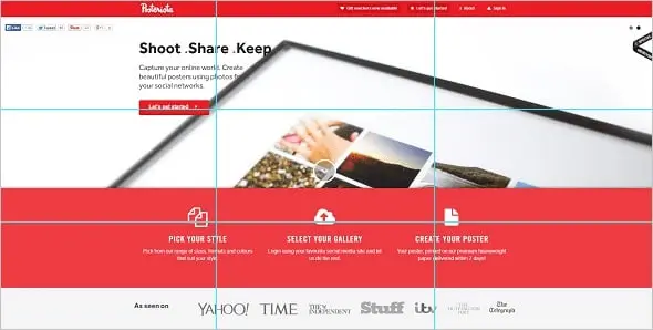
The Posterista webpage places the most important call to action right next to the top left hot spot, making it effortless for users to “get started” with using their services.
Furthermore the icons on the bottom are perfectly in line with the bottom horizontal grid line to create a nice sense of balance.

This webpage for a family therapist does a great job at keeping the key information near or on the grid’s hotspots.
Within seconds of looking at the page, the viewer can tell who the therapist is and how to contact them for a quick and easy way to make an appointment.
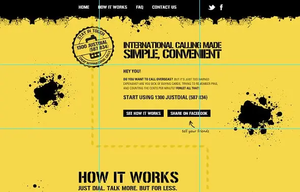
The above webpage places the descriptive title right near the top right hot spot so users know exactly what the company is offering.
Their logo with contact number is also placed near a key grid intersection helping the user’s contact the company faster and hopefully gaining a new client.
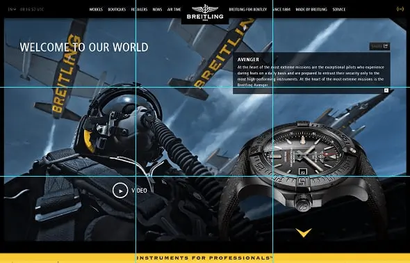
This Breitling watch web design does a great job at balancing a potentially messy webpage with many elements in one screen.
The placement of the images, text, and video link is not only visually appealing and dynamic, but help users quickly recognize what products are being showcased and how to learn more about them.
Key takeaways
Across many creative disciplines, artists and designers have freedom to explore and express. However, there are well-thought out and evidence-based practices that help ensure engaging, effective, and eye-pleasing designs. The rule of thirds is one of these tools.
The rule of thirds grid makes focusing and placing important images, text, or buttons a lot easier. It follows the natural pattern the human eye takes when scanning a field so the viewers or users are more likely to notice important information.
While the rule of thirds is great for creating balance and dynamism in designs or images, it’s important to remember it is merely a guideline and may be broken in certain situations.
If you’d like to read more about the world of UX design, check out these articles:
