
If you’re looking for a career in UX—whether as a designer, researcher, or writer—getting familiar with visual hierarchy is a great idea.
In this blog we’ll explore what visual hierarchy actually is and why it’s important. We’ll then look at seven key principles of visual hierarchy with examples from well-known websites.
If you’d like to skip ahead to a certain section, simply use the clickable menu:
- What is visual hierarchy?
- Why is visual hierarchy important in UX/UI design?
- Visual hierarchy, mental models, and user expectations
- What are the principles of visual hierarchy?
- Draw attention with size and scale
- Make elements stand out with color and contrast
- Change perspective to create the illusion of distance and separation
- Adjust typefaces for different impacts
- Create balance and symmetry to focus the user
- Connect elements with alignment and proximity
- Reflect reading patterns with visual hierarchy
- Final thoughts
1. What is visual hierarchy?
Visual hierarchy is a fundamental principle of design—the idea that by manipulating design elements and visual characteristics, you can direct users’ attention to the most important part of a page’s content.
This means that by emphasizing certain design elements of a page, you can largely dictate the order in which users will read the content on a page.
This simple but effective example of visual hierarchy has been widely shared across the UX design community recently:
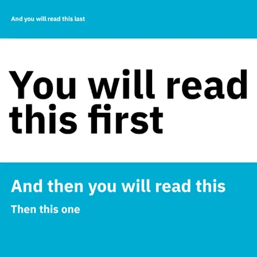
Source: lush.io
2. Why is visual hierarchy important in UX/UI design?
Visual hierarchy is important in UX/UI design because user behavior is largely based on what users expect from previous interactions with digital products.
This explains the patterns in user behavior that are routinely found in user research to some extent.
And put simply, an unexpected visual hierarchy is likely to create confusion by drawing users’ attention to the wrong places and making things more difficult to find.
On the other hand, a visual hierarchy that helps users easily navigate through your product (to find what they need where they expect to find it) will remove friction and increase usability.
3. Visual hierarchy, mental models, and user expectations
To explain this another way, imagine you’re targeting a job at your dream company. You google the company and head to the homepage. Where do you go first to get to their careers page?
The chances are you scroll down to the footer, and start scanning for a link to a “Careers” page or a heading or section title called “Company”, “About us”, or “Team”.
You probably do this intuitively, and that is because you expect the page to be reachable from the footer based on your experience from finding other companies’ career pages.
And if the link to the “Careers” page was somewhere else, perhaps under a dropdown menu from the top navigation, it would probably take you longer to find. You might become frustrated or confused at not being able to find it.
Mental models
The intuition that prompted you to scroll down to the footer is part of a mental model. Mental models are what users believe about a UI. They are individual, so different users may construct different mental models based on the same UI.
They are also based on beliefs, not facts. Mental models are described by Norman Nielsen Group as “model(s) of what users know (or think they know) about a system such as your website”.
User expectations
As we’ve established, user behavior is based on user expectations, which are in turn largely based on mental models. If you’d like a refresher on what these are, check out our full guide to mental models in UX design.
Essentially, this means it’s the job of UX/UI designers to create a visual hierarchy that reflects common user expectations and allows them to complete their tasks with low interaction costs.
But how exactly does a UX designer do this? Well, there are many design elements that can be manipulated by designers to show the importance of a page or screen’s contents.
In the next section, we’ll take a look at seven key principles of visual hierarchy.
4. What are the principles of visual hierarchy?
This list isn’t exhaustive, there are other principles of visual hierarchy that we won’t cover here.
But these seven principles should give you a broad understanding to use as a base for further research and exploration.
Draw attention with size and scale
As in the example from lush.io above, size and scale (the size of elements relative to other elements) are key to drawing users’ attention. Larger elements will be read first.
You can use this principle when you’re designing your visual hierarchy to direct attention to the most important part of your content.
However, as with all the other principles it needs to be used in moderation. Increasing the size of too many elements can reduce their impact.
Make elements stand with color and contrast
Adjusting color and contrast is a strong way to influence how users interact with your UI.
As you’d expect from color theory, strong, bright colors attract a lot more attention than dull ones. And creating high contrast between the colors can draw attention.
In the example below from the Tesla homepage, you can see this idea in action—a strong bright color is used against a dull background to grab attention.
It’s used to such an extent, and in combination with the size and scale principle mentioned earlier, that it actually becomes difficult to pull your eyes away.
In this case, the car grabs all of the attention, and the CTAs below almost become of secondary importance.

Change perspective to create the illusion of distance and separation
The Tesla homepage in the previous image is also a good example of how perspective can be adjusted to bring elements (in this case, the car) into focus.
Although most UIs are designed as two dimensional and usually seem flat, playing with perspective can create a feeling of distance and separation in the elements.
In this example the car seems somehow separated from the background, almost three dimensional.
Adjust typefaces for different impacts
Typefaces can be used to your advantage in two main ways:
Increasing the content hierarchy
Using larger and/or more heavily weighted typefaces gives you the opportunity to draw attention to the most important content, and pull the focus away from what’s less important. Once again, the example from lush.io at the start of the article is a simple but solid demonstration of this.
Giving your website personality
Typefaces and fonts should also be chosen to enhance and be in harmony with your brand personality. They can add uniqueness.
Let’s take a look at software company Atlassian’s homepage to see these ideas in action.

At first glance, there are five lines of text front and center that really jump off the page.
Although they use the same font as much of the other content, it’s much bigger and color and bolding are used to make specific words and phrases stand out. It also uses their own custom font, Charlie Sans, which gives the page a look and feel in line with their unique brand personality.
The text itself could be described as a mini elevator pitch for Atlassian. They introduce themselves, give two examples of what they do (Jira and Trello), and give a glimpse into their why (that they’re “serious about creating amazing products, practices, and open work for all teams”).
This visual hierarchy has been designed for the homepage so users’ attention will first be directed to a quick “who” and “why”. This is almost certainly intentional—as many users landing on the homepage may not be familiar with Atlassian (but might have heard of—or even used—Jira or Trello).
On the other hand, Atlassian’s core users do not need to read this. And the visual hierarchy and use of typefaces on the login page in the example below, reflects the different user needs.
The visual hierarchy and use of typeface is designed to make it quick and easy for the user to complete their primary task—logging into their account.
Create balance and symmetry to focus the user
A great way of focusing user attention, making things easy to follow, and creating simplicity is to use balance and symmetry.

Let’s take another look at the above example of the login page of Atlassian’s tool Jira.
Here you can see the main component—the login modal—is centered, creating an easy symmetry. The bottom corners of the modal point diagonally to two illustrations that add balance, and there’s a simple footer centered at the bottom of the page.
This use of balance and symmetry adds up to a simple and easy-to-use, login page that is also visually pleasing.
If you’d like to see more great examples of these for inspiration, check out our guide to the best login screen examples.
Connect elements with alignment and proximity
Earlier we talked about the importance of mental models when creating visual hierarchy, specifically how visual hierarchy can be used to meet user expectations that are based on mental models.
One expectation that users are likely to have is that related elements will either be aligned along the same path, close to each other, or both.
You’ll find examples of this principle of visual hierarchy in UIs everywhere, but let’s take a very quick look at an example from the NordVPN tool.

Their pricing page probably looks familiar to you because an extremely similar layout is used by thousands of brands.
You can see here how both proximity and alignment connects the elements for users:
- The duration of plan options below the headline are both horizontally aligned and adjacent to each other. This tells the user that they’re related.
- The content of the individual plans is aligned vertically, but as a group they are horizontally aligned and adjacent to each other.
- The plan features are vertically aligned and in close proximity to each other.
This use of proximity and alignment of connected elements makes the content scannable and easy to understand.
You can even see this principle in any top navigation bar, the menu options are horizontally aligned so you immediately recognize it’s a navigation menu.
Reflect reading patterns with visual hierarchy
Visual hierarchy can be used to create a flow that reflects reading patterns.
It’s never possible to know exactly where all our users will look when they view our content, but two main viewing patterns have been established by research: the F-Pattern and the Z-Pattern.
In the F-Pattern users first read horizontally, usually across the top of the content, before moving down slightly and again reading horizontally (normally a shorter distance).
They then scan the left side of the content in a vertical movement, making the F shape.
Users’ eyes are more likely to move in the F-Pattern when pages are more informationally dense, i.e., they have more content and it’s likely to be less spaced out.
This newsfeed from TechCrunch is an example of a fairly content-heavy page being designed to fit the F-Pattern.

Users are more likely to scan pages in the Z-pattern when they’re less informationally dense.
If your page is simple—and you want users to be drawn to a single call to action, for example on a landing page—design your content for the Z-pattern.

You can clearly see the Z-pattern in this example from streaming giant Netflix. They’ve placed their call to action (enter your email and “Get Started”) right in the middle of the Z path.
This, along with other principles of visual hierarchy they’ve applied to add emphasis, will make sure users see it.
5. Final thoughts
Understanding the importance of visual hierarchy in UX design is crucial if you want to design experiences that make it quick and easy for users to complete their tasks and achieve their goals.
Visual hierarchies that do not meet user expectations make it more difficult for users to complete their tasks. In doing so they can cause confusion or frustration.
However, use these principles of visual hierarchy appropriately and you can give your users the information they need, when they need it, and where they expect to find it.
As you’re developing your UX design skills, it’s important to have a blend of the fundamentals (such as visual hierarchy) along with an awareness of the current and future trends in the industry. All of these and more are included in CareerFoundry’s fully mentored UX Design Program, where you’ll be able to study at your own pace, with the support of a dedicated mentor and tutor.
If you’d like to read about other fundamentals of UX design, you can check out: