Software engineering is one of the world’s most in-demand professions—and according to the U.S. Bureau of Labor Statistics, that demand is set to increase by a whopping 25% between 2021 and 2031.
Having a stand-out software engineer portfolio is crucial for differentiating yourself from the competition, especially for career-changers.
You might be wondering “Do software engineers even need portfolios?”
The answer is objectively yes. A good one will demonstrate your technical skills, reflect your commitment to the discipline, and tell a coherent story. In today’s competitive job market, it can be less likely to land an interview without one.
The good news? Creating a top-class software engineering portfolio isn’t rocket science.
In this guide, we’ll walk you through what goes into a software portfolio—and showcase some examples of software portfolio websites to inspire your own.
- Why do you need a software engineer portfolio?
- What should a software engineer portfolio include?
- 24 software engineer portfolio examples
- Wrap up
1. Why do you need a software engineer portfolio?
The word “portfolio” might be more commonly associated with UX designers, data analysts, or content writers. But for software engineers and developers, a good portfolio is vital for your job-hunting success.
Ever heard the phrase “the proof is in the pudding?” Well, in this case, the pudding is your portfolio. Literally.
Anyone can *say* they’re good at something, but a software engineer portfolio is the evidence that you actually have the skills you’ve listed on your resume.
The projects you showcase provide real-life examples of how you work—and the approach you might bring to the companies you’re applying for.
A software engineer portfolio website is so much more than a resume you can click through, or some links to projects you’ve worked on.
Your portfolio should be part of your personal brand—or, in other words, an opportunity to market yourself. A portfolio website lets you tell a compelling story about your journey to becoming a software engineer, and, ultimately, sets you apart from the competition.
To learn more, check out our guide to building a personal brand for your tech career.
If you’re new to software engineering, and you don’t have a lot of high-profile projects to show off, a portfolio website also allows you to fill in those gaps by showcasing the transferable skills you’ve picked up from your previous career path(s).
2. What should a software engineer portfolio include?
Now we know just how important a software engineering portfolio is, how do you actually create one?
Do you need to hire a designer, or can you just upload your projects somewhere and call it a day? Well, neither.
Let’s take a look at five best practices for creating a software engineer portfolio:
Build your site
How you go about creating your portfolio website will depend on your budget, skill-level, what you want on the site, and how much time you’re willing to invest.
Luckily, you have plenty of options.
If you’re looking to truly impress future employers, one of the best ways to demonstrate your technical ability is to set up a server and create a website from scratch.
By building your own portfolio, and having that website sit as part of your portfolio, you’d be killing two birds with one stone: After all, building and deploying websites is one of the key software engineering skills hiring managers want.
If you’re new to coding and want to learn how to make a mobile-responsive portfolio website from scratch, then CareerFoundry’s free 5-day video short course is a great option. In it, you’ll use HTML, CSS, and JavaScript to create and style the site, which you can then add functionality to.
If the thought of building (and designing) a website from scratch sends you into panic mode, don’t worry: Website builders like Wix or Squarespace have hundreds of professional portfolio templates you can adapt and customize.
Alternatively, popular developer portfolio sites like Github, Bitbucket, or Gitlab will allow you to host your code repositories and create static software engineer portfolios for free.
Pick your projects
The projects you showcase, and how you showcase them, will directly affect how hiring managers will assess you as a candidate—so it’s important to get it right.
If you’re new to the field of software engineering, you might be worried about only having one or two projects to include. But quality trumps quantity every time.
Ultimately, employers want to see two main things: Technical programming skills (e.g coding languages and debugging), and soft skills (e.g project management, leadership, problem-solving).
As long as you can demonstrate a versatile array of the in-demand skills employers are after, you won’t need to worry about your lack of high-profile projects. Everyone has to start somewhere!
Make sure you embellish your projects with descriptions and documentation. Explain in clear terms what the goal was, the role you played, the approach you took, and what you learned. What coding languages did you use? How did you build, test, iterate? What was the impact of this work?
A handy way of doing this is by making a screen recording of yourself talking through the project, using a tool like Loom. It’s a great way to convey your process to show potential employers how you approach programming tasks.
Employers want to see your work in action, so don’t forget to include relevant links.
This could be linked to source code, using repositories like Github. But could also be links to apps, websites, or software you’ve built. As long as you go beyond screenshots, you’re on the right track!
Inject some personality
Employers don’t hire robots, they hire humans. As such, the more you can tell them about what kind of person you are, the higher your chances of getting invited for an interview.
There’s a fine art to knowing just how much personality to showcase in a software engineer portfolio. Ultimately, it still needs to be professional—and too many quirky-yet-distracting elements could overshadow your technical skills.
Hiring managers have very little time on their hands, so stick to a creative (but snappy) bio that tells a short story about your background.
This is your chance to provide relevant context on your bootcamp education, approach to software engineering, and what attracted you to the field. Try to keep it relevant (no need to go into detail about where you live or how many pets you have!) and bonus points if you have links to blog posts, podcast episodes, or webinars you’ve done.
Add links to your socials
Outside of applying for roles, a software engineering portfolio website can be used as a powerful networking tool.
This means making your social media sites accessible so people can follow and interact with your work. Bear in mind, this might mean doing some social media housekeeping once your portfolio goes live.
The most obvious links might include your Github, Bitbucket, Gitlab, and LinkedIn profiles.
If you’re an active member of software engineering communities or forums, you might also want to link to those—like Stack Overflow, Quora, or Redditv.
You can also link to your Facebook and Twitter profiles, but make sure you’re only linking out to profiles where you’re actively engaging with software engineering-related topics.
Depending on your reputation or following on these sites, highlighting your socials could help—or hinder—your chances of landing your dream software gig.
3. 24 software engineer portfolio examples
It’s all well and good being told what makes a great software engineering portfolio—but sometimes, without a visual reference, you’re still unsure of where to start.
Well, we’ve got visual references aplenty.
From software newbies to seasoned developers, here’s our roundup of 21 software engineers who totally nailed their portfolio websites—and what they’ve done right (so you can do the same for your own portfolio).
Tamal Sen
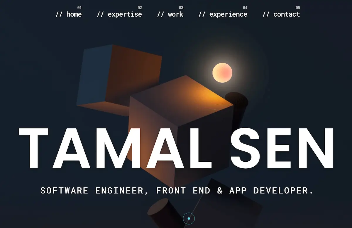
Tamal’s portfolio is professional, high-quality, and attention-grabbing.
As well as sleek 3D design, he’s also mimicked an integrated development environment (IDE) code in the background, which enforces his commitment to software engineering.
Rather than listing his skills as such, he instead labeled the section as ‘my expertise’ which cleverly reinforces him as an expert in the field.
Key takeaway: Be clever with language and wording.
Adenekan Wonderful
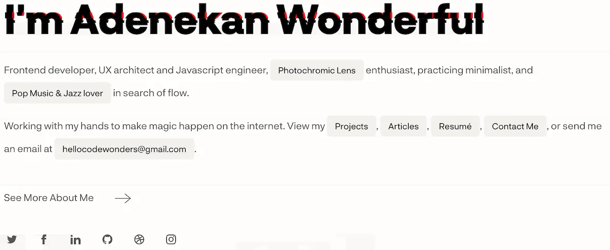
With a background in UX, it’s no wonder Adenekan’s portfolio is so well-designed.
The introductory paragraph cleverly mirrors a line of code, and there subtle animation of the opening line is edgy without being distracting.
Adenekan has opted for high-interactivity, with a branded cursor and dynamic previews into his projects—further demonstrating his technical skill.
Key takeaway: Add an element of interactivity.
Matt Farley
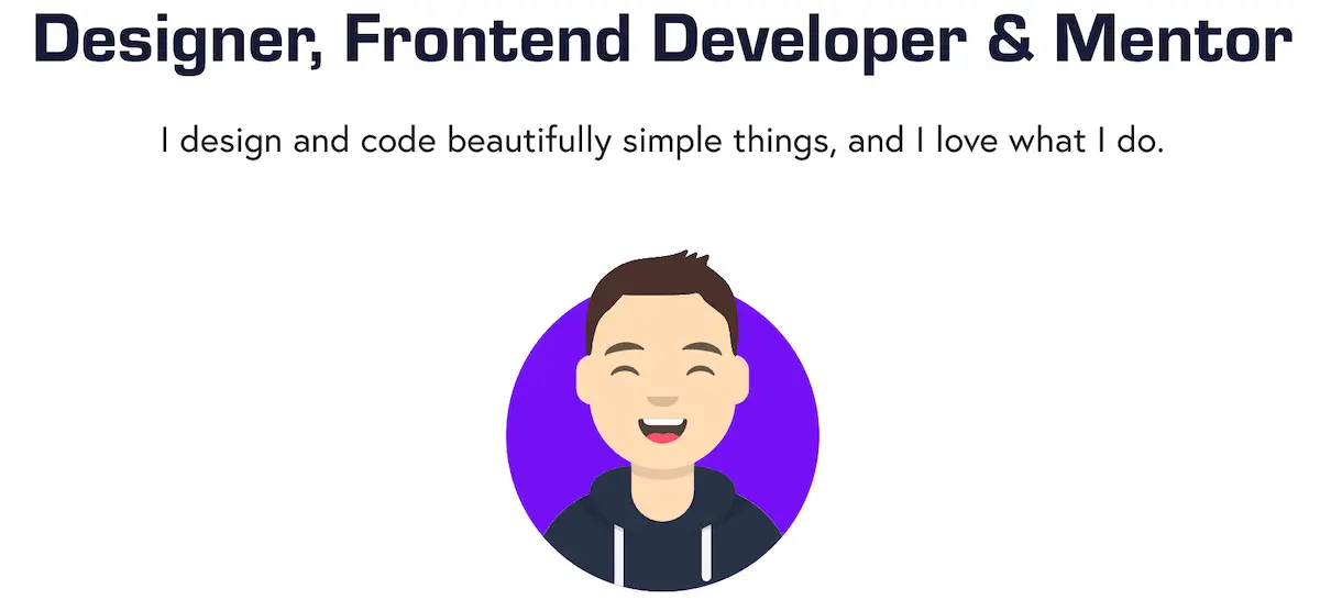
Matt’s portfolio opens with a clear and memorable headline, which demonstrates his passion for the discipline.
His quirky “avatar” (a pattern you’ll see across these software engineering portfolios) and cartoon-like illustrations also showcase his personality without distracting from the written content.
From bullet points to boxes, Matt has played around with the formatting to provide a comprehensive yet scannable overview of what he brings to the table.
Key takeaway: Illustrations are a great way to showcase your personality.
Zenia Gist
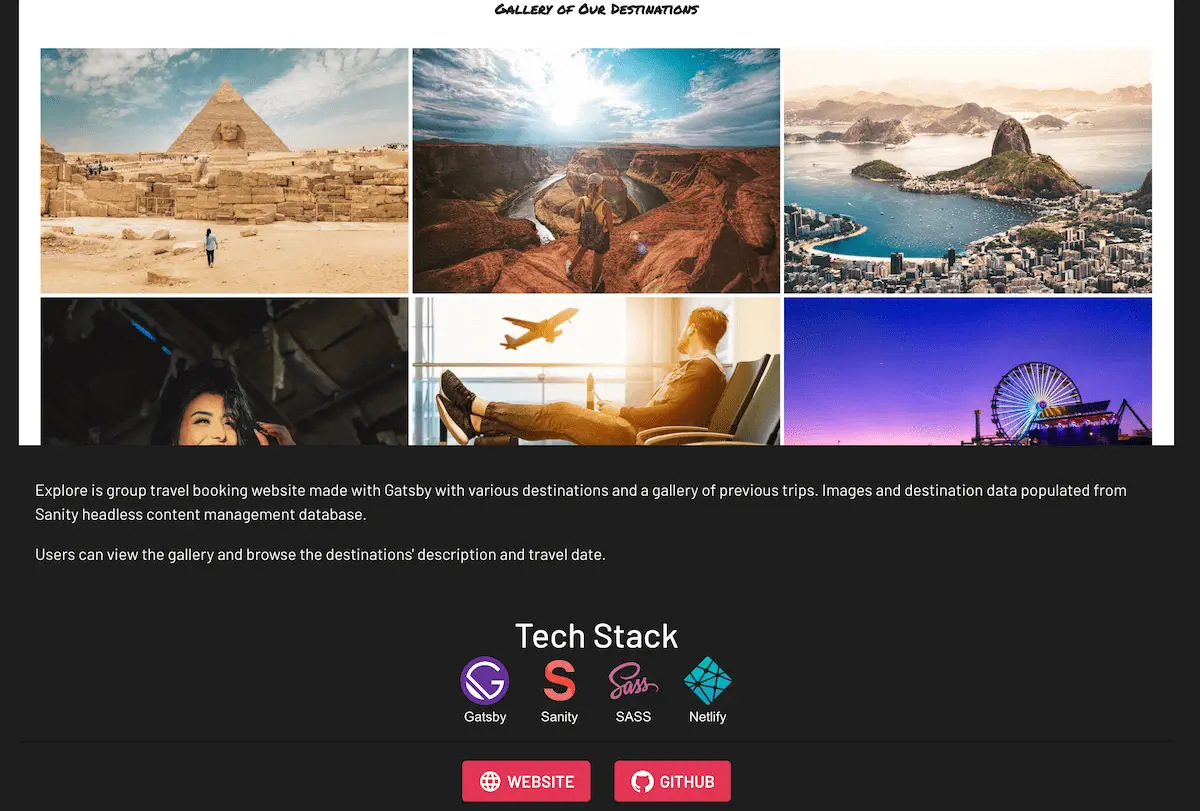
This beginner’s software engineer portfolio website is a great example of when you have few projects, present them beautifully.
As you can see from her presentation of Explore, a travel website, she shows off in short what it was created with, links to the repository and where you can see the site itself.
A graduate of CareerFoundry’s Full-Stack Development Program, she deftly shows off what she learned inside and outside of the classroom.
Key takeaway: Focus on presenting what you have well.
Armaiz Adenwala
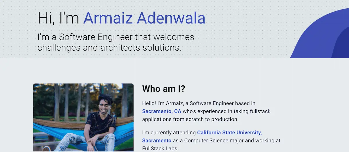
Armaiz’s software engineer portfolio is a great example of a relatively new coder presenting who he is, where he’s at, and what he’s done so far.
His website is simple, smoothly designed, and easy to navigate. Prospective employers can easily get an overview of the products he worked in and what they involved.
Armaiz also contains a whole blog section of his portfolio site, with articles and useful How To guides showing off his skills as well as how he wants to share his knowledge to help the community.
Articles include everything from technical guides to how to build a flashing LED rave mask. Pretty cool!
Key takeaway: Simple and smooth beat overcomplicated.
Gift Egwuenu
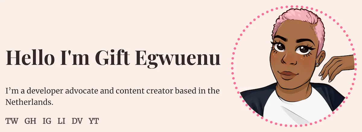
For something a little different, Gift’s website focuses more on the content and communication aspects of programming. You can see this immediately from the links to her socials prominently placed.
Originally a software engineer by trade, Gift is now spending a lot of her time talking and writing about learning code, technology, and the industry.
That doesn’t mean she didn’t take the time to show off her CSS chops while building her portfolio site.
Key takeaway: Direct your visitors to the things you want them to see most.
Ayub Ait Dahmane
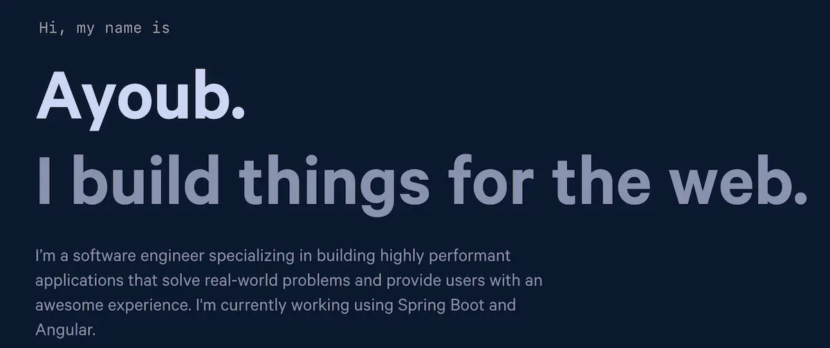
A slick one-page website, Moroccan coder Ayub has created a great example of a portfolio website that gives viewers the information they need quickly and attractively.
Looking for his resume? Just one click in the top right-hand corner brings you to the PDF.
Looking for his socials? His GitHub, Twitter, and LinkedIn are always easily within reach in the bottom-left corner.
Key takeaway: Simple thoughtful presentation is effective.
Nicky Kosasih
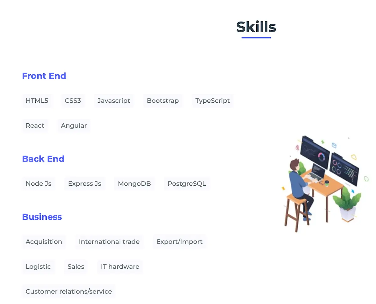
Another graduate of the CareerFoundry’s Full-Stack Development program, for his portfolio site Nicky decided to start adding some animation.
As you journey down the single-page-website and move your cursor about, his skills, projects, and other elements gradually arrange themselves into shape.
What’s neat is that the animations have been calibrated to make sure that they’re present without becoming too distracting from the content itself.
Key takeaway: Animation makes a one-page website bounce
Barlas Apaydin
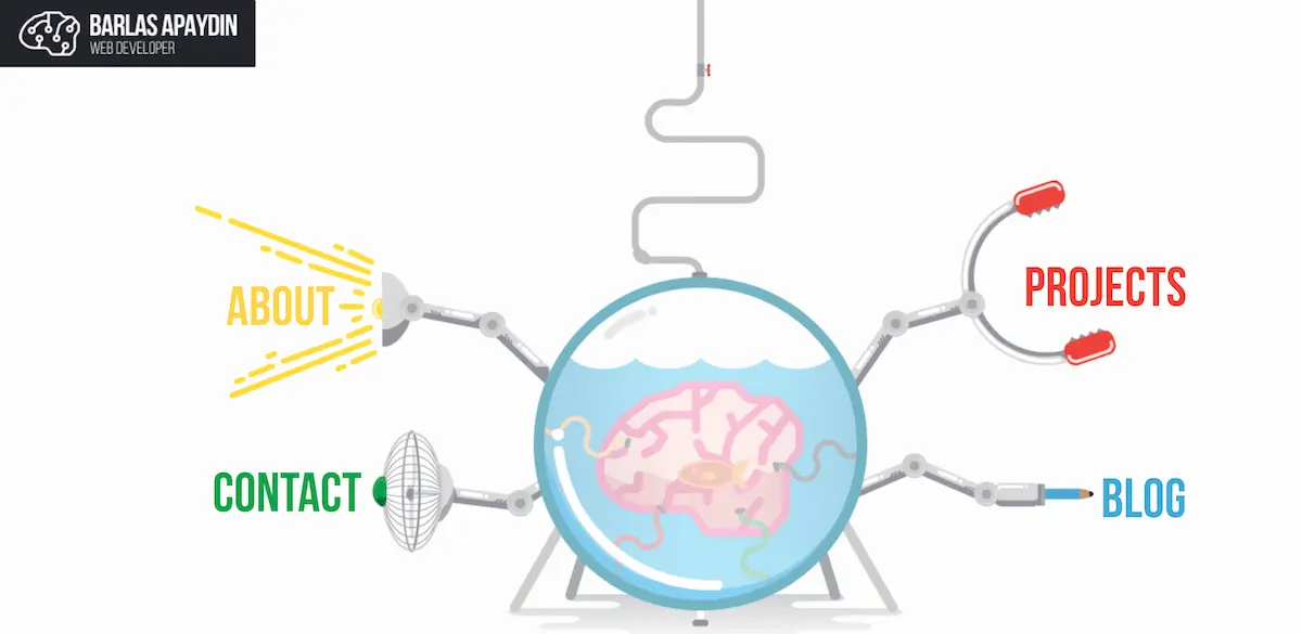
Barlas’ portfolio is full of personality, and he has a clear visual identity that’s reflected throughout the site.
The portfolio mirrors a high school science experiment, with themes and motifs of a chemistry lab.
He’s opted to display his projects like playing cards, with the option to link out and inspect the projects in more detail.
His software engineer portfolio site also includes a blog, where he showcases his thought leadership and expertise with tutorials.
Key takeaway: Including a blog in your portfolio will make you come across more qualified.
Josue Espinosa

Josue’s bold opening hook of “Not Your Average Software Engineer” is more than enough to entice you to learn more.
Josue has gone for a sleek and professional theme, using understated animations and iconography to add personality.
Proof points like “100+ projects completed” offer a creative way to showcase his skill and experience for hiring managers who only have a few minutes to spare (if that).
Key takeaway: Provide scannable proof points.
Atanas Atanasov

Opening Atanas’s portfolio feels like opening a page of code.
Before launching into skills, education, work etc, Atanas presents us with an interactive calendar that illustrates his activity over the last year.
The theme of time continues with a timeline of work experience, which you get to when you scroll past the featured projects.
Another notable section is the Skills section, which provides a colorful visual antidote from what would otherwise be a very text-heavy page.
Key takeaway: Use visual elements to break up text-heavy sections.
Rachael Rigby
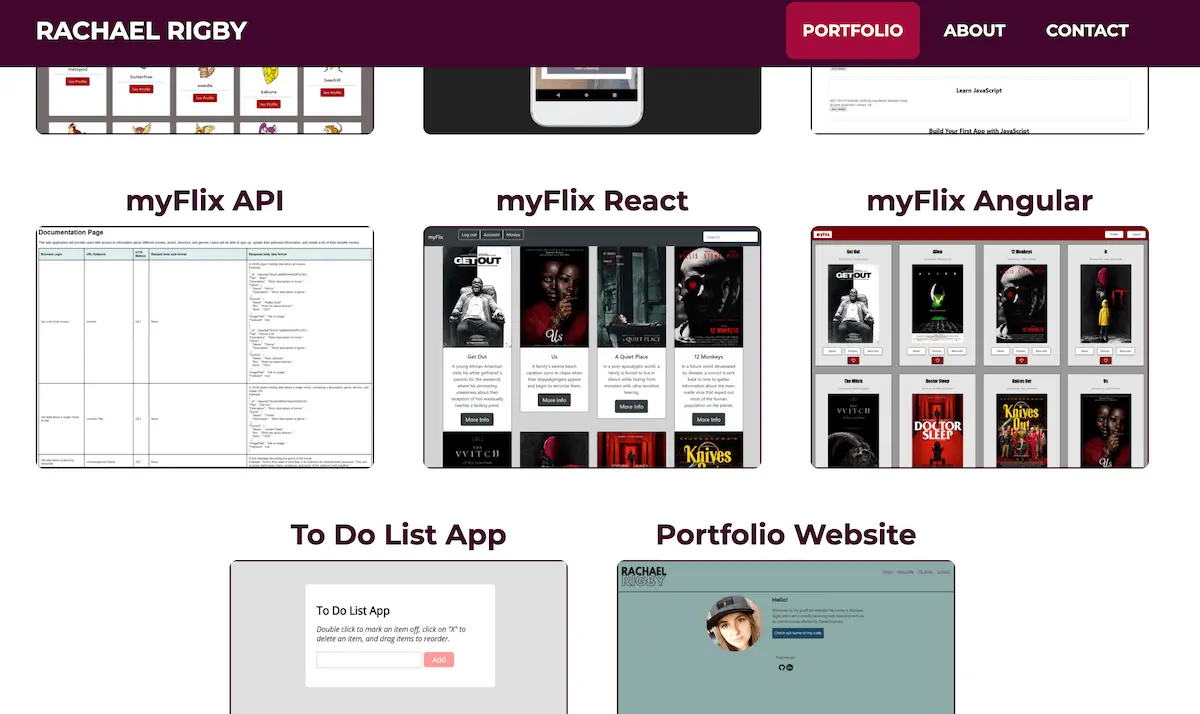
Rachel’s programming portfolio is an excellent way of populating your projects section as a newbie software engineer without all that much experience.
While quality beats quantity every time, there’s no reason why if you put in the work and are proud of something, then you should show it off.
With that in mind, if you planned, coded, and designed your portfolio website on your own, why not add it as a project?
Key takeaway: Maximize the projects you have.
Ian Dunkerley

Taking the “one-page portfolio” concept even further, Ian provides us with all the necessary information in a single snapshot: A concise bio, links to his most notable projects, and social links.
When you boil it down, that’s all a portfolio really needs—and Ian has executed minimalism in the best way possible.
While there are very few “designed” elements to the page, Ian has cleverly added dynamic colors which change depending on the project you’ve selected.
Key takeaway: You don’t need multiple pages to communicate key points.
Dani Roxberry

For her software engineer portfolio, Dani has taken a simple concept—an opening folder—and designed it well.
Unfolding into three pieces, this allows her to divide up the important sections of her portfolio: her employment history, her projects, and a contact form.
Visitors looking through her portfolio can find exactly what they’re looking for easily.
Key takeaway: Clever design can trump fancy flourishes.
Jordy Ruiter
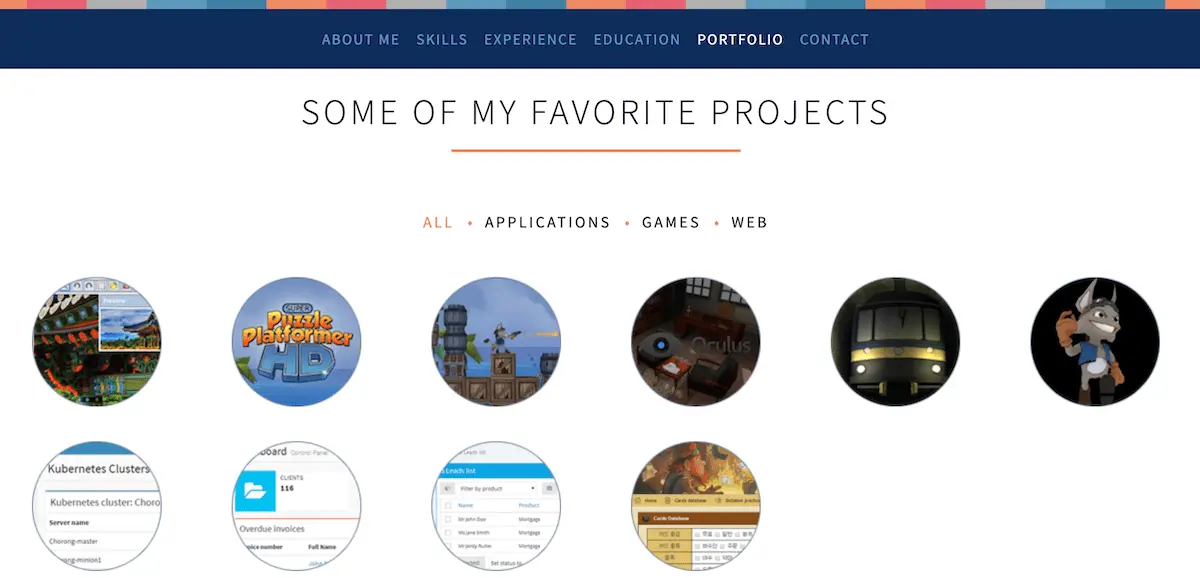
In terms of design, Jordy’s portfolio is more basic than some of the portfolios featured on this list.
But it’s the perfect reminder that you don’t need fancy interactive elements or sleek design to showcase your skills.
Jordy has embellished his bio with personal interests, and added his commonly used tools to the “Skills” section to give us even more insight into how he works.
Key takeaway: Talk about tools.
Ilya Vlasov
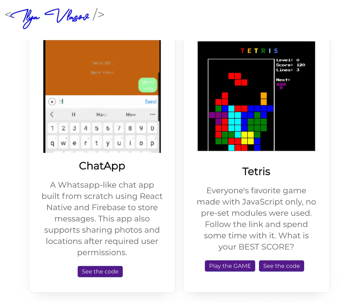
Sure, coding projects come in all shapes and sizes.
Sometimes they’re highly technical database projects built on the backend. Other times you can turn around and say “I coded my own Tetris game.”
For CareerFoundry graduate Ilya, it’s a case of the latter.
Some prospective employers and graduates will first look for the code behind the project and so click on the GitHub link. The rest of us will be going straight to playing some Tetris.
Key takeaway: Keep things fun.
Bruno Simon
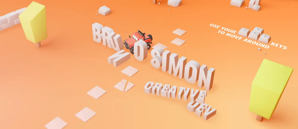
Almost bringing the ultimate fun interactivity, Bruno has created an entire 3D animated world that users can explore at their leisure in a truck.
By pressing keys, users can move around—and even knock elements over. Like a map, Bruno has included direction to sections of the portfolio (about, experience etc).
He’s also created a “playground” section once you’re finished reading through the portfolio itself.
Key takeaway: Make it fun, and people will interact with your portfolio for longer than they’d intended.
Madison Bertis
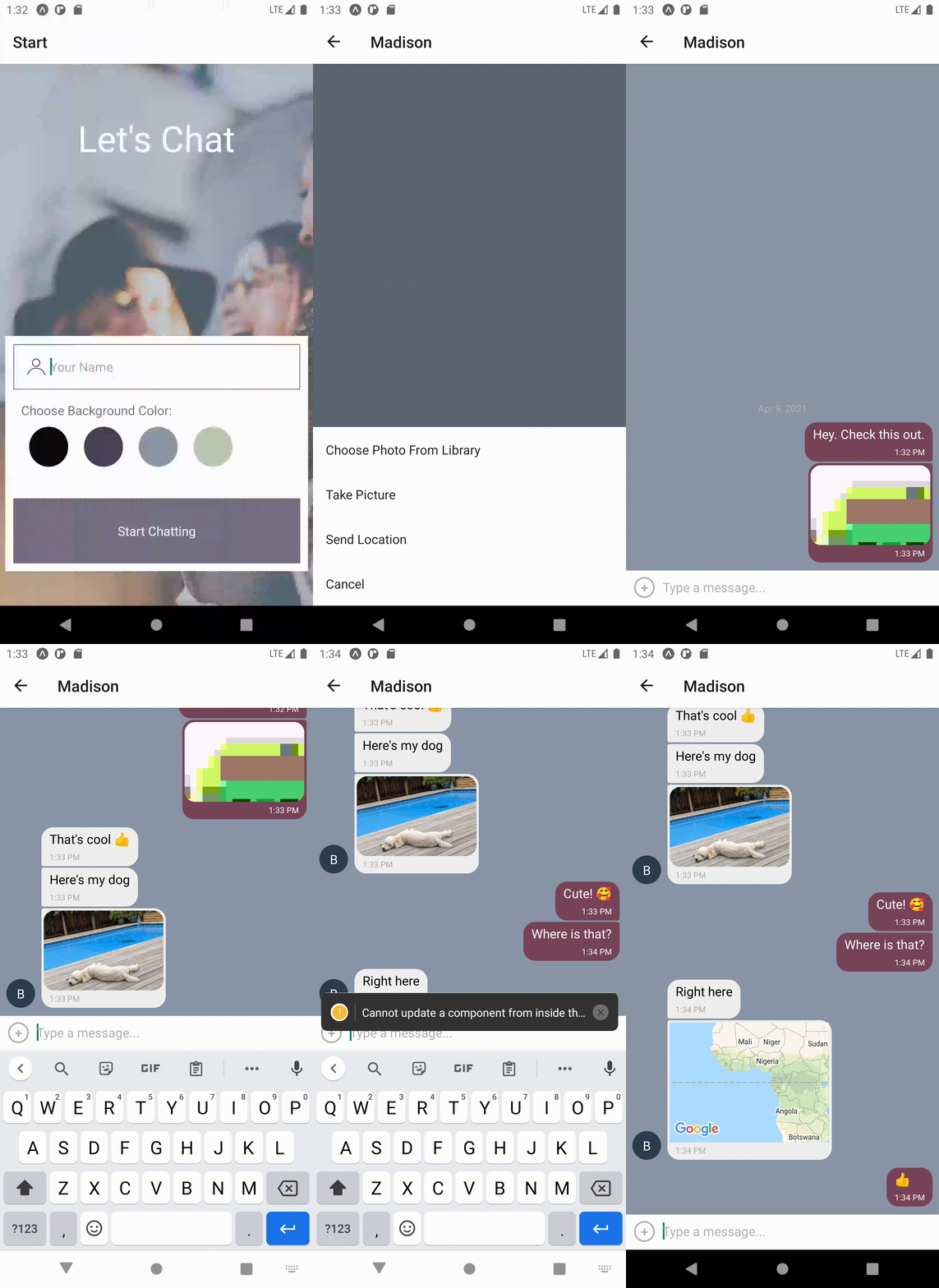
If you’ve designed a whole app, why not give people a simple run-through of how it looks on a smartphone? That’s what CareerFoundry Full-Stack Development Program graduate Madison has done with her portfolio project.
Coming from a fascinating background of music and chemistry helped instead of hindered her career change to software engineering, and she’s now fluent in the MERN stack and working as a junior developer.
Key takeaway: When it comes to displaying your coding projects, sometimes something that looks like it takes a lot of work, actually doesn’t. It’s far easier than you think to do a short screen recording and then converted it to a GIF via the likes of GIPHY Create.
Kenneth Jimmy
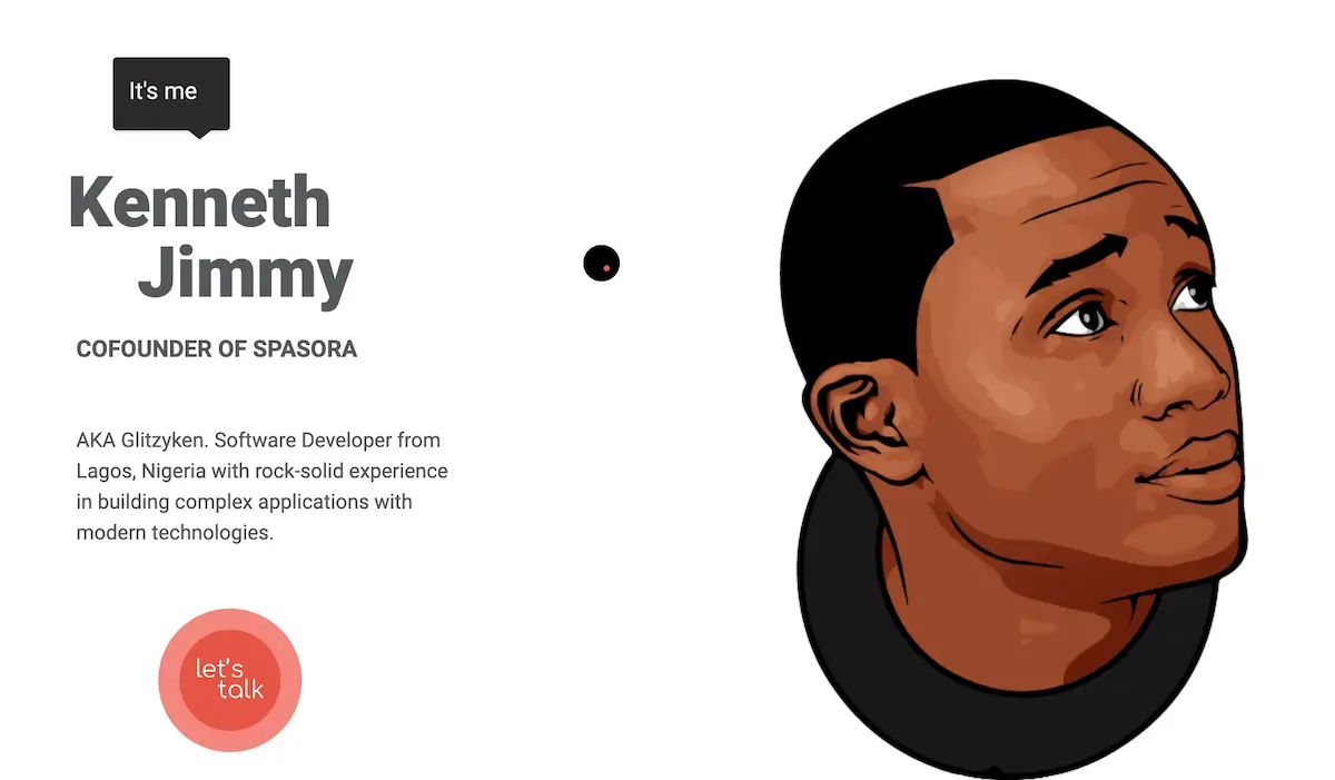
Kenneth’s portfolio strikes the perfect balance of fun and personal with sleek and professional.
Overall, the design itself is minimal—but Kenneth has embellished the interface with dynamic illustrations.
The “What I can do” section provides relevant insight into his skills, before launching into his biography, which includes a quick-fire overview of fun facts and current projects.
Key takeaway: Find creative ways to showcase your skills.
Edward Hinrichsen
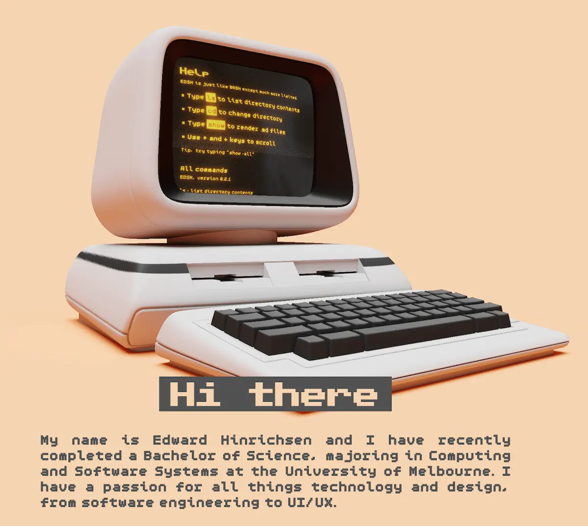
Despite being a newcomer to the field, Edward has created a portfolio that could compete with the industry’s most seasoned developers.
Mirroring the nostalgia of the internet’s early days, this custom website is unique, creative, and demonstrates his passion.
Despite the old-school design, Edward has kept it simple with a one-page portfolio, with the option to skip ahead to relevant sections.
Key takeaway: Don’t let impostor syndrome stop you from being unconventional.
Adeola Adeoti
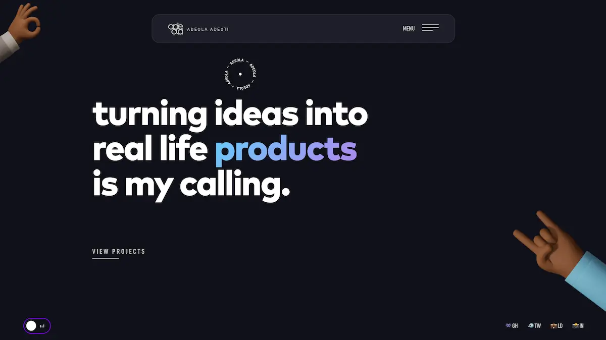
Adeola places his mission statement front and center; giving us an immediate insight into his approach.
The dark aesthetic is complemented by the lighthearted 3D illustrations and emojis.
He’s also opted for call-and-response style hooks over longer paragraphs, similar to what you’d find on social media—and giving the portfolio a youthful, on-trend feel.
Key takeaway: Make the content short and snappy.
Alicia Sykes
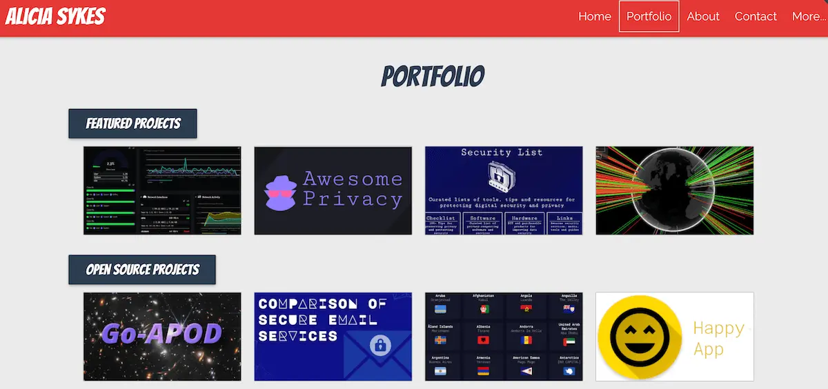
Alicia’s website is not over-designed but is even more satisfying by not being too distracting.
A bright red cracked-ground effect across the top of the homepage is simple but immensely satisfying to smoothly run your cursor over.
Simply laid out like a conventional site, it’s her projects that really make the eye pop. Hovering over each gives a short explanation, and click on them sends you to the Git repository for each one.
Key takeaway: Do one clever thing well instead of 10 clever things badly.
Maxime Bonhomme
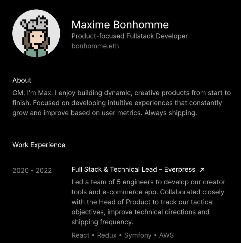
Maxime’s minimalist one-page interface proves equally effective as some of the more design-heavy portfolios on this list.
Keeping his bio short and sweet, Maxime lets his experience do the talking; with key links to examples of his coding skills at the bottom.
While simplistic, Maxime’s portfolio tells us everything we need to know about his approach, skill-level, and what drives him.
Key takeaway: Keep it simple.
Onyedika Edewor

Onyedika’s portfolio is oozing with personality, and has a clear and consistent nostalgic theme.
Enticing with a striking color contrast and cartoon-like illustrations, Onyedika has found simple ways to display his work while fortifying his personal brand.
He’s also highlighted his social media profiles to encourage users to connect.
Key takeaway: Make your branding consistent.
4. Wrap up
And that’s a wrap on our guide to software engineering portfolios, and how to create one.
As you can see from our list of examples, there isn’t a set formula or “template” to creating an awesome software engineer portfolio.
It’s all about reflecting on your personal brand, and telling a coherent story through written content and design. Software engineering might be a technical discipline, but (as we’ve seen) that shouldn’t stop you from showcasing your creative flair.
Whether you go for a highly dynamic and comprehensive website, or opt for a simple, one-page interface, it doesn’t matter. As long as you’re demonstrating the right skills, showcasing your personality, and making your key links accessible, you’re on the right track.
After that’s ready and your applications are going out, you can get preparing for the recruiter screen, rehearse some interview questions, and get studying software engineer salaries ahead of negotiations.
As they near the end of their studies, students of the CareerFoundry Full-Stack Development program receive 1:1 sessions with a dedicated career specialist. They’ll actively provide guidance as you refine your portfolio, tune-up your resume, search for and select job postings, and polish your interviewing skills.
Not quite done learning yet? Give these programming articles a read:
