If you’ve dipped your toe into user experience (UX) design, you’ve likely heard the word “wireframes” tossed around.
In simple terms, wireframes are visual representations of a web page or app interface, stripped down to its bare bones. Think of it as the architectural blueprint of your design project. They outline the structure and functionality of your product without getting caught up in colors, visuals, or specific content.
Here at CareerFoundry, we’ve trained thousands of working designers who are now crushing it in the industry (we offer a free 5-day short course in UX, if you’re interested).
- What is a wireframe?
- When does wireframing take place?
- What is the purpose of wireframing?
- What are the different types of wireframes?
- What is included in a wireframe?
- Desktop wireframes vs. mobile wireframes
- What tools are used to create wireframes?
- Examples of wireframes
- Conclusion
Let’s get you covered on wireframing so that you can start getting your hands dirty.
1. What is a wireframe?
A wireframe is a two-dimensional skeletal outline of a webpage or app. Wireframes provide a clear overview of the page structure, layout, information architecture, user flow, functionality, and intended behaviors. Styling, color, graphics, and other design elements are kept to a minimum.
They can be drawn by hand or created digitally, depending on how much detail is required.
Wireframing is a practice most commonly used by UX designers. This process allows all stakeholders to agree on where the information will be placed before the developers build the interface out with code.
2. When does wireframing take place? (And is a prototype different?)
The wireframing process tends to take place during the exploratory phase of the development process or product lifecycle. During this phase, the design team is testing the scope of the product, collaborating on ideas, and identifying business requirements.
Armed with the valuable insights from user feedback, designers can build on the next, more detailed iteration of the product’s design—such as the prototype or mockup.
Learn more about the difference between a wireframe, a prototype and a mockup.
3. What is the purpose of wireframing in UX?
Wireframes serve three key purposes: They keep the concept user-focused, they clarify features and navigation, and they are quick and cheap to create.
Wireframes keep the concept user-focused
Wireframing facilitates feedback from users, instigate conversations with stakeholders, and generate ideas between the designers. Conducting user testing early allows the designer to get honest feedback and identify key pain points.
By using placeholder text (Lorem ipsum) for future content, designers can prompt users with questions like “what would you expect would be written here?”
These insights help the designer to understand what feels intuitive to create products that are easy to use.
Wireframes clarify features and navigation
When communicating your ideas to clients, they may not be able to keep up with terms like “hero image” or “call to action.” Wireframing specific features will clearly communicate to your clients how they’ll function and what purpose they’ll serve.
Seeing the features will also allow you and your stakeholders to visualize how they all work together—or not.
The wireframing stage is when stakeholders can be brutal! Better now than later.
Wireframes are quick and cheap to create
If you have a pen and paper to hand, you can quickly sketch a wireframe without spending a penny. The abundance of tools available means you can also build a digital wireframe within minutes.
Often, when a product seems too polished, the user is less likely to be honest in their feedback. By exposing the very core of the page layout, pain points can easily be identified without significant expenditure of time or money. The later in the product design process, the harder it is to make changes!
4. What are the different types of wireframes?
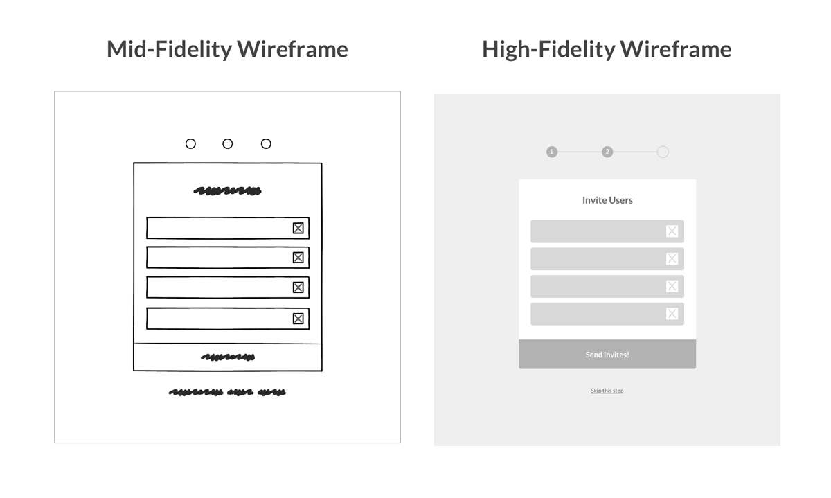
There are three main types of wireframes: low-fidelity, mid-fidelity, and high-fidelity. The wireframe fidelity refers to the level of detail in each design.
Let’s look at these more closely:
Low-fidelity wireframes
Low-fidelity wireframes usually serve as the design’s starting point. As such, they tend to be fairly rough, created without any sense of scale, grid, or pixel-accuracy.
They include only simplistic images, block shapes, and mock content—such as filler text for labels and headings.

Low-fidelity wireframes are useful for starting conversations, deciding on navigation layout, and mapping the user flow. They’re ideal if you have stakeholders or clients in the room and you want to sketch something up with a pen mid-meeting.
They’re also incredibly useful for designers who have multiple product concepts and want to quickly decide which direction to take.
Mid-fidelity wireframes
The most commonly used, mid-fidelity wireframes feature more accurate representations of the layout. While they still avoid distractions such as images or typography, more detail is assigned to specific components and features.
Varying text weights might also be used to separate headings and body content. Though still black and white, designers can use different shades of gray to communicate the visual prominence of individual elements. Mid-fidelity wireframes are usually created using a digital wireframing tool, such as Sketch or Balsamiq.
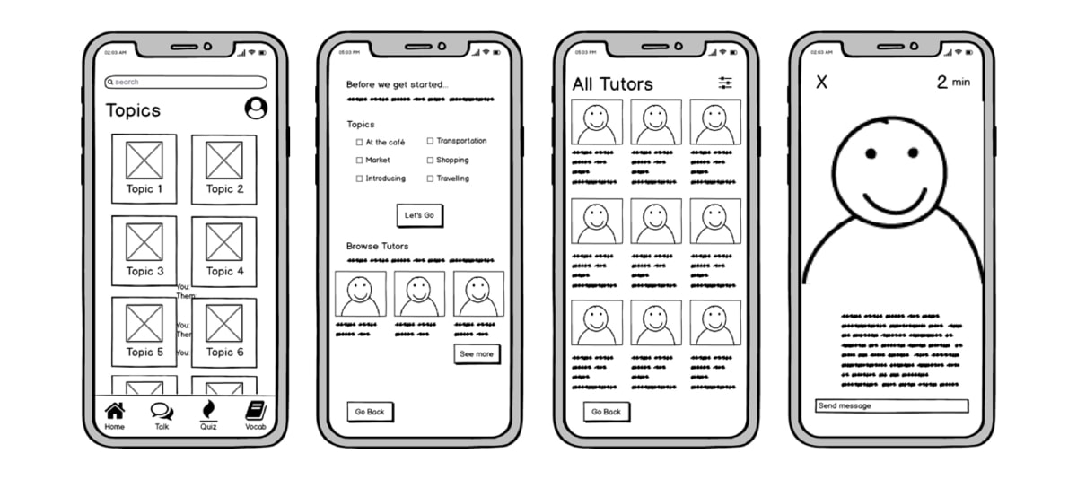
Source: Katherine Lu’s portfolio
High-fidelity wireframes
High-fidelity wireframes have pixel-specific layouts, and may include actual featured images and relevant copy.
They are ideal for exploring and documenting complex concepts such as menu systems or interactive maps.
5. What is included in a wireframe?
Elements that are typically found in wireframes include:
- logos
- search fields
- headers
- share buttons
- pseudo-Latin (Lorem Ipsum) placeholder text
High-fidelity wireframes may also include:
- navigation systems
- contact information
- footers
Typography and imagery should not be part of a low or mid-fidelity wireframe—but designers often play with the sizing of the text to represent the information hierarchy.
Wireframes are traditionally created in grayscale, so designers often play around with shading. In high-fidelity, designers may throw in the occasional color; such as red to indicate a warning or error message, or dark blue to represent an active link.
Remember that wireframes don’t show the interactive features of the interface, like drop-downs, hover states, or accordions that implement show-hide functionality.
6. Desktop vs. mobile and app wireframes
When we think of wireframes, we often cast our minds to desktop site design. But mobile devices require special considerations.
Size
On a desktop website, for example, your layout might spread over multiple columns.
On a mobile app, the number of columns is usually restricted to one or two columns maximum. You’ll need to decide whether they see an infinite scroll, or whether you want to decrease the number of items per page to display other content.
Learn more about the differences between desktop and mobile UX design.
Behaviour
On a website, the user will use a mouse or trackpad to navigate the page. The user can also click on certain features to reveal additional pieces of information, or even hover over certain interactions to reveal menus.
On a mobile app, however, users will have to tap the screen to open a feature. When wireframing for mobile apps, this means thinking more carefully about how you will encourage your users to tap a specific button to reach a specific goal.
Interaction
An app may pull content and data from the Internet, but many apps also offer the user the option to download content for offline use. These “offline modes” specific to mobile applications should be reflected in your wireframe.
To learn more about creating wireframes for mobile apps and websites, head to our blog post here!
7. What tools are used to create wireframes?
Designers have lots of advanced wireframing tools and programs at their fingertips. Built-in UI components, such as form elements, button states, and navigation, allow designers to take advantage of pre-made design decisions and create wireframes in a fraction of the time, allowing for a truly iterative process.
Sketch
One of the best-known wireframing tools on the scene is Sketch, which uses a combination of artboards and vector design shapes to enable designers to easily create on a pixel-based canvas. Sketch also has a convenient Symbols feature, meaning you’ll be able to reuse UI elements once they’ve been created.
Balsamiq
Need something more professional than a paper wireframe but aren’t striving for pixel perfection? Opt for the equally popular Balsamiq, a tool that enables designers to focus on the layout, intuitive interaction design, and basic information architecture.
To learn more about wireframing tools, check out our take on the 8 best wireframing tools that every UX designer should know.
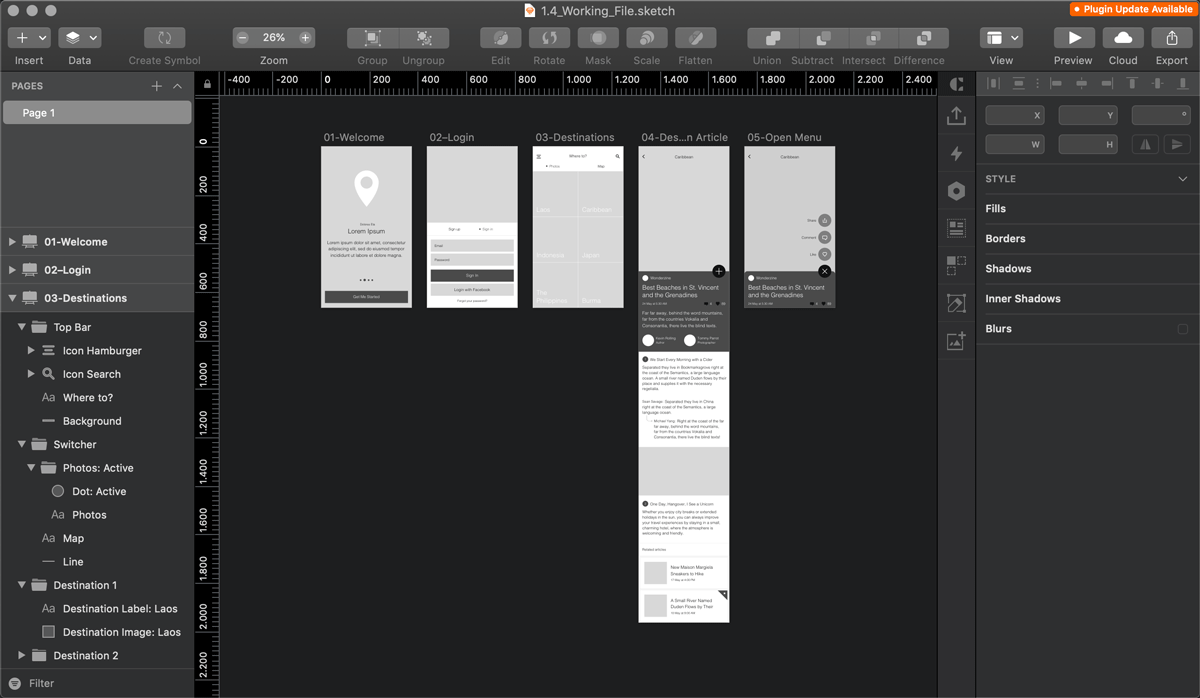
8. Examples of wireframes
To give you an idea of the variety of ways wireframes can be created (and to provide you with some well-needed inspiration), let’s take a look at some examples:
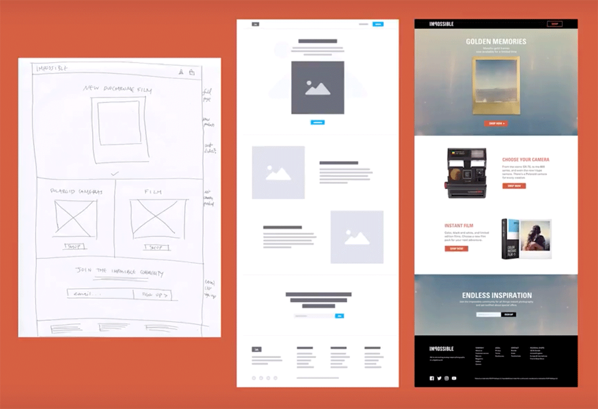
Monica Galvan shows us the transition from low-fidelity wireframe to high-fidelity wireframe, right through to the final UI for her Impossible project.
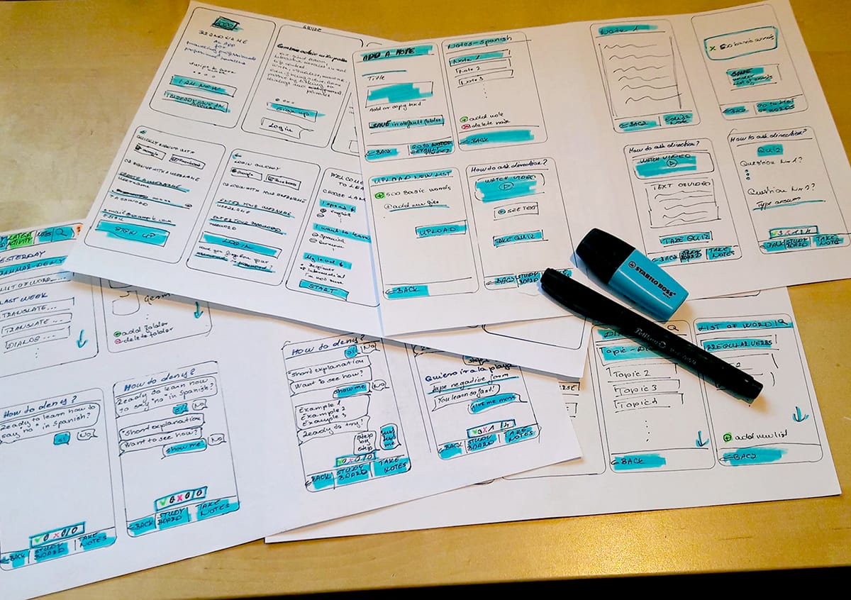
Elvira Hellenpart’s wireframes for the VocabApp project, created as part of the CareerFoundry UX Fundamentals Program.
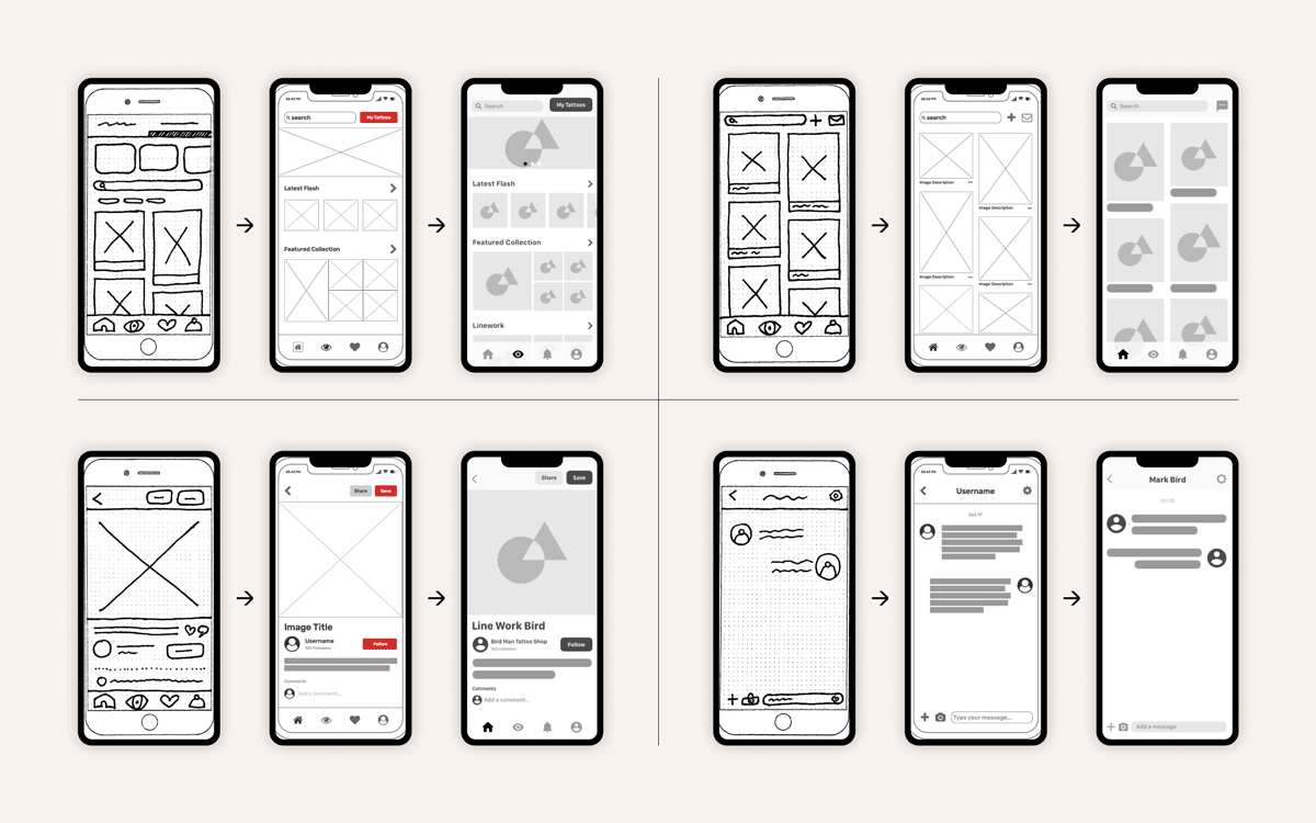
“Starting with low-fidelity ink-on-paper wireframes and a mobile-first design approach, I began to iterate my way to a higher-fidelity prototype,” says UX alumnus Aaron Akbari Mort about his Inktank project.
Conclusion
They may seem basic enough to be overlooked, but wireframes will enable you to get vital user, client, and stakeholder approval when it comes to the layout and navigation of the product’s key pages.
The bonus? You’ll save heaps of time and money in the long run!
Ready to start creating your own wireframes? Read our definitive guide on how to create your first wireframe, or dive into our free 5-day short course in UX design.
Be sure to check out the video below, in which senior UX designer Dee Scarano presents the ultimate beginner’s guide to wireframing.
