Minal Bombatkar's Portfolio Project

During the CareerFoundry UX Design Program, you’ll build out a job-ready portfolio. Here is a breakdown of graduate Minal’s portfolio project, Yogic; an app which seeks to connect with yoga mentors from all over the world.
What inspired you to make a career change into this field?
“While working as e-learning designer, I got the opportunity to work closely with the UX team. I was fascinated by the UX design approach, and I discovered I had a passion for problem-solving. It was a no-brainer.”

Project Overview
Yoga lovers face the dilemma of finding the perfect Yoga teacher without having to stray too far. In the case of prenatal and postnatal yoga, this can be a considerable problem.
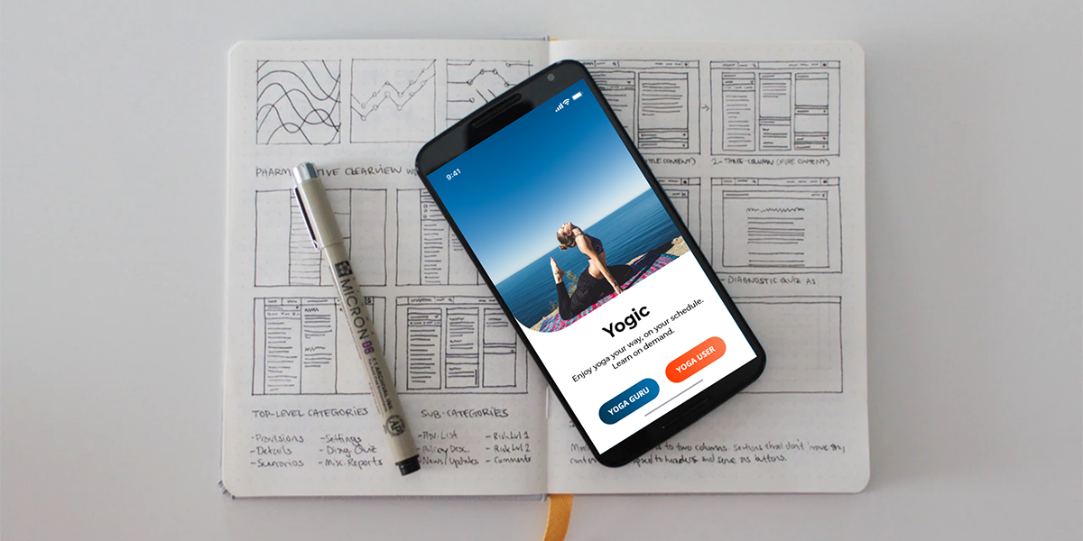
Yogic’s responsive web solution strives to connect yoga gurus around the world. This was my inspiration for the app’s tagline: “Learn from a world-famous yoga guru. Enjoy yoga your way, on your schedule. Learn on-demand.”
My role:
This project allowed me to plan and direct each step of the design process.
- UX researcher
- Usability tester
- UI designer/ Product designer
- Interaction designer
Why did I decide to work on this project?
- I am a yoga practitioner.
- This project belongs to me in terms of UX, UI, and interaction design.
- Using the Guerilla testing method allowed me to interact with real yoga users through user interviews and usability testing.

1. Design approach
###
Following the stages of the design thinking process, I started by understanding the business need and user goals to create the product’s core features. I then created wireframes to gather initial feedback and make the necessary revisions. Following the low-fidelity wireframes, I created high fidelity wireframes to test my design with potential users. After several iterations of the design, the final screens were then polished and made ready for the development team.

Problem Statement
####
Yoga users need a way to find the yoga guru who specializes in prenatal and postnatal yoga. Yoga users want yoga to be easily accessible, more convenient, and with a variety of experts on offer.
Research
####
To begin my research, I started to look at a few competitors or similar platforms, analyzing UI, UX, User flow, IA, and key features. During the research, I identified many different scenarios.


Pain points
- Users like to learn yoga from experts. This could be prenatal, postnatal, or regular yoga.
- Users prefer doing yoga at home rather than going to a studio or classes.
- To gain trust, users are open to experiencing yoga with new experts. As of now, they consider the recommendations from doctors, friends, and family or use google feedback and reviews.
Solutions
In an attempt to address the pain points, I documented the results of the online survey focused on collecting the quantitative data. Next, I recorded each interview based on the notes for each participant.
Finally, I arranged ideas in intuitive clusters and assigned them with specific findings.
Finally, Ideas have been arranged in intuitive clusters and categorized to specific findings.

Persona
To start off, I created a provisional persona of a potential yoga user based on my research. This persona was something that I continually referred back to throughout my project to guide my decisions and priorities.

Mental models & User journey map
####
To better understand the challenges that yoga users face, I created mental models and user journey maps.

Task analysis and user flows
####
Creating mental models and user journey maps helped me to understand what kind of things the users are looking for. After selecting the most important tasks, I created user flows for the persona.


2. Ideate
###
Reviewing my personas and user journeys and having certain features in mind, I started to think about the structure of the app. I had a rough idea of keeping the structure simple with co-existing hierarchies, since there is a great deal of overlapping information and wanted my users to have easy access from one page to the other.

Card Sorting
####
To cross check, I used to follow the card sorting and base on that result, refined the site map.


Refined Sitemap
####

Wireframing
####
After that, I started creating wireframes with pen and paper. Having the hand-drawn screens, I made a low-fidelity prototype putting them together to represent the user flow. These wireframes are focused on core functions and navigation structures of the app.


Prototyping
####
NextI explored different design possibilities: From each repetition of the design I learn something that I can use for the next iteration. I tested the prototype with five individuals. Below are the Mid-Fidelity mockups of my final solutions excluding the results of the user testing before and after implementing my design solutions.

3. Usability testing
###
Goal
####
I wanted to observe and measure if users understand the app, its value and how to complete basic functions through testing the high-fidelity prototype. Both in-person and remote moderated usability tests were conducted. The test included a short briefing and task performance with the Yogic mobile app.

Usability Test Results – Finding & Insights
After collecting the information, I created an Affinity Map which helped me to get a better overview and identify valuable insights. Takeaways from this usability testing are issues with high severity should be fixed at this stage of the developing process. Furthermore, the ideas, inputs and missing information or data should be added now as well.

Take aways for prototype Changes
• On boarding video is necessary to understand how app will works
• Email conformation for booking will be required
• Add to Favorite list feature will be added so that comparison of yoga expert should possible before booking
• Add the prototype for back button with all wireframes
• Redesign the booking page and payment page
• Add the icons for online presence of yoga expert
• Voice search will be added with the auto suggestions
Preference Test
I conducted the Preference test. There were 17 participants, both yoga users and non-yogi, including the people I conducted the interviews and usability tests with. I decided to test two different pictures, Typography, Color palette, Button style for the introduction screen. This gave me clear feedback that the first design was more appealing to potential users.


5. VISUAL DESIGN
Material design
Color palette: For Yogic, I used bright Blue and other shades of blue with Orange color. While Blue color delivers amazement, surprise and Orange colour used for button, it related with the vigilance that are more welcome for an yoga app.
Typography: Montserrat is a well-balanced with Open Sans typeface superfamily that seems to complement the interface.
Naming: The main reason to choose the name Yogic was practical. I wanted to have the word ‘Yog’ in the name but every other combination with it was already taken. The suffix ‘ic’ means the state or the condition of person. I felt this suits the app’s vision and therefore I chose Yogic.


Iterations and solutions
From the usability test, I iterated a high fidelity prototype. The visuals was also enhanced in the design by using the right fonts and colours. All the screen visual design goes through the iterative design process and comes with improved solutions.


Visual design for onboarding screens
What I learned :
Designing the app has been a challenging and rewarding journey. It was clear from the guerilla testing that the major challenge will be to make with yoga lovers requirement and expectations from the product. I researched the yoga practitioners need, pain point and their expectations. I understood the needs of the users through the survey and conversations. Finally, I faced the challenge of creating an engaging app both from the user experience perspective and the visual perspective.
Because of this project, I realized the importance of prototype testing for exploring new design concepts. Also, the new designs were viable solutions before putting in the development effort.
Other Portfolios
Daniel Cho's Portfolio Project
Daniel Cho
Devanshi Vasa's VUI Portfolio Project
Devanshi Vasa
Devanshi Vasa's Portfolio Project