When designing an app, the login screen might seem like something of an afterthought. After all, the users only encounter the login screen every now and then, and the sign up screen when they register. How much attention does one screen need? The answer is: a lot. Or at least as much attention as you would give to any other screen.
The login screen is the gateway to a mobile app. It’s the first thing users see when they download an app and is a crucial part of the app’s user experience. If the login screen isn’t easy to navigate and fast to fill out, your users could get frustrated at the first hurdle.
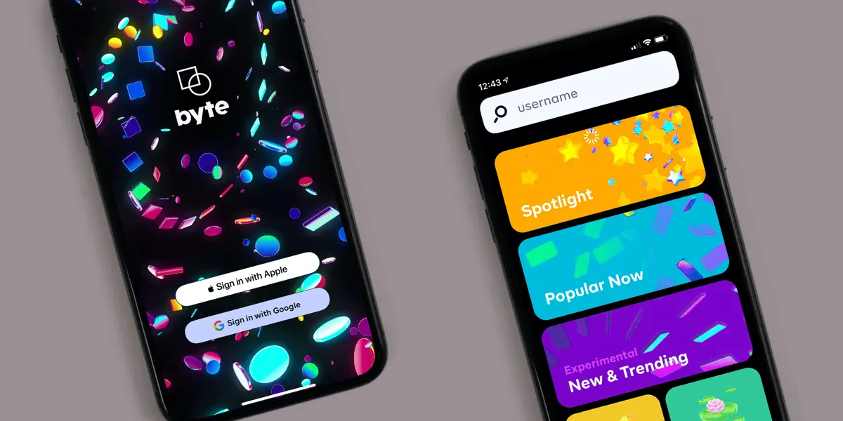
To make sure you’re nailing the login screen for your upcoming mobile UI project, we’ve rounded up some examples of awesome login/sign up screens for you to draw inspiration from.
Let’s go!
1. IOS and Android app login/signup screen kit by Sandeep Webexpert
This duo of bright, simple login/sign up screens uses splashes of bright orange juxtaposed with a clean white background, giving the interface some character without being too distracting. Here, the UI designer has cleverly made the process of logging in the star of the show while giving the user a foreshadowing of the app’s UI.

View the project here.
2. ‘Lippy’ app login screen by Lula Christman
This trendy, minimalistic sign up/login screen has achieved a happy balance of being clear and straightforward while still being fun and playful. Interestingly, the UI designer has presented the options to sign up with Google, Facebook, Instagram, and Twitter as icons below the input fields rather than the conventional rectangle buttons. While the option to sign up with an alternative account is in small, muted text at the bottom, it’s still accessible.

View the project here.
3. ‘Banana lovers’ app sign up screen by Alexandra Budina
This playful sign up screen is oozing with personality. Quirky illustrations and even quirkier sub-text let you instantly know that using this app will be a fun, lighthearted experience. Alexandra hasn’t let the app’s clear theme obstruct the navigation—she’s left buttons for returning users at the top and bottom of the screen. She’s also provided additional clarity by including a yellow tick to indicate when a field has been correctly filled out.

View the project here.
4. Fintech app login screen by Ramotion
Who said fintech apps have to be dull and boring? Stepping away from the blue and silver colors typically associated with finance, the UI designer has opted for a warmer pink/red accent to breathe life into the otherwise white interface. Aside from the background pattern and a few smaller icons, there’s no frustrating content to annoy or distract the user from completing the task at hand.

View the project here.
5. Miscellaneous app sign in screen by Sam
Here we have a beautiful example of how just how impactful illustration can be—even on something as (seemingly) arbitrary as a login screen. UI designer Sam’s custom illustrations breathe life into this set of login screens, while dark blue is used to establish hierarchy and guide returning users to their accounts. On the second screen, the illustration of the car gives the optical illusion that it’s ‘driving’ along the top of the login screen—making filling out a form all the more fun for the user.

View the project here.
6. Acorns app login screen

Investment company Acorns’ app demonstrates the importance of designing a password field that’s easy to populate. In other words, your password input bar should have a built-in option to display the password while it’s being typed. This can be achieved with an eyeball icon or the word ‘show’ as Acorns have done.
View the app here.
7. Uplabs login screen
Opting for a slightly more complex interface, Uplabs have presented their options to sign in with various social media accounts as round buttons on an angle, creating a playful line underneath a diagonally split screen. Rather than the login and sign up options being on two different screens, Uplabs have but both sets of input fields on the same screen, with new users having to scroll down to get to the signup option.

View the project here.
8. ‘Wwwater’ app sign up screens by Liliya Kizlaitis
On the login screens of her water delivery concept app, UI designer Liliya Kizlaitis has managed to make the login/signup process feel like you’re wading through water itself. Adorned with blue shapes that mimic pools of water, blue text is used to create contrast against the white background and increase the visibility of vital text like ‘forgot password.’

View the project here.
9. Miscellaneous app sign up screen by Meghan Rose
Veering away from conventional form design, this gorgeous signup screen by Meghan Rose is an exercise in creativity. Rather than keeping each input field separate, as we’ve seen wit the other screens on this list, Meghan has designed the form like a set of building blocks that comprise one square shape. Dusty pink background with hints of neon layered against sharp, thin lines—signing up to use an app has never felt so chic!

View the project here.
So there we have it; 9 creative examples that prove there’s so much more to login screens than a simple form. For more inspiration ahead of your upcoming app design project, check out these articles on the blog:
- 9 inspiring examples of great UI design
- 8 typography trends that will transform your user interface
- 9 of the best UI design portfolios that will inspire you
- How to design a great search experience
FAQ
1. What is a login screen?
Sometimes called a login page or login form, a login screen is a screen that appears when you first try to access a restricted area of a website, app, or any system that requires authentication.
It usually contains a username or email field and a password field, and sometimes also a “remember me” checkbox and a “forgot password” link. Users need to enter their credentials to gain access.
2. What should a login screen have?
A good login screen design includes the basic username and password fields as well as additional checkboxes for better user experience, such as a “remember me” box and “forgot password” link.
In its design, a login screen should be intuitive, simple, and secure. It should be user-friendly, accessible, and have clear instructions and options for error handling.
3. Why is a login screen important?
The login screen is the gateway to a mobile app. It’s the first thing users see when they download an app and is a crucial part of the app’s user experience. If the login screen isn’t easy to navigate and fast to fill out, your users could get frustrated at the first hurdle.