Hi there,
Welcome to tutorial three of your Data Analytics for Beginners Course—you’re making great progress! This tutorial marks the halfway point, and things are about to get interesting 🤩 In the previous tutorial, you cleaned your data, ready for analysis. Now, you’re going to start gleaning valuable insights through exploratory data analysis; namely, using descriptive statistics and pivot tables.
The goal of this tutorial is to learn about descriptive statistics and practice calculating the mean, median, and range for certain variables. You’ll then get familiar with pivot tables to gain further insights from your data. In doing so, you’ll find answers to four of the five questions we set out in the first tutorial:
- What are the most popular pick-up locations across the city for NY Citi Bike rental?
- How does the average trip duration vary across different age groups?
- Which age group rents the most bikes?
- How does bike rental vary across the two user groups (one-time users vs long-term subscribers) on different days of the week?
Answering these questions will give us valuable insights into who our users are and how they use the NY Citi Bike rental service. All very useful for making business decisions, as we’ll see later on in the course! 🚴
Before we dive into answering the questions, let's explore/feel our data a bit so that we are more acquainted with it before answering these questions. As a data analyst, you have to know your data much better than everyone else.
In this tutorial, you will:
- Calculate descriptive statistics
- Create pivot tables using different variables
- Answer four of our five main questions about the dataset for stakeholders
As always, we’ll start with some theory before jumping into the practical component. We’ve structured the tutorial as follows:
- What is exploratory data analysis (EDA)?
- What are descriptive statistics?
- What is a pivot table and what are they used for?
- Practical exercise: Descriptive statistics and pivot tables
- Key takeaways and further reading
Got feedback or questions? We'd love to hear from you! Just reply to any of the course emails you've received so far ✉️
Ready? Let’s begin!
1. What is exploratory data analysis?
Before you start conducting in-depth analysis, it’s important to first get acquainted with your dataset—to get the “lay of the land,” if you will. This is where exploratory data analysis comes in.
You can think of exploratory data analysis as an initial investigation of your dataset where you seek to understand and summarize its main characteristics. EDA is useful because it helps you to understand how your data is structured, to spot potential patterns and trends, and to catch any anomalies. EDA is also important for determining if the methods of analysis you are planning to use later on are actually appropriate for your dataset.
We encourage you to learn more about exploratory data analysis once you’ve completed this tutorial 😀 These days, AI data tools such as Polymer help analysts with the EDA process by automatically generating charts and tables from your dataset. You can also use ChatGPT to help out, as explained by CareerFoundry's Senior Data Scientist Tom Gadsby in this video (the EDA part is 6 minutes in): Data Analysis Made Easy with ChatGPT
For now, let’s move on to a crucial component of exploratory data analysis: Descriptive statistics.
2. What are descriptive statistics?
In a nutshell, descriptive statistics help you to summarize or describe the characteristics of your dataset in a meaningful way.
Imagine you have a dataset containing hundreds or even thousands of values. It would be impossible to look at that raw data with the naked eye and make any sense of it.
For example, if you collected data on the test scores of three hundred students, you might want to gauge their overall performance. You wouldn’t be able to do this simply by looking at a spreadsheet with all the raw data, but you could calculate the average (or mean) score. That’s an example of descriptive statistics!
Descriptive statistics are also useful for spotting potential errors or strange occurrences within your dataset. For example, in calculating the minimum and maximum values for a certain variable, you might notice that the maximum value falls outside of what could be considered a reasonable range. Imagine you’ve collected height data for a group of school children and calculated a minimum value of 20cm. That doesn’t seem like a realistic height for a child. Based on that, you’d investigate further to see what’s going on (and make sure that your dataset is in a fit state for analysis) 👀
Up next: What are the different types of descriptive statistics?
What are the different types of descriptive statistics?
The three main types of descriptive statistics are:
- Frequency distribution, which tells you how frequently (i.e. how many times) a certain value occurs within your dataset.
- Measures of central tendency, which estimate the middle or average values within your dataset. Measures of central tendency are the mean, median, and mode.
- Measures of variability help you gauge how much variability or “spread” there is within your dataset; in other words, how spread out the values are. Measures of variability are range, standard deviation, and variance.
You’ll learn how these values are calculated when we get to section four, the practical component of our tutorial. For now, there’s one last piece of theory we need to complete the jigsaw. Proceed to section three! 🏃🏻
3. What is a pivot table?
A pivot table summarizes large amounts of data in a more digestible, at-a-glance format. It does this by grouping the data in a meaningful way, for example by showing the sum or average values of certain variables.
Let’s imagine you have data for a chain of department stores. Your dataset includes data on the sales made each month in two different store locations. You want to be able to see, at a glance, how each store performed across the year, but it’s impossible to know when faced with thousands of rows of data in a spreadsheet.
Here’s where a pivot table can help. You’d add up the total sales for each store for each month of the year, and summarize the data in a pivot table, like so:
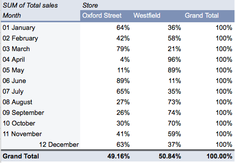
You can find a more in-depth explanation of pivot tables in this guide, and you’ll learn how to create your own in the next section—our practical task for today! 🙌
4. Practical exercise: Descriptive statistics and pivot tables
It’s time to get hands on!
Now that you’re familiar with some of the theory behind descriptive statistics and pivot tables, let’s explore some of their applications in our NY Citi Bike dataset. We’ll be focusing on some of the key research questions we laid out at the beginning of the course, namely:
- What are the most popular locations across the city for NY Citi Bike rental?
- How does the average trip duration vary across different age groups, and over time?
- Which age group rents the most bikes?
- How does bike rental vary across the two user groups (one-time users vs long-term subscribers) on different days of the week?
You’ll be calculating the frequency distribution to identify the most popular pick-up locations for NY Citi Bike bicycles. We’ll also be calculating various descriptive statistics for the variables “Trip duration” and “User age” in order to get an idea of how NY Citi Bike usage varies across different age groups and at different times of the year. For these variables, we’ll calculate the mean and median values (measures of central tendency), as well as the minimum and maximum values.
To answer the first three questions, we’ll conduct a descriptive analysis using the following columns (variables) in our dataset:
- Start station name (this indicates where the bike was picked up from)—column D in your dataset
- Age (of the user)—column J in your dataset
- Trip duration in minutes—column M in your dataset
Our analysis will consist of two parts:
- Calculating some of the descriptive statistics we covered earlier on: the mean, median, minimum, and maximum values for two variables of interest (trip duration in minutes and user age).
- Creating pivot tables to summarize our descriptive statistics.
So, let’s begin with some basic descriptive statistics. Onto task one!
Task 1: Calculate descriptive statistics for “Trip duration” and “User age”
Step One
Log into your Google account and open up your (now clean) dataset in Google Sheets. You can access our view-only clean dataset here for reference. We’ve named this version “New York Citi Bikes_Clean ''.
*Tip 💡: If you got stuck on the data cleaning task in tutorial 2, make a copy of* our clean dataset *and use that version to continue :)*
Step Two
Create a brand new sheet by clicking on the “+” sign in the bottom left corner: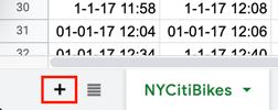
Figure 1.
By default, it will be called “Sheet 2” so we’re going to rename it “Descriptive statistics.” To do this, click on the downward arrow next to where it currently says “Sheet 2” and select “Rename” from the menu. Type “Descriptive Statistics” (the new name for your sheet) in the label field.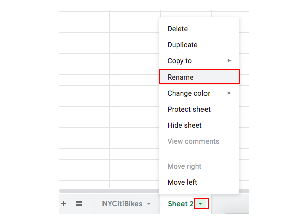
Figure 2.
Figure 3.
Step Three
Next, we’re going to create a very basic table. This will eventually contain all the descriptive statistics we are about to calculate. Type “Statistic,” “Trip duration,” and “User age” into cells A1, B1, and C1 respectively. Then, under the “Statistic” column, type “Mean,” “Median,” “Minimum,” and “Maximum” into cells A2, A3, A4, and A5 respectively. You should end up with a very simple table like this one: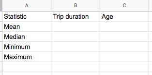
Figure 4.
We’ll now use formulas to calculate the relevant descriptive statistics for each of our two variables of interest: Trip duration in minutes and User age.
First, we’re going to calculate the mean value for our first variable of interest: Trip duration in minutes. This will give us insight into the average length of a Citi Bike trip. Do Citi Bike users rent bikes for long durations, or do they tend to take shorter trips? Let’s find out!
We’re going to use the AVERAGE formula to sum together all of our trip duration data, and then divide it by the number of values. So: Click in cell B2 (under “Trip duration” and next to “Mean”) and type the following formula:
=AVERAGE(NYCitiBikes!M2:M16845)
Here you can see it in action:
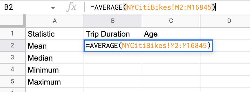
Figure 5.
Let’s explain the workings of this formula.
Our variable of interest (Trip_duration_in_min) is located in column M of the “NYCitiBikes” tab in our data file. Because the data we want is located in another tab, we start the formula with the notation “NYCitiBikes!”.
Then we specify which column contains the data we want (column M) and the range to be considered (M2:M16845) with the amount of rows in the dataset (the numbers 2:16845 are the rows selected). Essentially, this formula specifies that the calculation of the AVERAGE should be made using the data from column M in the sheet named “NYCitiBikes.”
Lets break down the formula even more!
- =AVERAGE tells Google Sheets to create an average
- NYCitiBikes! tells Google Sheets where the data is in the sheet its in
- M tells google what column the data needs to be pulled in for the formula
- 2:16845 are the row numbers that are being asked to consider in the formula
Step Four
Once you’ve typed the formula in cell B2, press “Enter.”
The formula should work its magic and the mean value will now appear! This is the average trip duration taken with Citi Bike rental bikes (in minutes).
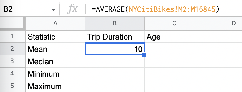
Figure 6.
Step Five
Next, we’ll calculate the median value for our “Trip duration” variable. This will tell us the middle value in our dataset, which is useful because it’s a more robust measure of central tendency (compared to the mean, which is sensitive to extreme values).
You can see a visual representation of the median of a set of numbers here:
Again, we’re going to use a formula. Click in cell B3 and type the following formula, then press “Enter:”
=MEDIAN(NYCitiBikes!M2:M16845)
The median value will automatically appear in cell B3.
Step Six
Now let’s calculate the minimum and maximum values for our “Trip duration” variable.
These are interesting because they show us how much variability there is within our dataset—in other words, how spread out are our trip duration values? Is there a huge difference in terms of the shortest trip (the minimum value) and the longest trip (the maximum value)?
To calculate the minimum and maximum values, type the following formulas into cells B4 and B5 respectively:
=MIN(NYCitiBikes!M2:M16845)
=MAX(NYCitiBikes!M2:M16845)
Again, the values will appear as soon as you press “Enter.” Here’s how your descriptive statistics table should now look: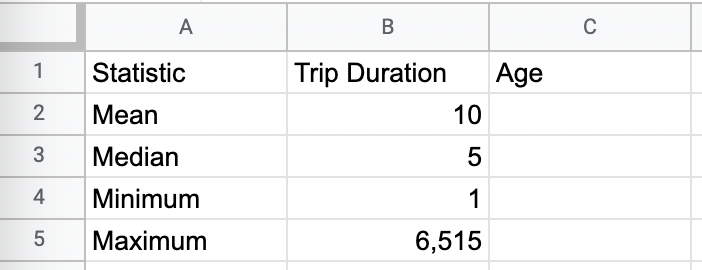
Figure 7.
We now have a full set of descriptive statistics for our first variable of interest. Bravo! 💃 Let’s do the same again for our second variable: User age.
Step Seven
We’ll use all the same formulas as before, but we’ll replace the range. This time, we want to pull data from the “Age” column, which is in column J of our “NYCitiBikes” sheet.
All done? Hopefully, you now have a fully populated table of descriptive statistics: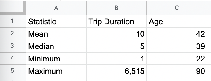
Figure 8.
Great work! 💫
Reviewing our descriptive statistics
As we mentioned earlier, descriptive statistics can help you to spot if something’s “off” with your dataset, or with a particular value. Looking at your table of descriptive statistics, can you spot anything fishy? 🐟
You’ll notice that the maximum values for our two variables, “Trip duration” and “User age,” are rather unrealistic. It’s highly unlikely that someone rode a Citi Bike for 6,525 minutes (that’s about 109 hours, or 4.5 days!). Something’s clearly gone awry!
So what happens now?
You’ll need to do another iteration of data cleaning in order to remove those erroneous values. Here’s what you need to do:
- Navigate back to the “NYCitiBikes” tab and select the entire dataset. Once all the data is highlighted, click “Data” and then select “Sort range” and then select “Advanced range sorting options” from the dropdown menu. You’re going to sort the data by the column “Trip durationin_min” in descending order:
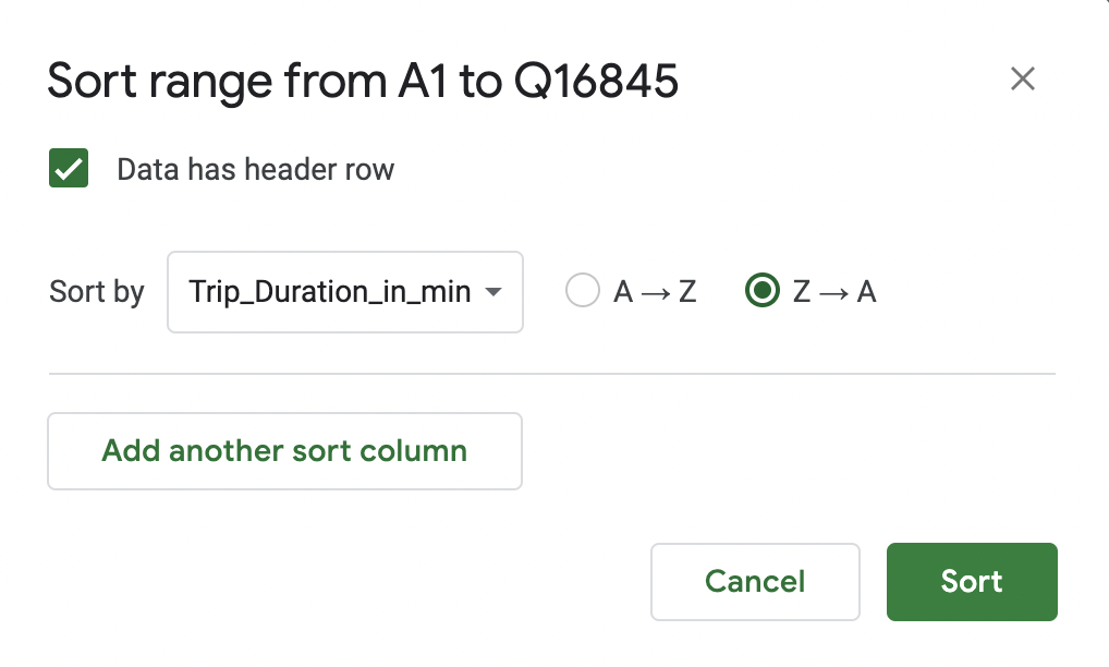
_Figure 9. - Scroll along to the right, to column M (Tripduration_in_min), and you’ll now see the erroneous, extreme values right at the top:
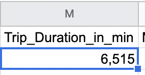
_Figure 10.
To remove these outliers from your dataset and stop them skewing your results, you’re going to delete the entire row associated with them. This might ring a bell from tutorial 2! 🔔 To delete the rows containing the extreme values: - Select the row so they’re highlighted blue, then right-click and select “Delete row ” from the drop-down menu.
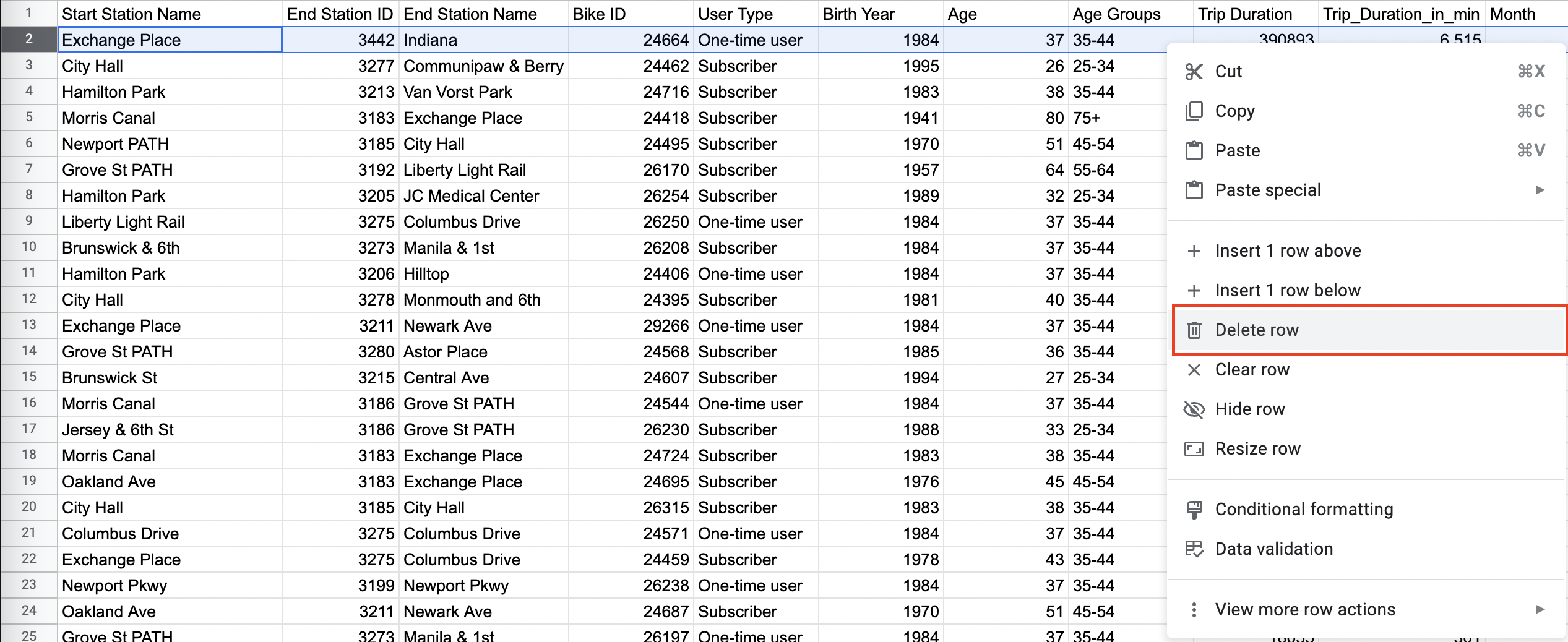
Figure 11. - Once you've removed the extreme (and erroneous) value from the “NYCitiBikes” dataset, navigate back to your “Descriptive Statistics” tab. You’ll notice that the values in your table have updated automatically. That’s the beauty of formulas!
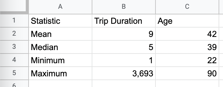
Figure 12.
After this second iteration of data cleaning, we can see that the oldest NY Citi Bike user is 90, and the longest trip was 3,693 minutes (about 2.6 days!)—that’s still pretty impressive, but much more realistic than our previous calculations.
Having calculated some descriptive statistics for our dataset, we are starting to see some initial insights about our NY Citi Bike users. Have a go at answering the following questions to paint a picture of the NY Citi Bike user base:
- What’s the average age of NY Citi Bike users?
- What’s the average trip duration for NY Citi Bike users?
- What were the shortest and longest trips taken by NY Citi Bike users?
These insights provide an interesting start, but they’re not enough to answer the main questions we set out at the beginning of the course. We’ve laid the foundations; now let’s start answering those key questions with another super-powerful tool: the pivot table.
Task 2: Create pivot tables
Pivot tables are a true staple in data analysis because of their versatility and the plethora of functions they offer. We’re going to use them now to answer four of our main questions:
- What are the most popular pick-up locations across the city for Citi Bike rental?
- How does the average trip duration vary across different age groups, and over time?
- Which age group rents the most bikes?
- How does bike rental vary across the two user groups (one-time users vs long-term subscribers) on different days of the week?
Ready to create some pivot tables? Great!
*Psst! If you got stuck with calculating descriptive statistics, or with that second iteration of data cleaning, no worries! You’ll find a cleaned dataset with all the right descriptive statistics* *here*. We’ve called this version “New York Citi Bikes_Clean_v2.” Feel free to make a copy of it and use it for the next practical exercise. *
Task 2.1. Create a pivot table for the top 20 pick-up locations:
-
Navigate to the “NYCitiBikes” sheet and select the entire dataset by clicking in the top left (the space between column A and row 1). Then click “Insert” in the toolbar and select “Pivot table” from the dropdown menu.
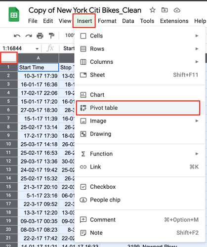
Figure 13. -
This will prompt a window which will ask you to confirm the range of selected data and to specify where the pivot table should be created (in a new, blank sheet, or in an existing sheet). It’s a good idea to put it in a new sheet, so make sure the “New sheet” option is selected and then click “Create.”
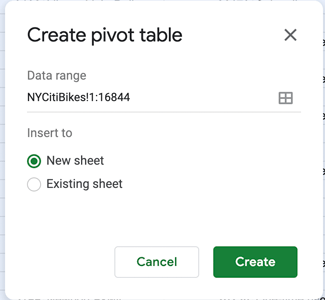
Figure 14.
This will create a new sheet called “Pivot table 1.”Let’s take a look at how this new sheet is structured. On the left hand side, you’ll see the beginnings of a table with labels for rows, columns, and values. The table is empty for now as we haven’t yet “poured” information into it. This is where the results will show up once we’ve customized the pivot table: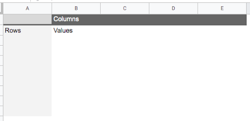
Figure 15.
Click on any cell in the pivot table and it’ll bring up the pivot table editor on the right hand side. You’ll use this editor to construct and customize your pivot tables.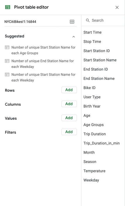
Figure 16.You can see that there are some suggestions for summary statistics provided at the top of the pivot table editor, under the “Suggested” heading. As we have specific questions and goals in mind, we’ll ignore those for now and continue with our own plan of action!
The first question we want to answer is What are the most popular pick-up locations across the city for NY Citi Bike rental? In this case, we’re interested in the “Start station name” column. We’ll calculate the frequency (another descriptive statistic) to see how many times each pick-up station occurs within the dataset. This will allow us to see which ones occur most frequently, and are therefore the most popular for NY Citi Bike pick-up.
We want to add the “Start station name” variable under the “Rows” section of our pivot table and then count the number of occurrences for each station in the “Values” column.
So:
-
In the pivot table editor, click on “Add” next to the “Rows” item and select “Start Station Name” from the list of options provided.
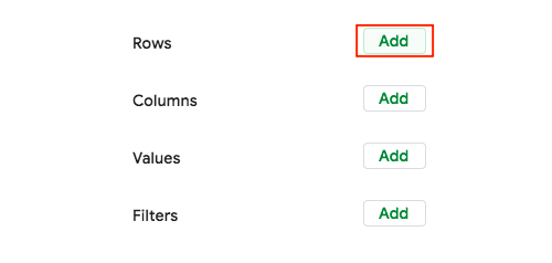
Figure 17.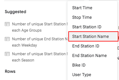
Figure 18.
For now, we’ll keep them in ascending order, so no need to change any of the default settings.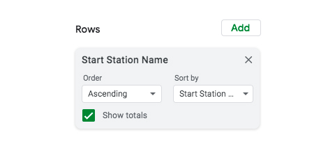
Figure 19. -
You’ll see that the left-hand side of your pivot table has been populated with all the values from the “Start Station Name” column in your “NYCitiBikes” dataset:
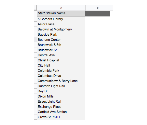
Figure 20. -
Now we’re going to calculate the frequency count for each station. In the pivot table editor, click “Add” next to the “Values” item and once again select “Start Station Name” from the options provided. Under “Summarize by,” leave the “COUNTA” option selected and “Show as → Default.”
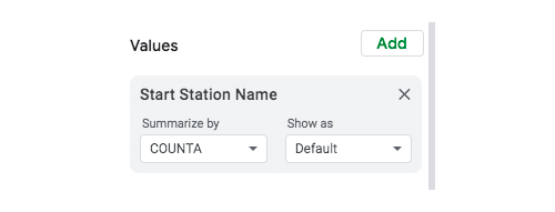
Figure 21.
Your pivot table will then be populated with the count (i.e. the frequency) of each start station. Success! 😃
Figure 22.
We’ll use the “Pivot table 1” tab to create all the pivot tables we need, and we’ll copy the output of each pivot table into a new tab each time. So: -
Click on the “Add Sheet” button (the plus icon in the bottom left) and name your new sheet “Task 2.1. Top 20 pick-up locations.”
-
In this new sheet, type “Start station name” into cell A1, and “COUNT” into cell B1.
-
Now you’re going to copy the data from your pivot table into this new sheet. So, navigate back to the “Pivot Table” tab and select the data in the “Start Station Name” column. You only need to select the station names, not the column heading or the grand total. With the station names highlighted, right click and select “Copy”:
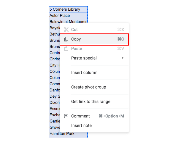
Figure 23. -
Navigate to the “Task 2.1. Top 20 pick-up locations” tab and paste your copied data into the “Start station name” column, like so:
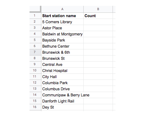
Figure 24. -
Now copy the “COUNTA of Start Station Name” data (excluding the column heading and the total) from your Pivot Table sheet into your “Task 2.1” sheet, this time placing it in the “Count” column:
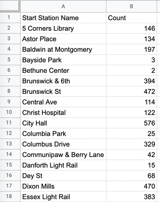
Figure 25. -
In the “Task 2.1. Top 20 pick-up locations” sheet, you’re going to sort the data by count, in descending order. Select the entire range of data by clicking in the top left corner (between A and 1), then select “Data” from the top toolbar and click “Advanced range sorting options”:
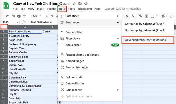
Figure 26.
Sort the selected range by “Count” in descending order (Z → A):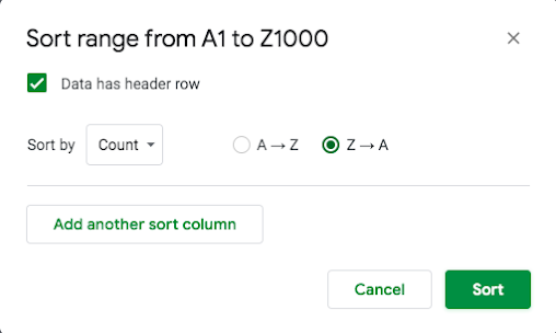
Figure 27.
Your data is now arranged in such a way that you can easily pinpoint the top 20 pick-up locations for NY Citi Bike rentals in New York. There’s our answer to question one 🎉
Task 2.2. Create a pivot table to see how bike trip duration varies across different age groups:
Next, we want to explore how the average trip duration varies across different age groups. Once again, we’ll tap into the power of the mighty pivot table!
The first two variables we’ll look at are “Age group” and “Trip duration in minutes.” Still working in your “Pivot Table 1” tab, use the pivot table editor to do the following:
-
Empty out your existing pivot table by clicking the “X” next to the current values. This will delete them, leaving you with a blank pivot table.
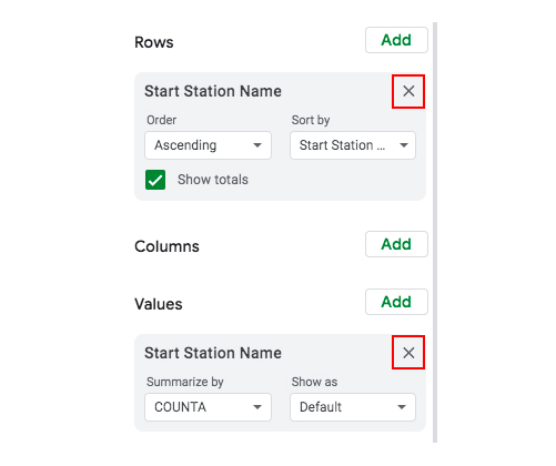
Figure 28. -
Next, add “Age Groups” to the “Rows” field, and “Tripduration_in_min” to the “Values” field. For “Trip duration,” select the option to summarize by average (rather than sum). Here’s how the pivot table editor will look now:
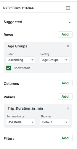
_Figure 29.
Once again, the pivot table will fill up with the values you’ve selected. Now, you can see the average trip duration for each age group: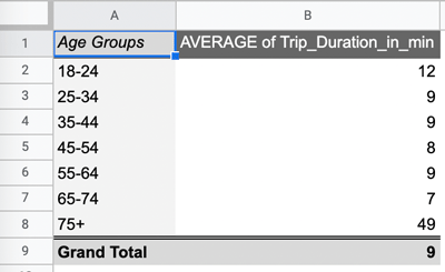
Figure 30. -
Just as we did before, create a new sheet and name it “Task 2.2. Trip duration / age group.” Type “Age group” and “Average trip duration” into cells A1 and B1 respectively. These are your column headings, ready for you to copy the data over from your pivot table.
-
Navigate back to the pivot table tab and copy first the age group data into your new “Task 2.2.” sheet, and then the average trip duration data. As before, you don’t need to copy over the headings or the grand total from your pivot table.
Your “Task 2.2. Trip duration / age group” sheet should now look like this: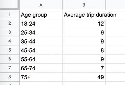
Figure 31. -
Use the “Data → Sort range” function we used before to sort the data by “Average trip duration.” This will allow you to see, at a glance, which age groups took the shortest trips and which age groups took the longest.
Again, in just a few clicks, we’ve answered another of our key questions! The resulting pivot table gives us clear, at-a-glance insights into how bike tripe durations vary across different age groups. We can see that those in the 75+ category tend to take the longest trips on average, while 65-74 year olds take the shortest trips on average. Pretty cool, huh? 😎
Task 2.3. Create a pivot table to see which age group rents the most bikes
Based on one of the pivot tables we created previously (average trip duration per age group), you might jump to the conclusion that the 75+ age group makes up the biggest segment of our NY Citi Bike customer base. They take the longest trips on average, after all! But does this mean that they rent more bikes than users in other age groups do?
Not necessarily. In order to answer our third question—which age group rents the most bikes?—we need to create another pivot table. This time, we’re looking at the number of unique bike rentals (calculated using the variable “Bike ID”) and summarizing the count by user age (using the “Age group” variable). So:
- In the pivot table tab, clear out the contents of the pivot table by removing the current selections in the pivot table editor.
- Next, add the “Age groups” variable to the “Rows” field and add the “Bike ID” variable to the “Values” field, summarizing by “COUNTA.” Your new pivot table should look something like this:
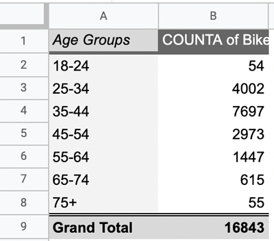
Figure 32. - Copy your pivot table output into a new sheet named “Task 2.3. Bike rental / age group.” This time, your column headings will be “Age group” and “Count of Bike ID”.
As you’re now accustomed to doing, you can sort the data in your “Task 2.3” sheet by “Count of Bike ID” in descending order. This way, you’ll be able to see, at a glance, what the data is telling you. Your new sheet will look something like this: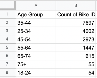
Figure 33.
You can see that users aged 75+ rented the least bikes (they just took longer trips on them!) The highest number of bikes were actually rented by those in the 35-44 age range. Interesting!
Task 2.4. Create a pivot table to see how bike rental varies across the two user groups (one-time users vs. long-term subscribers) on different days of the week
At the start of the course, we posed another interesting question:
How does bike rental vary across the two user groups (one-time users vs long-term subscribers) on different days of the week?
Once again, we can answer this question by creating a pivot table:
- In the pivot table tab, clear out the existing values. Once you have a blank pivot table, add “Weekday” to the “Rows” field:
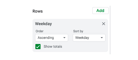
Figure 34. - Then add “User Type” to the “Columns” field. The pivot table will still appear empty because we haven’t got anything in the “Values” field yet. So:
- Under “Values,” add “Bike ID” and summarize it by “COUNTA.” Here’s how the pivot table editor should look:
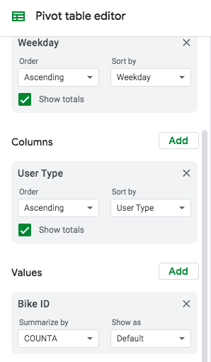
Figure 35.
The pivot table will now contain the data you’re interested in: the number of bikes rented on each day of the week for both one-time users and long-term NY Citi Bike subscribers: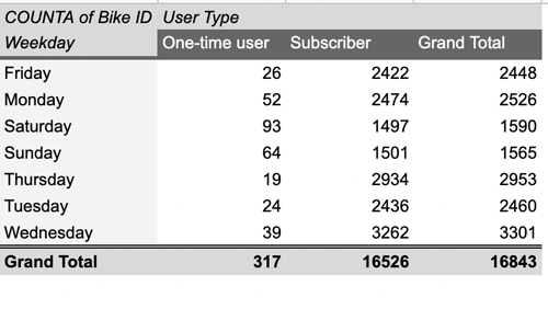
Figure 36. - As a final step, create a new sheet and call it “Task 2.4. User type / weekday.” Copy the data from your pivot table over to this new sheet, as you’ve done for all previous pivot tables. It should look like this:
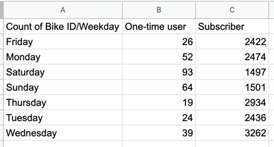
Figure 37.
This summary of the data is a good start in helping us to understand how bike rental varies across the two user groups on different days of the week, but it’s difficult to answer our question just by looking at the numbers in the columns. This is where data visualization comes in really handy—and, as luck would have it, that’s what we’ll be looking at in the next tutorial!
5. Key takeaways and further reading
As you’ve seen, the possibilities of pivot tables are endless! 🤩 In just a few clicks, we’ve uncovered some key insights into our data and what it tells us about NY Citi Bike’s customer base. We now know that Grove St Path and Exchange Place are the most popular pick-up locations for bike rental, and that users aged 35-44 rent the most bikes, but users aged 75+ tend to take the longest trips on average.
Here’s a summary of what we covered:
- In task 2.1, you created a pivot table to show the top 20 most popular pick-up locations for NY Citi Bikes. You looked at the frequency of the variable “Start Station Name.” Key finding: Grove St Path is the most popular pick-up station.
- In task 2.2, you created a pivot table to see how bike trip duration varies across different age groups. First, you looked at the average trip duration in minutes for each age group. Key finding: Over 75s took the longest trips on average.
- In task 2.3, you created a pivot table to see which age groups rented the most bikes. You looked at the count of each individual bike ID across each age group. Key finding: 35-44 year olds rented the most bikes.
- In task 2.4, you created a pivot table to see how bike rental varies across the two NY Citi Bike user groups (one-time users vs. subscribers) on different days of the week. You looked at the variables “Weekday,” “User Type,” and count of “Bike ID.” Key findings: Most NY Citi Bike users are long-term subscribers. With this more complex pivot table, it’s not so easy to get the insights you need. This is where data visualization helps, which we’ll look at in the next tutorial.
Whew! You’ve covered a lot of ground in a short space of time. It’s amazing what you can do with some simple data analysis techniques, isn’t it?! And this is just the tip of the iceberg. Imagine what you could achieve as a professional data analyst working in the field 🤩
As a way to check your work, check out this copy of the sheets with the final descriptive statistics and all pivots included.
In the next tutorial, we’ll create data visualizations to help us convey and communicate our key findings. Want to keep exploring in the meantime? We’ve got you covered:
- The 7 most useful data analysis methods and techniques
- 10 Excel formulas every data analyst should know
- What is multivariate analysis? A beginner’s guide
See you in tutorial four! 👋
