
Welcome back! Congratulations on wrapping up the first four stages of the design thinking process. In this tutorial, we’ll dive into the fifth stage of the process: testing.
By the end of this tutorial, you’ll:
- Understand the role of user testing in UX design
- Explore a few common testing types and methods
- Know how test results inform design decisions
Here’s an overview:
- Quick review
- Testing: An introduction to the fifth stage of the design thinking process
- Four types of user testing
- Three common user testing methods
- Practical task: Conduct a test with your prototype
- Summary
- What to do now
1. Quick review
In Tutorial 4, you learned all about prototyping—the process of building a model of your design solution to see how it would actually look and operate. Prototyping can help you preview the solution and see whether there are any shortcomings or gaps in the idea, before you go implementing changes in the actual user experience. It can also help bring to light any other problems or considerations that need to be solved at this point in time.
Prototypes are either paper or digital, and because there are so many easy-to-use tools for digital prototyping, this form is the most common—especially when you get past the ideation stage of the process. Whether you create a paper or digital prototype, you’ll need to decide how much detail the prototype should include, and how closely it should resemble the functionality of the final idea. And remember there are varying levels of detail/functionality in the three different types of prototypes. Let’s review these briefly.
Low-fidelity prototypes focus on overall structure and functionality rather than the details. This is by far the most common type of paper prototype, but you can easily build a good digital lo-fi prototype.
Mid-fidelity prototypes bring in a little more detail, and resemble something of a detailed outline of what the final design should look like. Placeholder images and text are common in this type of prototype, as well as icon templates and other pre-made design elements. While you can certainly get crafty and create an interesting paper prototype at this level of fidelity, it’s more common to see this in a digital format.
High-fidelity prototypes more closely resemble the final designs—what it will all look like when it’s polished and rolled out into a live product for users to engage with. High-fidelity prototypes often even involve color palettes and some basic UI design, making them the more polished ones to feature in a portfolio. In fact, budding designers are often tempted to focus more on high-fidelity prototypes in their UX design portfolios because they believe these are more “impressive” (you’ll learn in Tutorial 6 why this is something to avoid).
How do you know how much detail your prototype should include? It should depend on:
- How early in the design process you are
- Who you’ll be showing the prototype to (and why)
- What kind of time, budget, and tools you have at your disposal
Generally speaking, then:
- The earlier in the process you are, the lower the fidelity you’ll need in your prototype
- The more stakeholders are involved (and the harder you might need to work to get their buy-in), the higher fidelity you’ll need in your prototype
- The more time and resources you have at your disposal, the more detail and functionality you can build into your prototype
Once you have a solid prototype—whether paper or digital, and at whichever level of fidelity best suits your process—you’re ready to test your idea(s)!
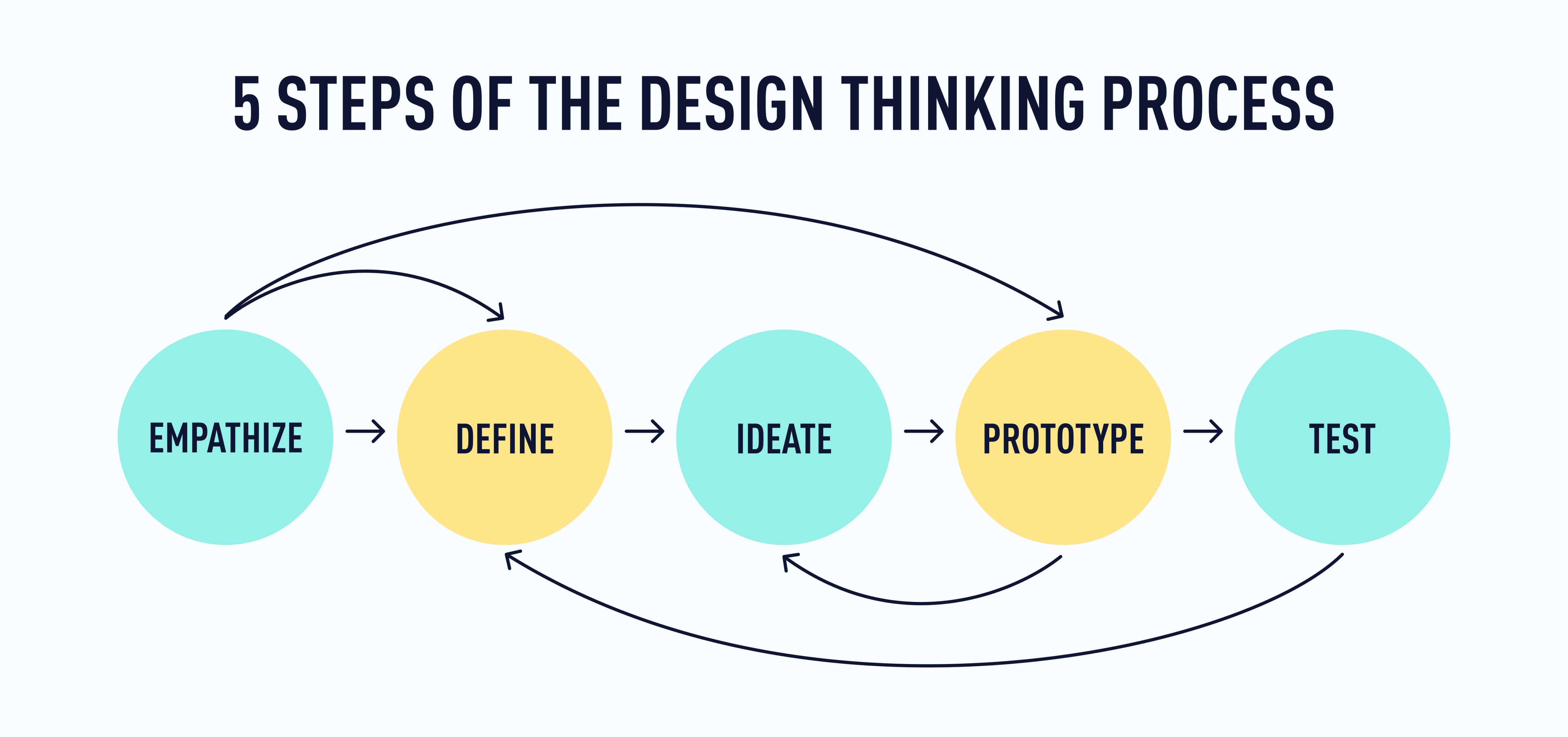
2. Testing: An introduction to the fifth stage of the design thinking process
As tempted as you might be to call this the “final” stage of the design thinking process, remember that this is an iterative and recursive process—it repeats again and again, and not always in a set order. The goal of this entire process is to continuously iterate and improve!
Testing (also known as user testing) is an opportunity to take the idea you’ve developed and validate it—take it back to your users and verify that it actually solves the problem. Without testing, even the best UX designers can only hazard a guess at how the designs will actually perform in the real world, how users will actually engage with them, and what pain points they will solve or highlight (for continued iteration!).
A summary of the user testing process
So how does user testing happen? Here, we’ve distilled the process into a few steps:
- Determine what you need to find out through testing. Are you simply trying to find out whether users would be interested in the product in the first place? Do you need to know if users prefer one design, element, or feature over another? Do you want to see how usable the design really is?
- Choose the test format and method that you think will be most effective. You can conduct a test in an in-person or remote format, and it might be moderated or unmoderated (we’ll discuss these formats further in the next section). And there are countless methods to choose from—though we’ll discuss concept testing, A/B testing, and usability testing in the next section.
- Define how you will measure the success of the test. This will be at least partially determined by the method(s) you choose. Some result in a clearer “winning” side of the test, while others work more like UX research – you’ll gather data and use it to figure out how you can improve the design and refine it before anything goes live.
- Create the testing task. What should you ask users to do with the prototype? You might ask them to simply look at a screen and report their impressions, or you could ask them to work through the prototype to accomplish a task. There are any number of ways to go about this. Ultimately, user testing is about observing what users say and do with the aspects of the prototype you’re most interested in testing.
- Recruit users to complete the testing. You might do this yourself or you could hire an outside agency to assist—this will depend on how involved the test is, how long it will take, how much access you have to people who use the product, and how motivated they are to participate. Remember that to make your designs inclusive, you should include a broad spectrum of people of varying age, ability, gender, race, etc.
- Conduct the test. This might feel somewhat reminiscent of the earlier user research you conducted in the empathize stage of the process, but it will be more specifically focused on the design—how it works and how users interact with it. How much information you gather along the way will depend on the testing method.
- Debrief. Review the test results. What did users say? How did they react? What did they do with the elements or features you were testing? Summarize the results of the test.
Once you’ve followed these seven steps, you’re ready to take a step back and consider the big picture. With what you’ve learned about your prototype in this testing stage, how should you change the designs? What problems did users encounter that you want to solve in the next iteration? This is when you look at the entire design thinking process and jump back to whichever stages will most benefit your users.
This is a summary of what can be a more complex process, but it will become clearer as you understand different testing types and methods—and as you conduct a test of your own prototype! 🙌
3. Four types of user testing
Before we look at specific testing methods, let’s consider four broad testing formats: in-person, remote, moderated, and unmoderated.
In-person vs. remote
In-person user testing requires users to leave the comfort of their homes and daily routines to meet with you at a specific location to test your prototype. This testing format can be expensive and time-consuming, because one or more members of your team will need to be present to conduct the testing, you need a reserved space for the testing to happen, and users are more likely to need an incentive to disrupt their daily routines.
The benefits? You have control over the testing environment and can determine what contextual factors come into play. You can minimize distractions and observe users’ facial expressions, body language, and more. There are also interpersonal nuances you can pick up on during an in-person testing session that you wouldn’t necessarily get in a remote setting (think of the difference between having a work meeting or a social gathering in person, versus over a video chat).
Remote user testing is often more affordable (less need to compensate users for the inconvenience of meeting you in person), less time-consuming, and simpler in many ways—because you don’t have to set up a room or moderate distractions. This does mean that you won’t be able to control the testing environment.
Even if users are alone in a quiet room, the doorbell could ring, or there could be any number of other distractions. What if they had to pick up their kids from school early or their neighbor is playing really loud music? While remote testing does introduce some unknown factors, it arguably gives you a more accurate picture of how users might actually engage with your product—in the context of their daily lives.
Moderated vs. unmoderated
Moderated user testing takes place with you (and/or others on your team) present and guiding or observing as users work through the prototype test. There’s a clear overlap here with in-person user testing: it can be time-consuming and expensive. The benefit is that you’re actually there to observe, guide, and ask questions as the need arises.
In unmoderated user testing, the testing task is set up and users complete it without you or another person present. You can still record what happens so you don’t miss out on any comments, reactions, facial expressions, etc., but you have no way of asking clarifying or follow-up questions.
For example, a user is working through the testing task and they say something like, “Huh, that’s weird”—and then they continue going about the task. In an unmoderated test, you might be left wondering what they were referring to and whether they felt something seemed unfamiliar, unexpected, unpleasant—or for another reason entirely. In a moderated test, you could ask follow-up questions: “What seems weird?” “Can you tell me more about that?” “What would you expect or prefer to see instead?”
UX designers take a variety of approaches to how much they insert themselves into the testing session with questions or guidance—but if you want to be able to clarify things with your users, you’ll want to conduct moderated testing (or some blend of the two).
For the purposes of this course, the most cost-effective and time saving approach (as well as the one we think will work best for your prototype) is to conduct an unmoderated and remote user test.
4. Three common user testing methods
While there are a lot more than three user testing methods that UXers employ in this stage of the process, we’re going to focus on three of the most common:
- Concept testing
- A/B testing
- Usability testing
Concept testing
Concept testing is good to conduct early in the design process, before you’ve put a great deal of time into the project. This testing method is best if you have a number of ideas for how to solve the same problem(s) and you want to test to see which idea users find the most valuable.
This usually takes the form of a qualitative survey, where users can provide feedback about their reasons and motivations for liking or disliking a particular idea. It presents the design concepts to participants, and looks for their insights and perceptions regarding which concept/product idea carries the most value for them in solving their problem.
You may have an idea you think is amazing, but what if you develop that idea fully into a digital product and send it out into the world only to find that users don’t see it as truly valuable in solving their problem? Concept testing allows you to explore the viability of an idea early on.
The downside? You could have your favorite idea derailed and need to reformulate the direction for your project, but this also helps you control some of your own bias in deciding the best solution to a problem. Also, this is qualitative information you’re gathering—users’ thoughts and feelings—so there will be some that’s left uo interpretation.
But if you’re still a little stuck between two or three of your initial ideas, this might be a great testing method to employ.
A/B testing
On the other hand, if you’ve got a prototype already for one of your leading ideas, you might feel ready to just get on with some A/B testing—and since the stakes are low in this free introductory course, that’s just fine! 👍
A/B testing is a useful and very common form of quantitative user testing—meaning that the test will have a “winning” result based on the number of users who prefer a particular version. Unlike qualitative, concept testing, you are going strictly off of data, rather than the interpretation of user thoughts and feelings.
In A/B testing, you take your prototype and you test it against a slightly altered version of your prototype. In other words, half of your users would see the A version, half would see the B version, and one would turn out to be more effective (the measurement for this is set before the test) ⚖️
This is a great method to adopt if you have one particular element in your prototype that you’re unsure about. Perhaps you have a few ideas for how this element could look or operate. A/B testing will tell you which version is actually the most effective for your users.
For example: Let’s say you’ve got a home screen with the navigation located at the top of the screen, but you want to test and see if users explore the app more if you put the navigation at the bottom of the screen (easier access for many users).
You could do an A/B test to see which version of the home screen was most engaging for users by showing half your users the A version, and half the B version. You could judge how successful each version is either by gathering quantitative data about how many users go from the home screen to other parts of the app. If you wanted to gather quantitative data, you could observe users engaging with either version of the app and gauge how they react to each one, as well as where they go from the home screen.
Here are a few important guidelines for effective A/B testing:
- Don’t test more than one key element/difference at a time. If you do, it will likely be unclear why one version of the test “wins” and the other does not.
- Have a clear measurement for what makes one version more successful than the other. A common measurement, for example, would be the number of people who click on a button to sign up or take the desired action.
- Make sure you have enough people involved in the test to make the results useful and accurate. Rather than giving you a strict rule for this, we’ll simply say that the more people who participate in the test, the more accurate the results are likely to be.
A/B testing is typically done later in the design process, if not with a product that’s fully developed and already live. But its basic functions can be applied throughout the design process.
Usability testing
Usability testing is absolutely essential to good UX design. For the purposes of this course, it’s not feasible to conduct this type of testing (unless you’ve created an amazing mid- to high-fidelity prototype and have some users to work with on this). But it is important that you understand usability, because it’s a big part of what it means to be a UX designer.
So let’s start with the fundamental question: What is usability? Simply put, usability is a measure of how easily people can use your product to accomplish what they’ve come there to do. For example, if you have a coffee machine or other small household appliance, and every time you use it you have to figure it out all over again or it fails in its basic functions—it’s not a very usable product.
Now let’s translate this to the world of digital products. Imagine you’ve just submitted a form on an app or website. The “submit” button is deactivated (or greyed out so you can’t click or tap it), so it’s safe to bet that you did at least initiate the process of submitting your information.
But what if there’s no other indication on the screen that anything is being processed or that the process is complete? Or perhaps there’s a spinning wheel animation on the screen, and you can guess that might mean that something is being processed. But you wait and you wait…and you wait, and never receive any confirmation. Eventually, you’ll probably be tempted to close out of the screen or to back out and re-submit the form. You wonder if you wait just another minute if the system will tell you something succeeded or failed.
Sounds a bit stressful, right? What we’ve described here is a very good example of a product that’s not very usable.
Usability testing helps UX designers (and others who work on digital products) test their designs and make sure that people will actually be able to use the product effectively. And this can take the form of a variety of testing methods, in-person or remote, moderated or unmoderated. But the most common (and our favorite) method is the user interview. While UXers will already have conducted user interviews early in the design process, at this point in the process the focus is less on getting the user to talk about their needs and goals, and more on observing them as they use the actual product or prototype. Here’s a brief summary of this process:
- Plan your test. This involves defining which usability heuristics you know you want to measure (this might evolve as you go about the tests) and writing effective usability testing questions.
- Recruit test participants. A minimum of five participants is best, and they should represent a variety of backgrounds, identities, and life experiences.
- Schedule and run the tests. This can be done in-person or remotely. And there are a number of ways you can go about observing, asking questions, and guiding the process (read more about these in our usability testing guide). The important thing is to ensure that participants will feel at ease, that your instructions and questions are clear, and that you have a setup that allows you to record (take notes, or otherwise document) the conversations.
- Analyze the results. You’ll likely end these testing sessions with both qualitative and quantitative data that you’ll need to synthesize and present—both for your own benefit (seeing everything organized) and for anyone who’s working with you or who needs to sign off on any changes.
As we said before, usability testing is more involved than what the scope of this course justifies, but stay tuned! In the next UX design tutorial, we’ll talk about next steps and ways that you can really get some hands-on practice with usability testing and other fascinating areas of UX design.
For now, let’s get a little hands-on practice with a combination between A/B and Concept user testing.
5. Practical task: Conduct a test with your prototype
At this point in the course, you should have a low- to mid-fidelity prototype (hand-sketched is fine!) of at least one screen for your app. In this exercise, you’ll use this to conduct a test that’s a bit of a blend between a concept test and an A/B test. We’re blending the approach to make the test as useful and approachable as possible, for this beginning stage of your UX journey.
What you’ll need:
- The prototype you created in Tutorial 4
- Materials (whether paper or digital) to create a simple variation of your prototype
- People to share your ideas with (either via an active social media account or more conversationally)
Goal: To share two variations of one screen in your app and gauge which one potential users like best.
Step 1. Review your prototype. What do you really like about it? What elements could be swapped out for a variation that might make a difference in how the screen will function? If it helps, you can also look at the sketches from your ideation session—there might be an idea you left there that could become a variation of your current prototype (we’ll talk about this a bit more in the next step).
For example, maybe you’ve included a “next” button at the bottom of the screen that you could swap out for a swiping function. If you have navigation elements, you could try moving these to somewhere else on the screen.
Step 2. Create a B version of your prototype. As much as possible, make sure the format (paper or digital) and fidelity matches the A version. The important thing here is to make the B version different from the A version in one key way.
For example, maybe you’ve included a “next” button at the bottom of the screen that you could swap out for a swiping function. If you have navigation elements, you could try moving these to somewhere else on the screen. Or, if one of your other Crazy Eights ideas was for a similar app, but took a totally different approach—you could create a quick prototype for this one and see which one people prefer!
Really, it depends on whether you want feedback on an iteration of the same design, or if you want to test between two different approaches to a similar product idea.
Step 3. Create a social media post that includes:
- Context (what the product is, who it’s for, etc.)
- Images of both versions
- A clear call to action for people to vote on which version they like best.
By way of example: Let’s say you have the two prototype images and you opt to post this to Instagram with a poll. Here’s an example Instagram story script:
“Hey, everyone! I’m working on a hypothetical product as part of my UX Design for Beginners Course with CareerFoundry—and I need your input! This is an app that people can use to find and rate nearby vegan restaurants. I have two different versions of the home screen. Which do you like best? Comment to tell me why!”
Then you can overlay the post with a poll that allows viewers to vote on which version they like better! If you’d like to take a deeper dive into Instagram polls and get some ideas, check out these two videos:
With your prototypes in hand, and this example for inspiration, create your test and post it to your most active social media account (wherever you’re likely to get the most responses). If you post this to Instagram, don’t forget to tag CareerFoundry—we’d love to see how it goes!
If you’d rather do this outside of social media, you could always show the two versions to friends, family, or colleagues and collect votes in that way.
Step 4: Wait and see what responses you get, then review the results to determine which is the “winning” version. But don’t forget to check comments for more qualitative feedback about why a version may have lost or won. There might be ways in which aspects of one version can be worked into the other.
From here, you can distill the results into a list of actionable takeaways—ways you could improve the prototype and test again to make sure you’re meeting user needs as effectively as possible.
Remember: The Design Thinking process is iterative and recursive! It repeats again and again, and not always in a set order. A great design is never a “done” design! It’s a design that evolves with user needs over time.
6. Summary
- The testing stage of the Design Thinking process allows you to check your designs to make sure they’re actually going to work the way you imagine they will. It helps you identify any design flaws in your prototype, and to see if your solution itself creates other problems that need to be addressed before you move forward.
- Testing can be completed in-person or remotely, depending on your needs, what works for test participants, and what will give you the most useful results on a timeline that suits your project.
- Testing can also be moderated or unmoderated—and there are pros and cons to each!
- Three common types of user testing are concept testing (to make sure initial ideas will actually be helpful in solving a user's problem ), A/B testing (to see which iteration of the design is most effective and engaging), and usability testing (to ensure that your designs work as seamlessly as possible).
7. What to do now
Fantastic work! You’ve completed your fifth UX design tutorial and you’ve got a solid understanding of what the Design Thinking process is all about 🎉
If you didn’t already share the results of your user test, why not shout it from the rooftops and show off your amazing work? Share it to Instagram and don’t forget to tag CareerFoundry!
Ready for your final tutorial in the course? Let’s talk about next steps: how the work you’ve done fits into the larger world of UX design and what it takes to become a UX designer. See you in Tutorial 6!