💬*"Growth mindset: Believing that you're capable of learning something with practice."*
Introduction
Welcome to step four of your software engineering short course. Take a moment to appreciate the fact that, in just three lessons, you’ve learned so much about the web!
You’ve gone from reading about the raw ingredients for building a website like HTML and CSS to actually using some of them on your first website. You also looked into some best practices of both HTML and CSS along the way, and then learned about responsive web design.
The next two tutorials are going to be equally filled with new lessons in software engineering: some advanced CSS and then getting our feet wet with the last pillar of the web, JavaScript.
This tutorial is all about colors and styles and animation. By the end of the lesson, our website will be popping with color!
What are we going to do in this tutorial?
- Add images to our "images" folder
- Replace the project placeholder images with our own
- Set custom fonts on our page
- Add more styling to our footer to help it look nice
- Learn to change our page’s background color
- Change the font colors on our page
As you can see, we’ve got lots to do. Let’s dive right in!
1. Prepping the "images" folder
In general, whenever we work with images on a webpage (which is almost always), we try to separate files according to their types. So all images go into one folder, CSS files go into another folder, and so on. Since we had only one CSS file, we didn’t put it in its own folder. But for the section ahead, we’ll be working with multiple images. So as not to clutter our working directory (which is the name for the folder in which our index.html file is), we’ll create a new folder called ‘images’ to hold all of our images.
In this ‘images’ folder, you’ll need to add some images that we’ll be using in this course. We’ll provide you with the images as it’s easier to not have to deal with image size and aspect ratio issues, but you can always experiment with your own images later on. All our images are from Unsplash, a website for free stock images for use in projects like ours.
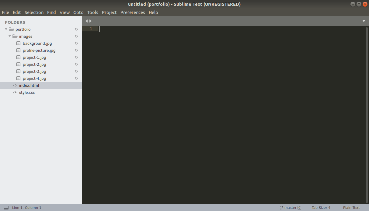
So, step one is to create a folder called images in Sublime editor, inside our portfolio folder.
Once you’ve done that, download the zip file from this link and unzip it inside the folder you just created. Once that’s done, this is how it should look in Sublime.
Now we’re ready to start using our images. First, we’ll replace the profile picture. In our HTML file, we’ll replace this line in the intro section:
With this:
Notice that the src attribute has changed. Essentially, we’re telling the browser to pick the image stored locally (hence no https://) and display it. Let’s reload the browser and see how it looks!
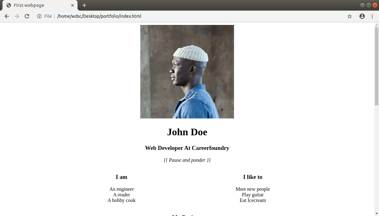
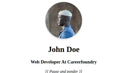
Not bad, but maybe a bit plain as a square image. Let’s make it round and add some shadows. Add a class called `profile-picture` to the same image tag in your HTML file and then select it in CSS, like so:
CSS
Oookay, that’s a mouthful. There are a couple of new properties in there that we haven’t seen before. Let’s explore those briefly now:
- border-radius turns the square image into a circle. By controlling the size of the border-radius, we can get anything from a nice round-cornered rectangle to a circle. Try setting it to a different percentage and see what happens.
- box-shadow adds nice shadows to an HTML element. The value for that property is best described by this page on Mozilla Dev Docs.
- transition sets a couple of parameters for the animation (transition). ‘all’ specifies that we wish to animate all aspects of this element’s transition (width change, height change, color change etc–for example), ease-in-out is a timing function that defines the speed of the curve (read more here: https://css-tricks.com/ease-out-in-ease-in-out/) and .2s specifies the time (in seconds) that the animation should run for.
- .profile-picture:hover { .. } sets CSS properties for the element when we hover over it with our mouse pointers (or touch it on smartphones and other touchscreen devices). Here, we’re just increasing the size of the shadow to make it feel like it reacts to our gesture.
Refresh your browser and notice the shadow. Now move your mouse pointer over the image and see how the shadow changes, giving the illusion that the image is being raised from the canvas. Beautiful, isn’t it?
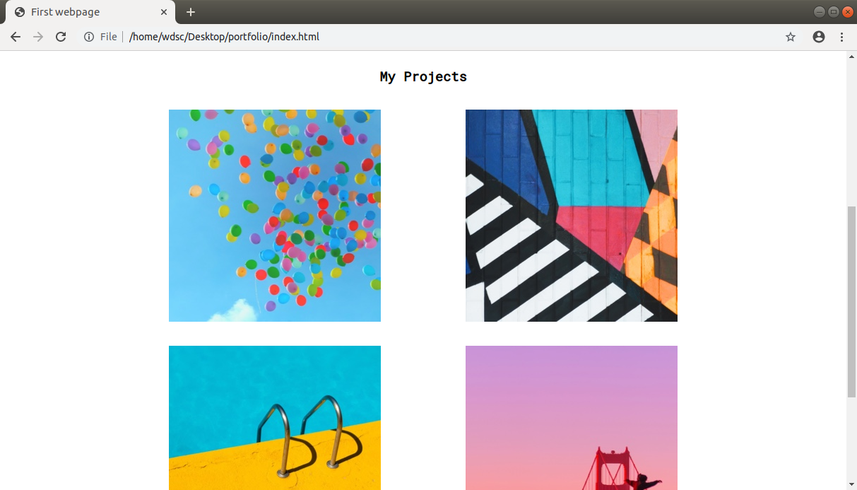
2. Replacing project placeholder images with our own
Let’s also replace the images in the project section with our own images. In the folder you downloaded earlier, there are four images named project-1.jpg through project-4.jpg. We’ll replace the placeholder images with each of these.
HTML
So now you should have the more colorful images showing up. In the future, these images could be replaced by some real portfolio projects that you work on!
Optional challenge: Adding effects to your images
If you’re feeling confident with what we’ve learned so far, you might like to try adding even more cool effects to your images. Let’s add some rounded corners, hover effects and hover text. We already did something similar for the profile picture a couple of sections above, so not everything is new here.
Essentially, here’s what we’re doing. We’ll give the images some rounded corners. Then we’ll give them some shadow and some deeper shadow on hover. So far, that’s exactly what we did for the profile picture. But now, we’ll add each image into a <div> and add an h4 (that’s a heading 4). We’ll make it so that the heading only shows when we hover on the image.
As a bonus, we’ll add a little brightness filter to the image so that the text is readable, and a transition to make everything a bit smoother. The result?
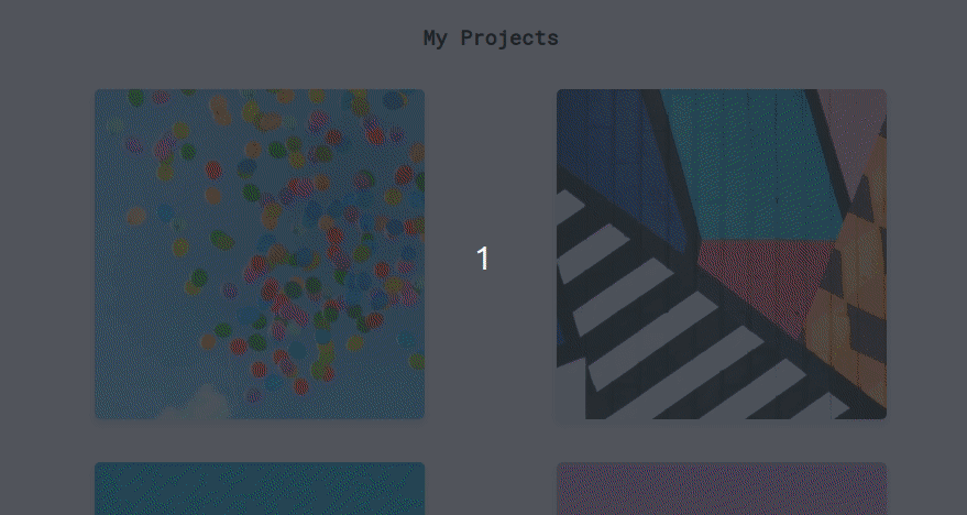
That looks great, doesn’t it? Here’s a brief explanation of the new CSS properties used:
- visibility: [visible/hidden] shows or hides an element
- position: [relative/absolute] position: absolute positions an element relative to the parent with a position: relative. That is, the parent with position: relative becomes a reference point and the child with position: absolute can be arranged relative to this parent like we’ve done by positioning the h4 to be 50% from the top and 50% from left, essentially centering it inside the parent viz. **.****project-image-wrapper** class. Read more here https://developer.mozilla.org/en-US/docs/Web/CSS/position
- transform: translate(X, Y) moves an element X percent along the x-axis and Y percentage along the y-axis. This is helpful when centering a child element inside a parent.
- z-index is about the stacking order. If two elements overlap each other, the element with a higher z-index will appear on top of the one with a lower z-index.
- filter: brightness(0.75) creates a brightness filter and reduces the brightness to 75% when this property is active.
You’ll find the code for the code changes in the commit linked above.
Let’s move on to fonts now, and see the difference we can make by adding a custom font (or fonts) to our page.
3. Setting custom fonts
A font defines the style with which text is displayed. We software engineering love to make pretty websites, and sometimes we need to use a font (i.e. style of text) that’s not given to us by the browser directly (browsers do provide us with some fonts out of the box). That’s not a problem, because CSS allows us to download and use any custom font that we want to use.
For this course, we’ve selected two beautiful fonts for you. For headings and titles, we’ll use Roboto Mono, and for body text we’ll use Noto Sans. The good thing about both of these fonts is that they’re free to use and are available at https://fonts.google.com/ for download. To use them, we’ll simply paste this line into the <head> section of our HTML page:
We’ll use the font-family property on the element we wish to style in this particular font, and add the value ‘Roboto Mono’ or ‘Noto Sans’.
For a quick start, we’ll make the default body font Noto Sans and default title font Roboto Mono:
CSS
Refresh the page and notice the difference in font styles! That’s how we add and use custom fonts.
4. Footer fixes
Now that our intro and portfolio sections have been taken care of, let’s focus on the footer. Let’s break the form in the footer so that each input label and input box appears on its own line. That makes it a bit cleaner.
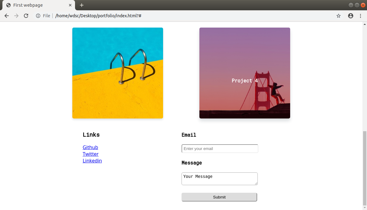
Notice the different variations of CSS that we’re using: form input to select input fields that are inside of a form, and form input[type=”submit”] to select input fields inside a form that have a type attribute set to ‘submit’ (this is the submit button at the bottom). Like we discussed in tutorial three, you can really mix and match CSS selectors as per the use case!
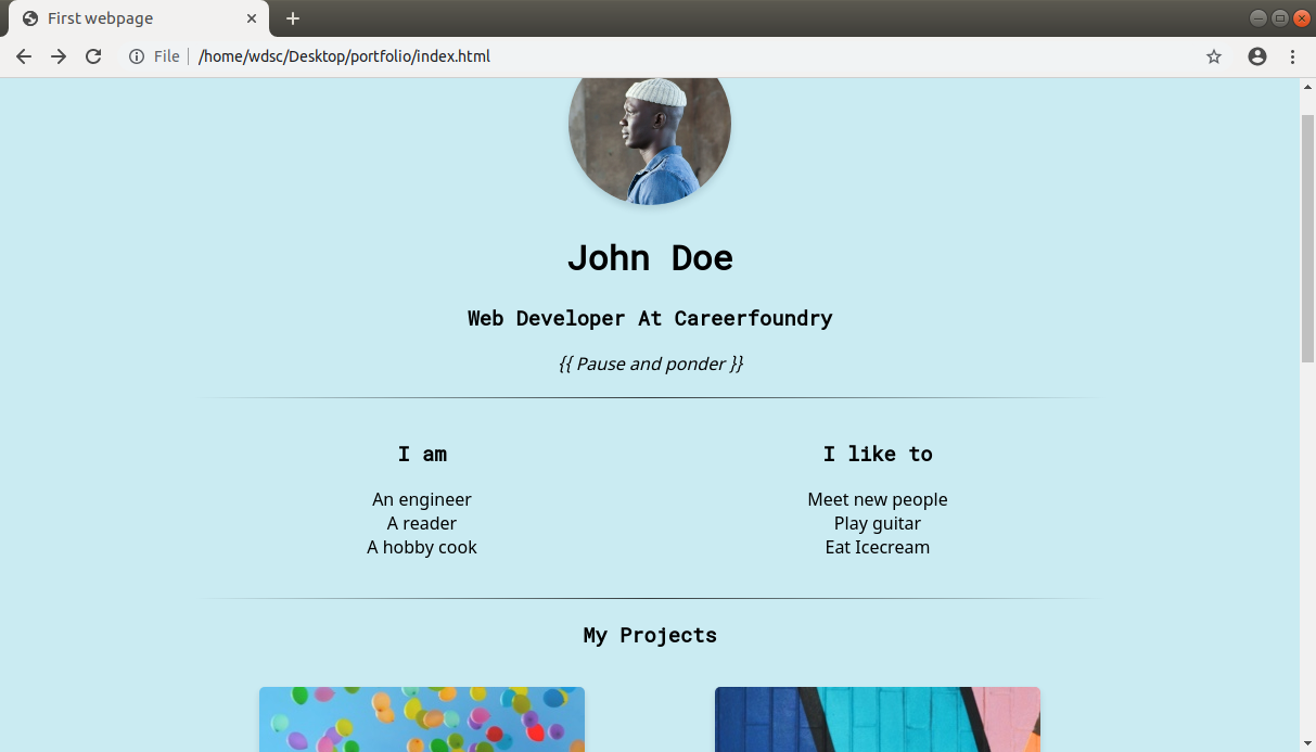
5. Changing the page’s background color
Now that we’ve taken care of some finer details, let’s zoom out a bit and see if we can make any page-wide changes that would further enhance the aesthetics of our webpage. First of all, let’s set a nice soothing background color to our page and add some physical separation between the sections of our webpage.
The HTML <hr/> element, h-r for horizontal rule, is a perfect candidate to visually separate sections of a page. Adding a margin also helps create a visual separation. For the background color, we’re using a shade of blue, close to sky blue. Blue is usually a color of choice for web designers and you’ll see it used quite a lot more than other colors (see Facebook, Twitter, Linkedin etc).
CSS
We will also style the <hr/> element by using the background-image: linear-gradient() CSS property. We pass four values to this function: direction, start, middle and end color (and opacity). It starts off with 0% opacity (transparent), goes to 75% in the middle and goes back to 0% towards the end. The other interesting function here is rgba(red, green, blue, alpha), where red, green and blueare the color intensities (that is, darkness. So 0 is no color), and alpha is the transparency/opacity setter.
Refer to the above commit and check where we’ve added the <hr/> (horizontal rule dividers). Also note how the CSS code is structured. Once you make the changes, you should have spacing and horizontal dividers like in our images.
6. Changing the font color
While black is the default font color on the web, a slightly different shade doesn’t hurt. However, it’s important to keep in mind that as software engineerings, we need to make sure that the contrast between the text and the background color is maintained in order to ensure readability and accessibility.
CSS
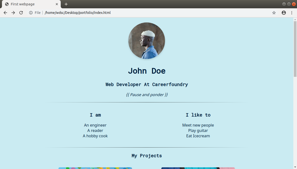
Open the commit and check how we made the change. We’ve set the color of the font to #001f3f which is navy blue. Did you notice that the text is a little easier on the eyes now? That’s what a little color tweak does for us!
😎Pro tip: Check out the color picker from Google and play around with it to understand how hex color codes work. Alternatively, these days there are AI color picker tools out there such as Colormind and the color palette generator Khroma.
Summary
That was a lot of CSS and wrapping your head around things, but look where we started and where we’re at right now! That’s the power of a few lines of CSS.
We suggest you go through the course material once again, perhaps a couple of hours later, and see if there was anything you didn’t understand the first time but now you did. We believe that you can extract more from the course the more you're exposed to the course material.
🧐 Practical Challenge
We’ve come a long way since we started with that colorless black and white page. But there’s a lot more that you can do to this page with the knowledge that you already have! For today's challenge, try the following:
- Change the color of the "submit" button to something that suits the overall theme of the page (you’ll need to use the background-color CSS property here)
Using trial and error, find another color combination for body background and default font color that looks nice (You can refer to this website for some inspiration).
📗References
❓ FAQ
Q. Do professional developers actually remember all these CSS properties and their values?
A. Not necessarily. There are way too many things to remember, and even if you could, there’s little reason to. What developers do remember, however, is that something along those lines exist to solve a problem. And then they just search the web and read the documentation.
Q. We’re running the code on Google Chrome, but I also want it to run on Mozilla Firefox / Safari / Opera. How do I make that happen?
A. Our website is interoperable across all browsers. So if you make a good website, it will look the same irrespective of the browser. There are some caveats to this, but for now, you can assume that whatever we’ve built, and will build, works on all major browsers.