
Introduction
Welcome to lesson three of your UI design short course! In the previous tutorial, we got familiar with the wonders of wireframing—and got stuck in with drawing our own wireframes for our chosen app screens. Now that we've laid the foundations for our app interfaces, it's time to get creative!
In this tutorial, we'll return to our Figma design file as we learn the basics of shapes and dimensions. We'll create our login and sign up button, and—here's the best part—design our very own app logo! Don't forget: if you still have your paper wireframes from the previous tutorial, keep them handy. They'll serve as a useful reference for your digital app screen layout.
Let's look more closely at what we'll be learning in this tutorial:
- Understanding basic shapes
- Boolean operations
- Creating buttons for our app screen
- Creating the logo for our app screen
Tutorial three—let's get stuck in!
1. Understanding basic shapes
Aside from the text, color, and imagery, most of what you see on an app screen is composed of various shapes. Shapes make up the core elements of an app screen, and most interfaces have more of them on the screen than meets the eye. Shapes are created using points and lines. Together, points and lines form paths that have a beginning, end, and direction.
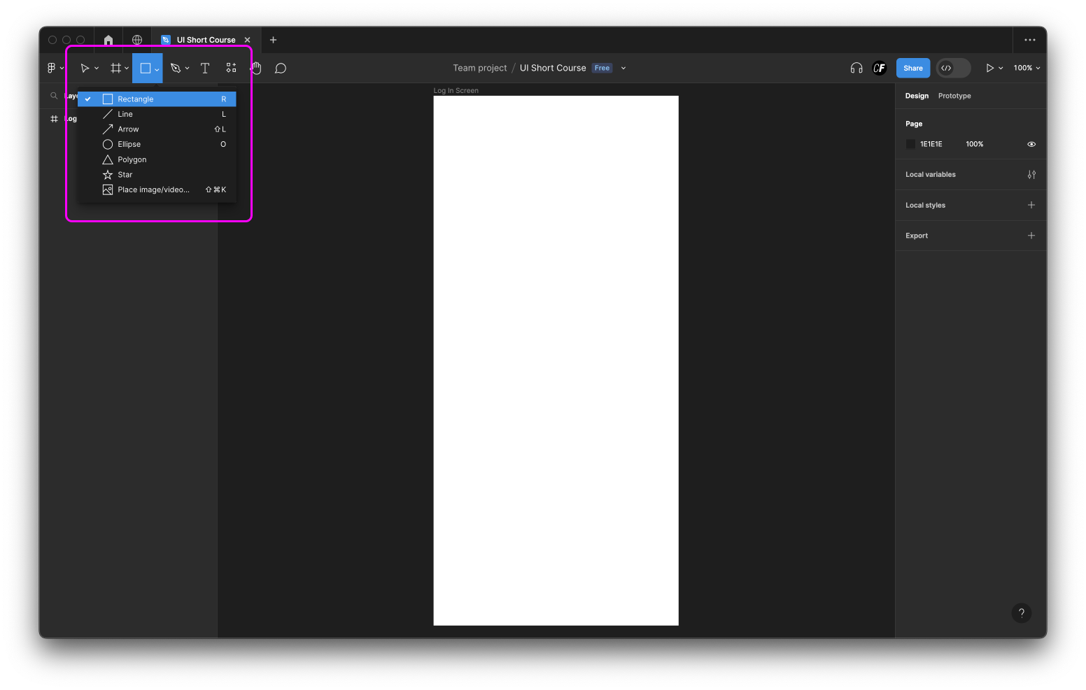
In Figma, shapes can be drawn with the built-in Shape tool in the top left navigation. (This might show a rectangle or another shape; the icon should display the last used shape). In the drop-down, you’ll see Figma comes with 6 default shapes:
- Rectangle
- Line
- Arrow
- Ellipse
- Polygon
- Star
Notice some shapes missing? Good eye! Squares and circles aren’t listed among these options. This is because squares are created using the Rectangle tool, and circles using the Ellipse tool. With the shapes listed above, you can create almost anything.
2. Boolean operations
So, we’ve covered the basic shapes you’ll use in Figma. But what if you want to create something much more complex than the choices listed above?
Let's think about some of the most well-known logos. If you look closely, most complex shapes can be reduced to basic shapes, like circles and rectangles. The YouTube app icon is simply a rectangle and a triangle combined. The iOS weather app icon is a combination of circles and lines. To combine the right simple shapes to create your logo, you'll use something called a Boolean operation.
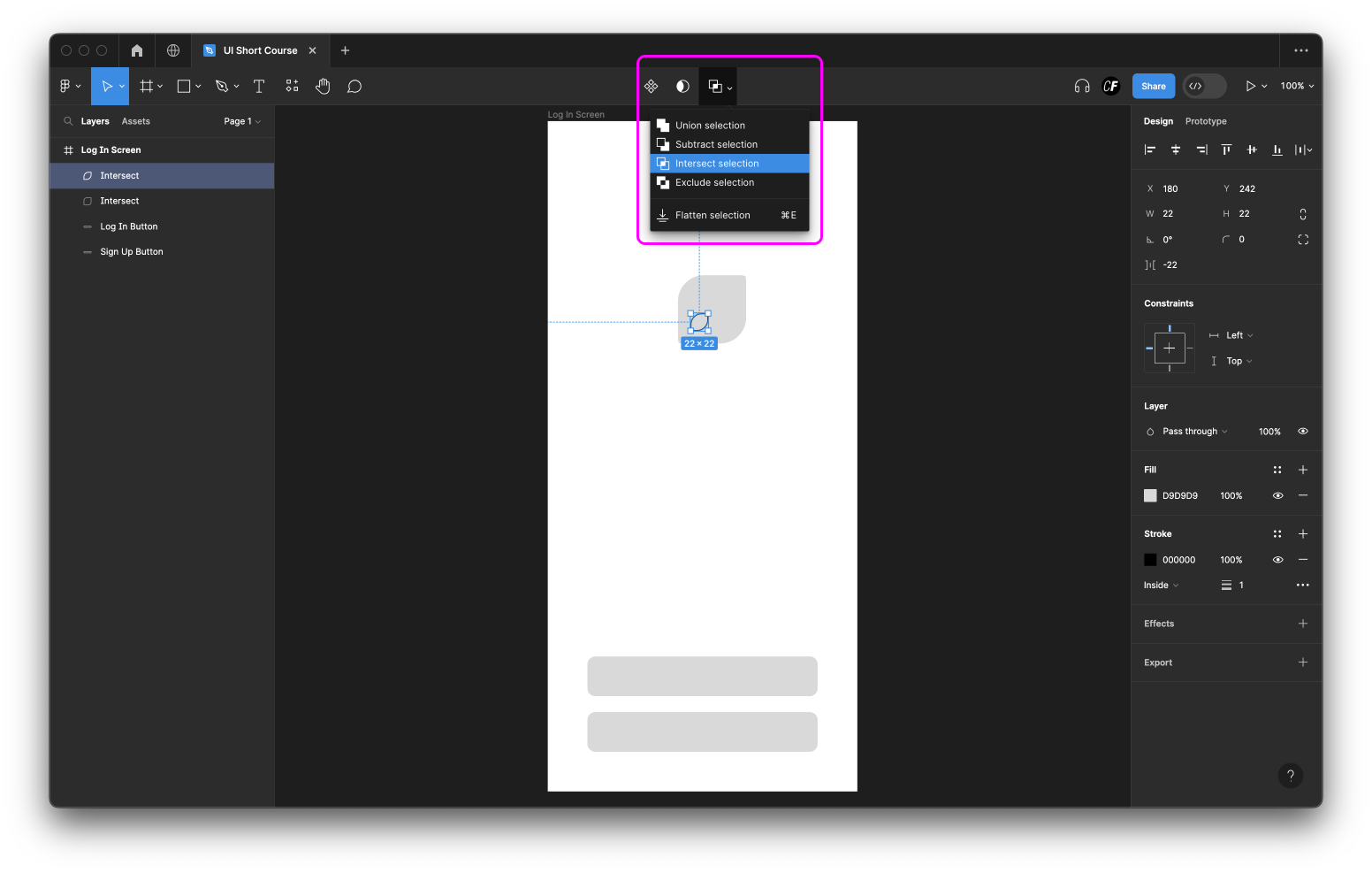
A Boolean operation is a powerful geometric tool found in most UI design applications. There are four main types of Boolean operations: Union, Subtract, Intersect, and Exclude. In Figma, they’re actually called Boolean groups. These options will pop up in your toolbar once you’ve selected two or more shapes that are overlapping.
Click the arrow to open the dropdown menu and see the different options. Selecting the icon itself will apply the last used option (Union, Subtract, Intersect, or Exclude).
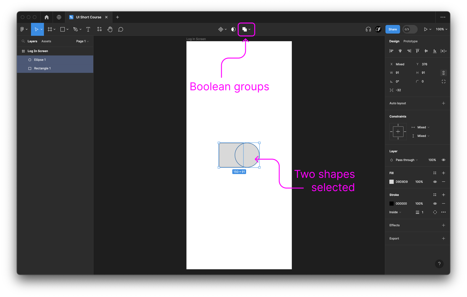
Using Boolean operations, you’ll combine basic shapes to create the logo for your chosen app in the practical part of today's tutorial. But before we get to that, let's look a little more closely at each Boolean operation, and what they achieve:
- Union Selection combines shapes together to create one solid shape.
- Subtract Selection takes whichever shape is on top and will delete it from the shape below.
- Intersect Selection only displays overlapping areas.
- Exclude Selection will show everything but the overlapping areas.
Considerations when creating shapes for your app
So, we're all up to speed with basic shapes and Boolean operations! Let's quickly look at some key considerations to be aware of when designing buttons and shapes for your app.
Remember the last lesson, when we talked about touch targets? Here's where touch targets really matter. When designing buttons, it's always better to go too big than too small. Smaller buttons are harder for users to tap on than larger ones, and—at the end of the day—you want all your users to be able to tap on the buttons you're creating with ease. To learn more about optimal touch target sizes for buttons, we recommend giving this set of guidelines by UX movement a read.
Another consideration is text. What text will be on your buttons, and how big will the text be? It's a good idea to leave some room for experimenting with different fonts and spacing, as we'll be exploring in tomorrow's tutorial.
For now, make sure your buttons are big enough to ensure the text can a) fit on the button comfortably, and b) be read without strain. For guidance on this, don't hesitate to refer back to the screens presented in tutorial one.
3. Creating buttons for your app screen
Buttons for the app are made using the shape tool in Figma. To create a new shape, click on the Shape tools button in your toolbar. (This might show a rectangle, or it might show the last used shape.)
Click on the arrow to open the dropdown menu of available shapes. Alternatively, you can use keyboard shortcuts, like R for rectangles, to define which shape you’d like to create.
Once you’ve chosen a shape, clicking once on the canvas will place a default shape, otherwise, you can click, hold, and drag to create a custom shape. If you want to create a perfect square or circle, hold down the Shift key while you do so.
After you’ve created your shape, you can resize it either by clicking and dragging on one of the corner points, or by inputting the exact size you want in the W and H fields in the right toolbar (which is available to view as long as the shape is selected).
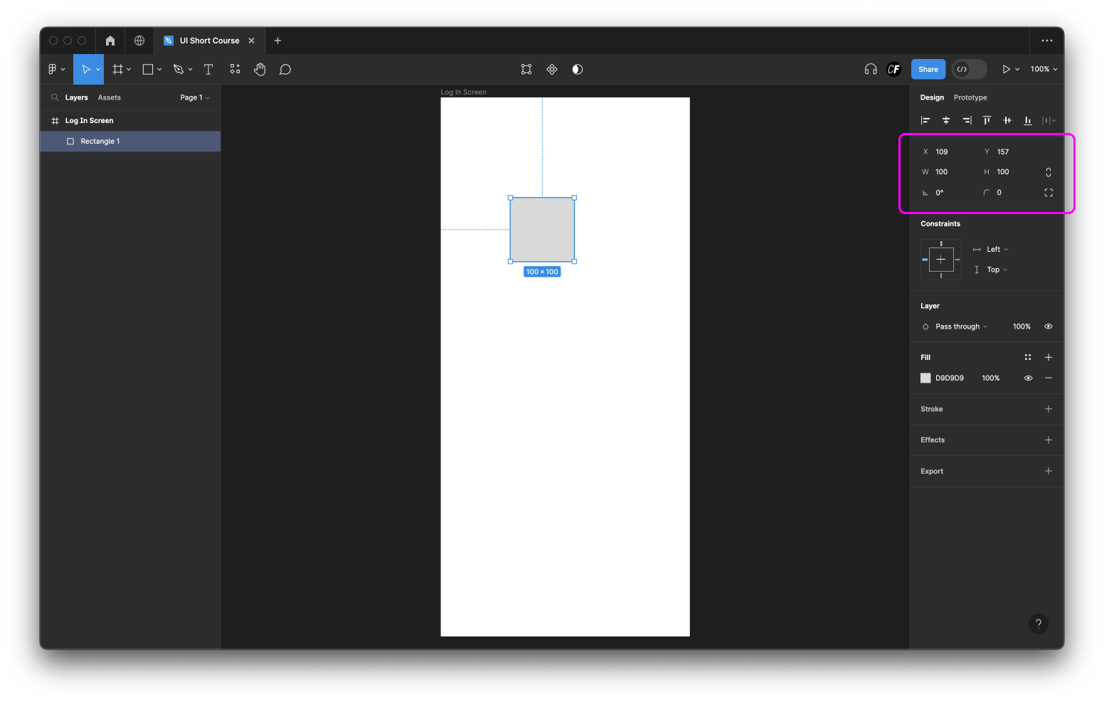
You can use the other controls here to change the position of the shape on your canvas, it’s rotation, and the corner radius of your shape. Depending on the shape you may see additional options.
Create two rectangles with the credentials shown in the image below (W = 290, H = 50, rotation = 0, corner radius = 10). These will become two buttons on our welcome screen of the Ethical Eater app later.
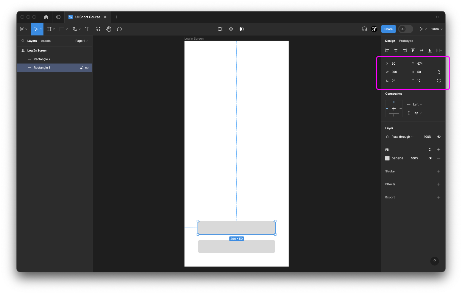
Once a shape (called a layer) is created, it’ll be visible in the Layers List, in the left sidebar. You can simply select a shape from the Layers List to edit it. Double-click on the name of the layer, to rename it. We’ve renamed the layers from “Rectangle 1” to “Sign Up Button” and “Rectangle 2” to “Log In Button”.
4. Creating your app's logo
If you remember tutorial one, we showed you a leaf logo we created for the Ethical Eater app. Let’s create the logo!
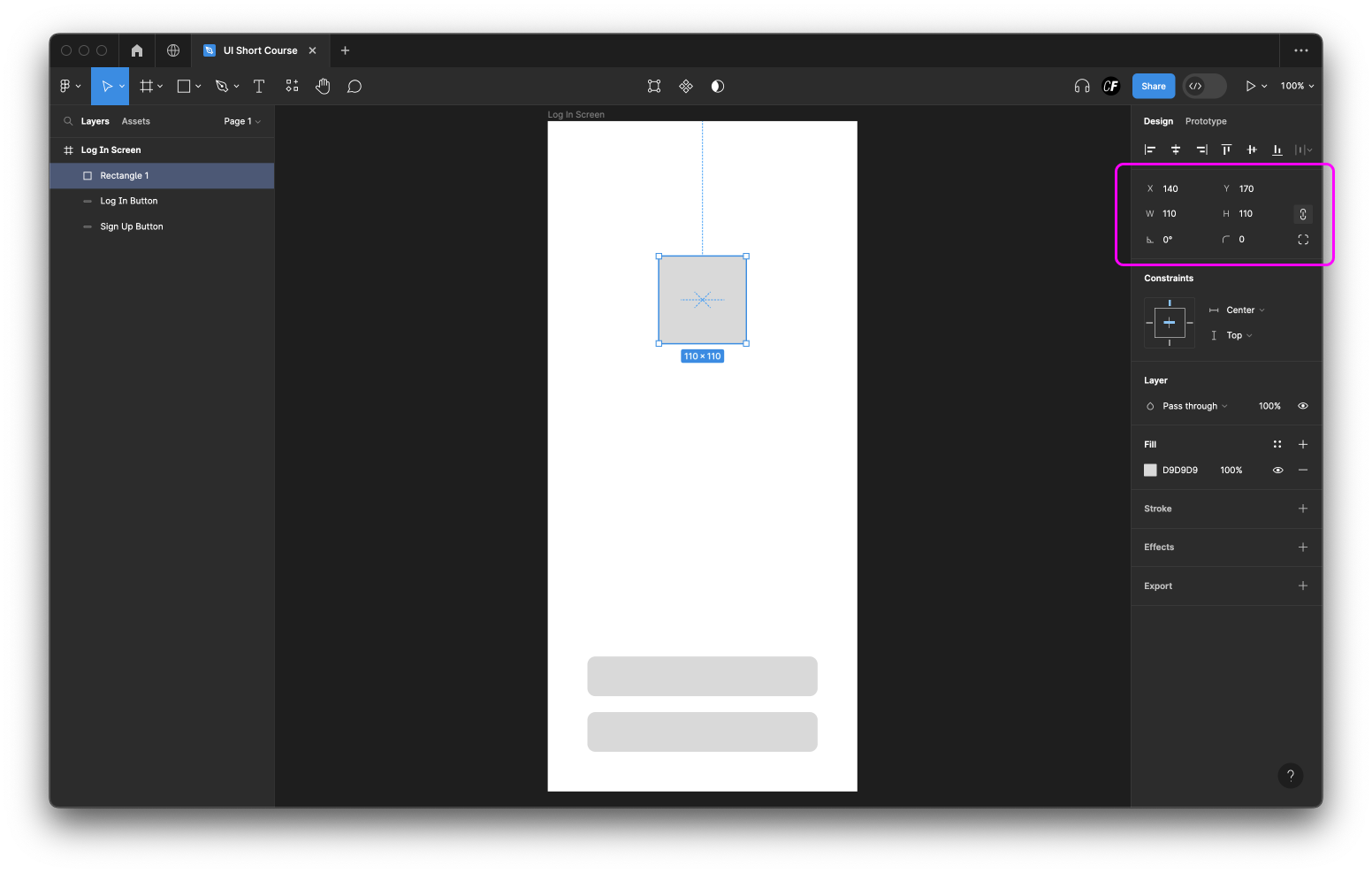
Step 1: Select the Rectangle shape from the toolbar and draw a square anywhere on your canvas with the dimensions 110x110. You’ll be able to see (and adjust) the height and width of the square in the right sidebar (W and H fields).
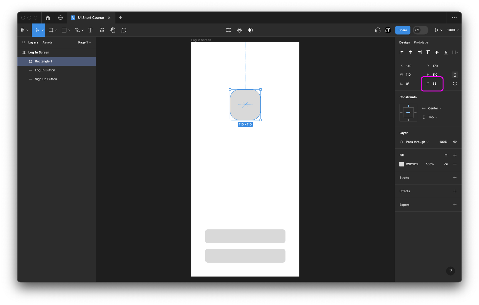
Step 2: Round the corners of the square with a radius of 33px.
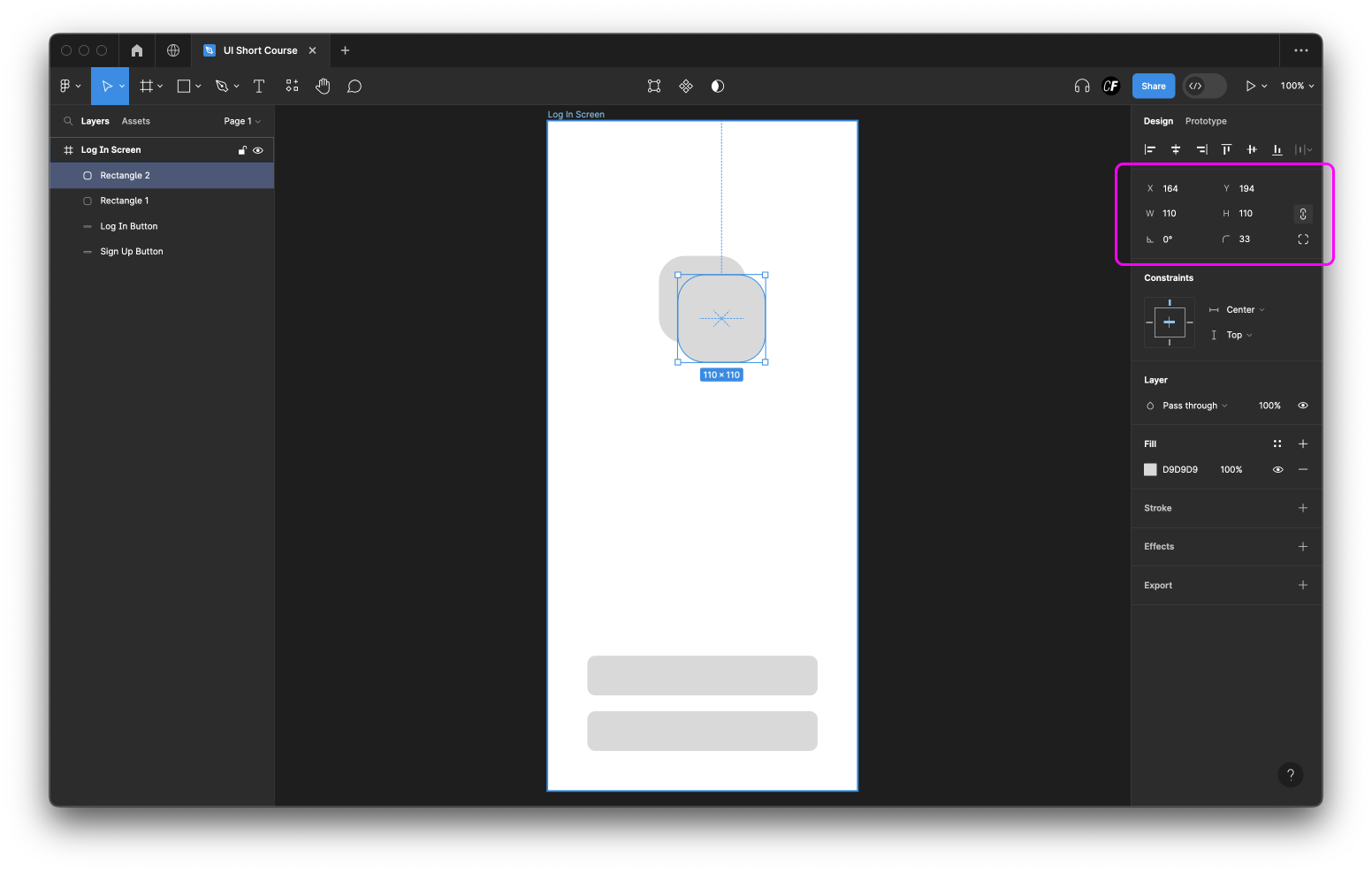
Step 3: With your rounded rectangle selected, hold down the Option key on Mac / Alt key on Windows and click and drag to duplicate it. Position the two rounded rectangles as shown below:
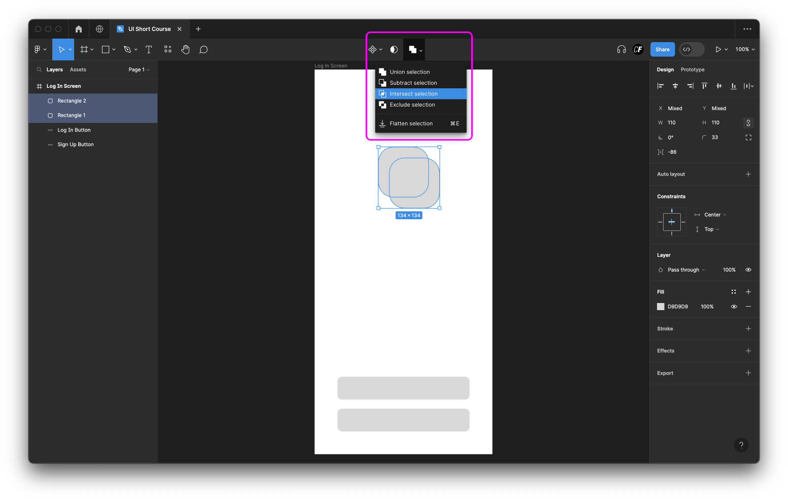
Step 4: Select both “Rectangle” layers (press Shift to select both) and apply the Boolean operation “Intersect” from the Boolean groups drop-down list. You should have something like this:
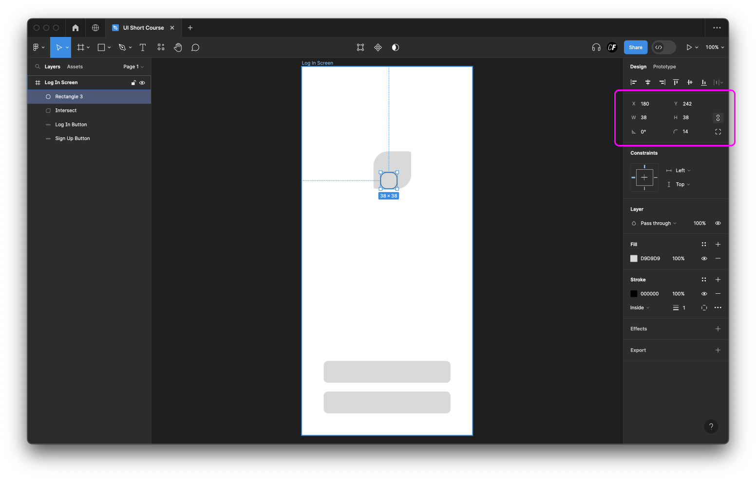
Step 5: Create a small rounded square as shown in the figure below using the width and height dimensions 38px. Adjust the corner radius to 14px.
(We’ve added a dark outline stroke to this shape in our image below, just so you can see it clearly).
Step 6: Duplicate the new small rounded rectangle and position it as shown here:

Step 7: Now select these two rounded squares and apply the “Intersect” Boolean operation, just like you did in step 4.
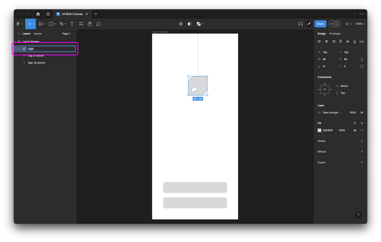
Step 8: Now, select both the big and small shape and apply the “Exclude” Boolean operation to make a cutout.

Step 9: Now you have the leaf logo for your Ethical Eater app! Don’t forget to name your layer.
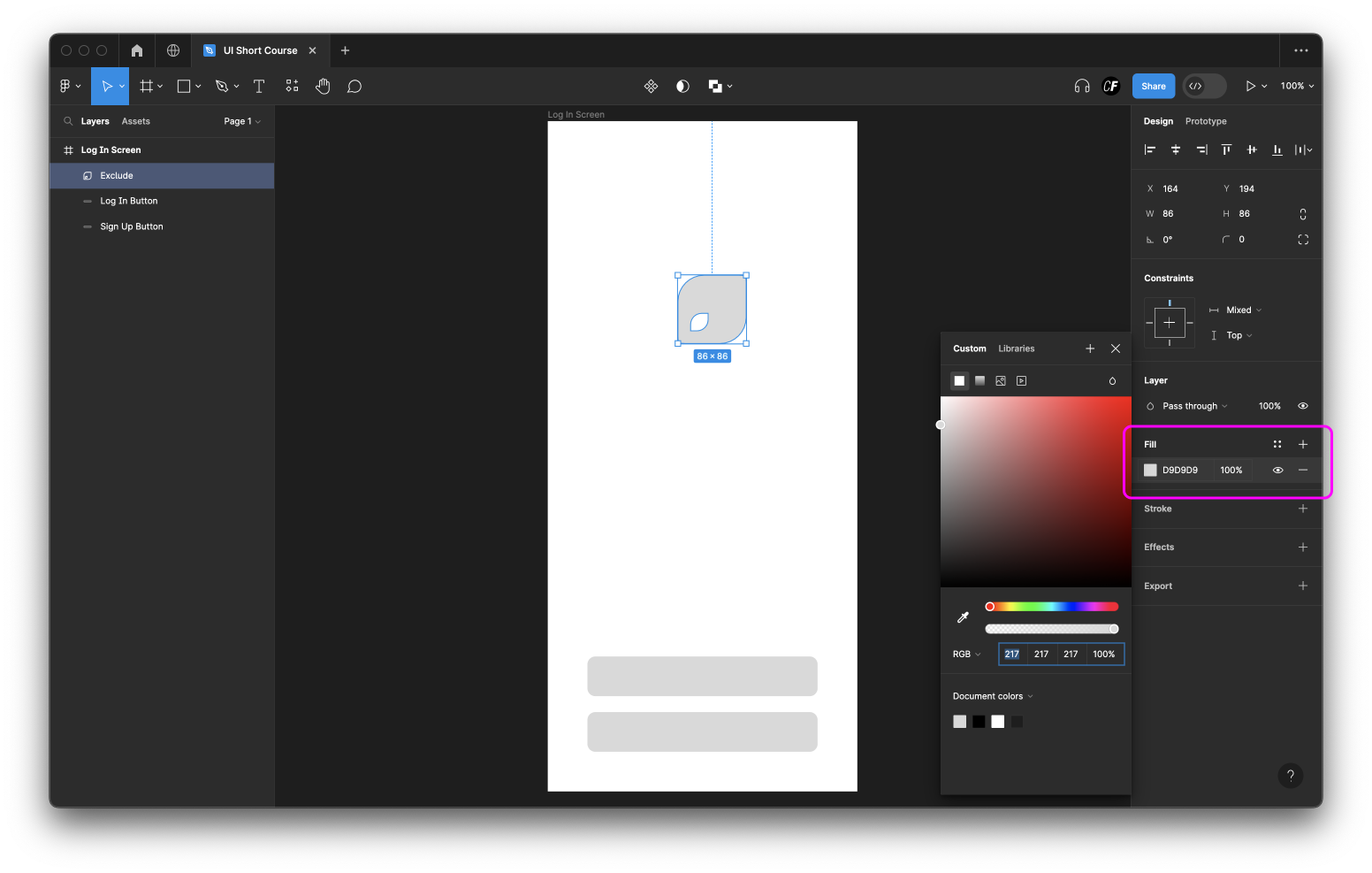
Step 10: With the shape selected, locate "Fill" in the right sidebar. Click on the colour thumbnail under Fill and you’ll be presented with a color palette to choose from. We’ll discuss colors in detail in tutorial five, so for now just explore and experiment with changing the color of your logo!
Summary
So there we have it—tutorial three is done and dusted! Give yourself a pat on the back; we covered a lot here! As mentioned before, don't be afraid to put your newfound knowledge of shapes to the test by adding a few embellishments to your climate change app logo!
As you progress through these tutorials, it's also a good idea to refer back to your most commonly used apps and navigate them with your new UI designer eye. How are they using shapes? What does their logo look like? How would you do things differently?
Tomorrow is all about text and typography. We'll take our app screens to the next level with some original copy, and learn the basics of typesetting. See you then!
Practical task
Add login and sign up buttons to your app screen, and design your app's logo. For an extra dose of inspiration, check out our blog post on the best app login screens on the block: 9 Of The Best Login Screen Examples