
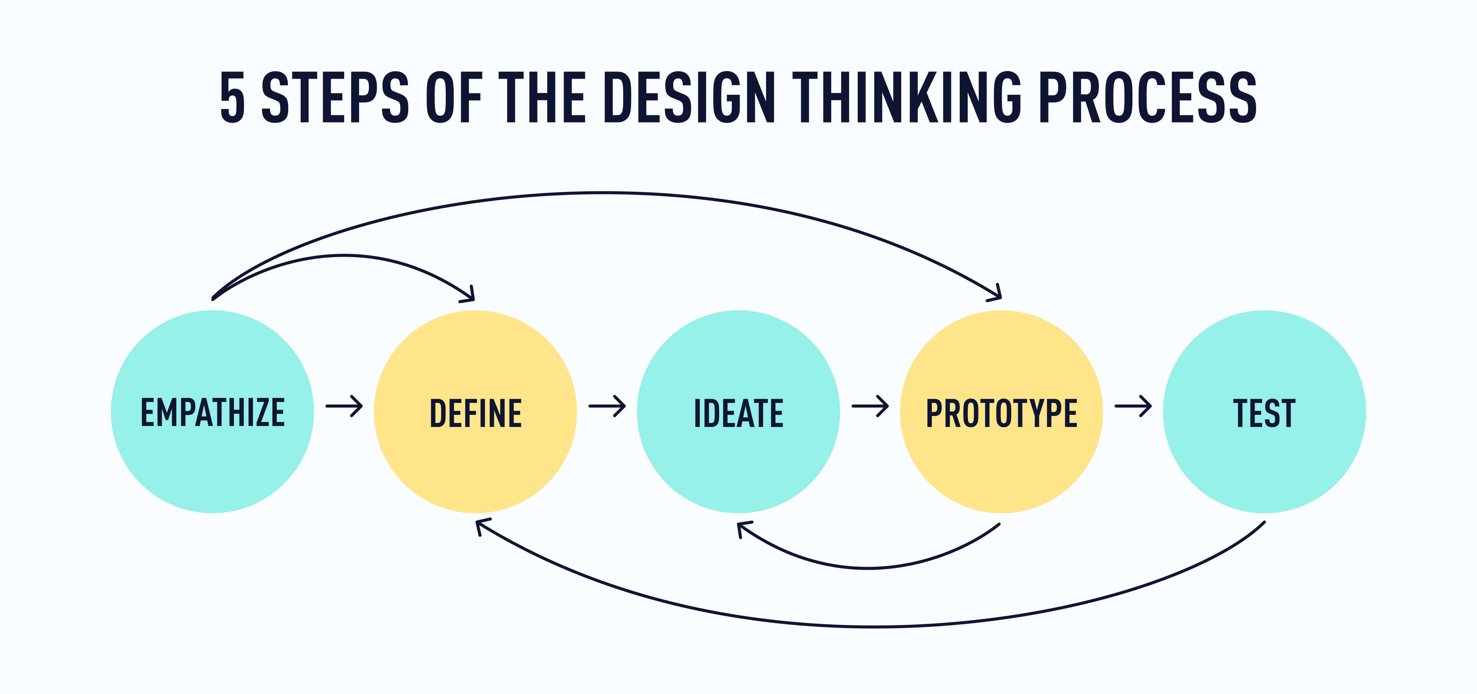
Welcome back! You’re doing an amazing job—with three stages of the design thinking process down, it’s time to dive into stage four: prototype.
By the end of this tutorial, you’ll:
- Know why prototyping is essential to good UX
- Understand the three different types of prototypes
- Have some hands-on experience with prototyping
Here’s what we’ll cover:
- Quick review
- Prototyping: An introduction to the fourth stage of the design thinking process
- Three types of prototypes
- How to decide which kind of prototype you need
- Practical task: Create a paper prototype
- Want to build a digital prototype instead?
- Summary
- What to do now
1. Quick review
In Lesson 3, you got a hands-on introduction to the third stage in the design thinking process (ideate) and generated 1-3 ideas for how to solve a real problem for users. Let’s review the basics before you move on to the next stage.
In the ideation stage, your focus is on generating as many ideas as possible for solutions to the problem in your HMW statement (take a moment to review that statement to keep it fresh in your mind).
You might do some brainstorming or brainwriting to kick things off and then push your imagination even further with some mindmapping or Crazy Eights. The most important thing is to look beyond your immediate perception of the problem to find the most effective (and even delightful) solution for your users.
While it is possible to do the ideation phase on your own (and you might find that you have to occasionally), more people working to find a solution means more perspectives and ideas on the table.
Once you’ve gathered some solid ideas, you’ll need to whittle it down to your top 1-2 ideas, based on:
- How effectively the idea solves the problem you’re working on
- How feasible the project would be in reality
- How many (if any) additional issues/problems the idea might create that you’d need to solve now or later
- The potential that solution has to go beyond functionality to actually delight your users
If you haven’t yet landed on that one bright idea, don’t worry! Read the next section to understand the fourth stage of the process and then you can decide which idea makes the most sense to carry forward. Our best advice is to not overthink it. This is an iterative process, so even the best and brightest idea is likely to evolve and change quite a bit throughout the process!
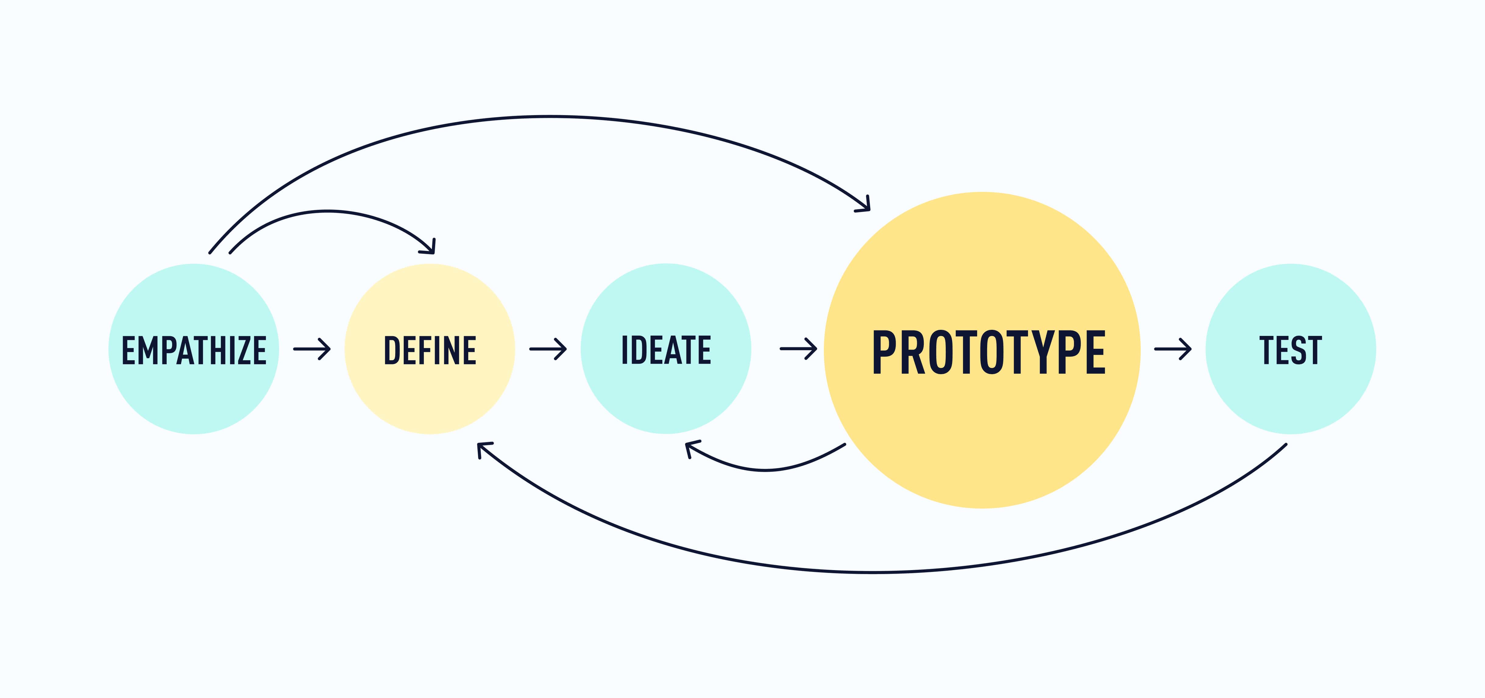
2. Prototyping: An introduction to the fourth stage of the design thinking process
This far into the design thinking process, you’ve taken the time to listen to your users’ needs, define the problem you want to solve, and come up with what you think might be a great design solution to that problem. Now it’s time to see what the solution would look like and how it would work if it were implemented—before you send a product or experience out into the world for users to engage with! Enter: prototyping.
Prototyping gives you the chance to test out your idea in a form that’s more tangible and detailed than your initial concept. Prototyping helps you to:
- Try the idea out before making any actual changes to the product and the user experience
- Think through the user experience step by step and consider details that you might otherwise overlook
- Spot any initial shortcomings in the solution—usability issues, design flaws, or other problems or considerations that the solution itself might create
- Show stakeholders, developers, and other designers what it is that you have in mind (to avoid misunderstandings and miscommunication that explaining an idea might cause)
A prototype is a “model” or a preview of your design that can be used to test your concept or solution. Depending on the level of your prototype, it might take the form of a rough paper or digital sketch that looks just a little more detailed than what you came up with during ideation, or it might be more similar to what a final digital version might look like.
You can create a simple paper prototype by hand (more on this in a moment), or you might use a prototyping tool to create a digital prototype that is more detailed and easily shareable. Most commonly, UX designers build a rapid prototype (whether digital or on paper) and iterate on that before they invest time and effort to build a more detailed digital prototype.
3. Three types of prototypes
You can think of prototypes in three broad categories based on how much detail they include: low-fidelity (lo-fi), mid-fidelity (mid-fi), and high-fidelity (hi-fi). Let’s have a look at these three types—with some examples from Frank Mojica’s portfolio (a UX designer, researcher, and CareerFoundry graduate).
Low-fidelity prototypes
Low-fidelity (lo-fi) prototypes are the quickest and cheapest to produce. These will often take the form of a paper prototype or a rapid digital sketch. What lo-fi prototypes lack in detail and polish, they make up for in how easy and quick they are to create.
If you’re very early in the design process and expect you might iterate on the overall design quite a bit, a lo-fi prototype will allow you to get a rough idea of where the design is going—without taking tons of time and effort that will likely be undone (or that you’d need to re-do) as you iterate and allow the design to evolve.
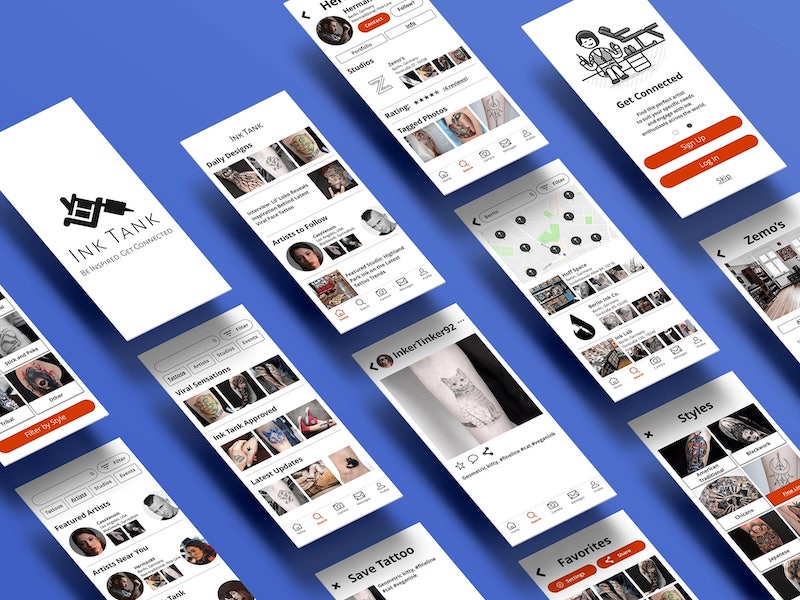
Here’s an example from Frank Mojica’s “Ink Tank” project (completed during his work in the CareerFoundry UX Design Program). Ink Tank is an app that allows people to find local tattoo artists. Check out these prototypes!
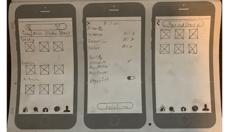
Note: Each individual screen design is known as a wireframe. Together, several wireframes that demonstrate a user flow are called a prototype. Even though there are many tools used both for wireframing and prototyping, wireframes focus more on information architecture, while prototypes focus more on user interactions and flow.
To learn more about the differences, read this guide: What’s the Difference Between a Wireframe, a Prototype, and a Mockup?
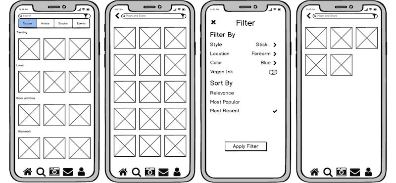
Mid-fidelity digital prototypes
Next up, we’ve got mid-fidelity (mid-fi) prototypes. If you need to work rapidly and give yourself or others a clearer idea of how the design will look in the end, a mid-fi prototype is a great direction to go. They’re quick and relatively simple to produce—and there are loads of free tools on the market that work well for this.
When it comes to striking the right balance between detail and speed, a mid-fi prototype is your best bet. Similar to lo-fi prototypes, mid-fi prototypes only display the most basic elements on each screen, however they allow users to move through an app in a more realistic way 🚀
Mid-fi prototypes include many elements in roughly the same configuration as they’ll be in the final version of the design, but these are often template or placeholder elements (including images and copy on each screen) and you’ll be hard-pressed to find a mid-fi prototype that accurately communicates the product’s brand (values, personality, color palette, etc.).
Mid-fi prototypes often allow users to click through placeholder screens and navigate an app at the most basic level, while not including too much design to the screens themselves.
Here’s an example of a mid-fi prototype from Frank Mojica’s portfolio:
You can create excellent mid-fi prototypes in most design tools, and even in collaboration tools like Miro.
High-fidelity prototypes
Finally, there’s the high fidelity (hi-fi) prototype. Hi-fi prototypes take more time and effort to produce because they seek to more closely capture what the end product will look like. If you’re in the end stages of the design process, it could be time for a hi-fi prototype—because any changes are likely to be smaller. Like mid-fi prototypes, hi-fi prototypes allow users to navigate through an app, but with a level of detail that simulates working with the actual product (the way it’ll look when it’s “done”).
Since hi-fi prototypes are often the most polished and impressive, they can also be helpful to use with stakeholders or clients, either for delivering the final designs or for getting buy-in (i.e., convincing stakeholders that this design option is the best one for your users).
Here’s an example of a hi-fi prototype from Frank Mojica’s portfolio:
4. How to decide which kind of prototype you need
Just because hi-fi prototypes are the more polished and “impressive” doesn’t mean they’re always the best option; similarly, lo-fi prototypes aren’t always best because they’re the quickest.
Ultimately, the best level of fidelity for your prototype will depend on the situation—and you should go with the level of fidelity that works best for you, the people you’re working with, and the project itself. It’s important here to consider:
- How early in the design process you are. Generally speaking, if you are early in the design process, a low- or mid-fidelity prototype will be more justified. By going with a high-fidelity prototype at this stage, you’re likely to put a lot of time and effort into a prototype that still might change drastically. If you’re later in the design process, a higher fidelity prototype makes more sense as it will allow stakeholders to provide “final” feedback and signoff. It will also help you communicate the specifics of your idea to the designers and developers who will turn the prototype into a live product.
- Who you’ll be showing the prototype to (and why). If you’ll only be showing the prototype to other designers or people in the team who are already on board with the idea, a lower fidelity prototype might be enough. If you need to show a lot of detail and secure buy-in from other stakeholders, a higher fidelity prototype can be useful in more accurately demonstrating what the idea will look like in reality. Ultimately, you’ll simply need to weigh the investment of time and effort against how much the prototype is likely to change, and how much of a “wow factor” you want when you communicate the idea to stakeholders.
- What kind of time, budget, and tools you have at your disposal. Generally speaking, the higher fidelity the prototype, the more time and resources it will take to build. That’s not to say that high fidelity prototypes are expensive to build—in fact there are many free tools out there to assist in the process. But as we’ve already established, they take more time to create than lower fidelity prototypes—especially if you end up drastically changing the design and building a new hi-fi prototype later in the process.
- Prototyping with AI ✨ There are also some AI tools that can help UX designers in various stages of prototyping. Check out some of our favorites:
⚠️ Critical thinking is very important for UX designers when using AI technology, particularly when it comes to reviewing the output. As with any profession, you’ve got to learn the fundamentals yourself before you incorporate AI into your toolkit. The tools we mentioned above might be suitable for an advanced UX designer, but how would you know what to expect from an AI tool without knowing what it should be producing for you?
Plus, with the rise of generative AI in design, it’s essential for UX designers to ensure the ethical use of these technologies, and always prioritize the user’s best interests. Remember the importance of empathy in UX design we covered in tutorial 2? Human creativity and emotional intelligence are things that AI can’t replicate, so always keep the human-in-the-loop when working alongside AI technologies!
Finally, remember that the Design Thinking process is iterative and recursive—meaning that if you pick the wrong kind of prototype for a project, it will be okay. You’ll learn as you go and you’ll approach it differently the next time! The great thing about Design Thinking is that mistakes are never really “mistakes”; they’re learnings that you can apply going forward.
5. Practical task: Create a paper prototype
Alright! Now that you understand what prototyping is, why it matters, and what different kinds of prototypes look like, let’s go back to those ideas you came up with in your ideation session (Tutorial 3). If you’ve already decided on one great idea, congratulations! 🎉 You’re ready to prototype the idea.
If you were still undecided between a couple of great ideas, see if you can figure out which one is best. A little UX research might do the trick—ask a friend, colleague, or someone who might have experienced the problem you’re trying to solve. Which idea do they like best? Pick that one and go with it!
However you get to this point, take your one amazing idea and get ready to prototype it! We’re going to take a simple approach to creating a low- to mid-fidelity, hand-sketched prototype. As a bonus, we’ll also share a couple of resources in case you want to create a mid- to high fidelity prototype—though we strongly recommend that you start with a paper prototype to ensure that your designs are “finalized” before you put time into a digital prototype.
So, without further ado, let’s build a prototype!
What you’ll need:
- 3 blank sheets of paper (more in case you need to scrap anything)
- Pen (or other relatively fine-tipped writing instrument)
- Optional: A mobile app layout template (Sketchize has some great options)
- Optional: Colorful markers or paper, scissors, and tape or glue (but only if you want to get crafty with this project).
Goal: To create a hand-sketched paper prototype of 1-3 screens within your mobile app.
Step 1: Review your HMW statement and your initial idea. Read over your HMW statement to make sure your users’ needs are fresh in your mind, then take a look at the sketch of your idea from the Crazy Eights ideation session. What do you love? What might need to be refined?
Step 2: Jot down any notes or ideas for the three screens you’ll sketch out. The three screens we want you to think about are:
- A sign-up/login screen. How will you show potential users the value of the app and encourage them to sign up for it? Example: For a dating app, there might be some bullet points for what kinds of features set this app apart from others like it, along with a sign up option or button that starts the signup process.
- A main/home screen. What screen in the app best demonstrates the main idea in action? Example: For a dating app, this might be a screen with a profile that users can swipe left or right on, or it could be more diverse gender options in user profiles. It’s likely that this is what your Crazy Eights sketch focused on in the first place.
- A third screen of your choice. Think about the apps you’ve used. On Spofity, users can move from their home screen to a playlist; on Tinder, users move from the swiping screen to their matches or messages. Where would yours users go from the home screen? Design that screen!
🪄 AI tip: If you're feeling stuck for ideas, ask ChatGPT to suggest the most important features that should be included on the screens, or brainstorm your ideas with Notion AI.
Step 3: Create a more detailed sketch of your first screen. You can sketch out whichever screen you’d like, but we’d recommend starting with a main/home screen as this is most likely to show how your idea would work. You can sketch on blank paper or you can use the mobile app template we’ve linked at the top of this section.
This sketch doesn’t need to be perfect—just more detailed than the version you sketched out during your ideation session.
Here’s an example from Anami Chan’s portfolio (UX designer and CareerFoundry graduate), to give you an idea of how this sketch will be different from your initial idea. Here’s how her sign-up screen evolved from early stages (far left), through low- and mid- fidelity prototyping (middle of the image), to a high fidelity prototype (last two screens on the right).
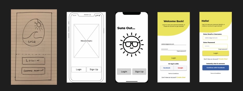
For a low- to mid-fidelity prototype, simple lines and placeholder images and text are just fine.
You can use different colors to differentiate elements or increase the fidelity of the prototype. You could even create a working 2D prototype with paper, scissors, and tape/glue, similar to what Google does with their paper prototyping.
[Optional] Step 4: Create sketches of one or two more screens within your app. Simply repeat Step 3 to prototype additional screens for your app. A prototype of one screen will be enough to get you through Tutorial 5, but if you have the time and the interest, prototyping additional screens will give you a better sense of how the app as a whole might work for users.
And there you have it: A low- to mid-fidelity prototype of 1-3 screens in your app! 🎉
6. Want to build a digital prototype instead?
If you want to skip all the paper and pens, and create a digital prototype instead, we have some resources that will help you do that. Keep in mind that digital prototyping (even at lower fidelity) can be time consuming, especially if you don’t already know the design tool you’re using. That said, digital prototypes tend to be cleaner and more easily shareable—which is important at a time when remote work and asynchronous collaboration are more common than ever before. So we understand wanting to explore in that direction!
If you want to create a digital prototype, we recommend using Figma and beginning with a low-fidelity version.
There is a free version of Figma available. We like Figma because it’s cheap and intuitive to use. That said, if it’s your first time using the tool, you’ll want some guidance. So check out our workshop on the topic: Designing and Prototyping in Figma.
7. Summary
- A prototype is a working model of your idea—typically created relatively quickly and at a much lower cost than it takes to build the actual product.
- Prototyping allows you to try your idea out before making any actual changes to the product and the user experience, and helps you consider easily overlooked details, spot design flaws, and give stakeholders a tangible idea of what it is that you’re going for.
- There are three kinds of prototypes—low-fidelity, mid-fidelity, and high-fidelity. Which one you use will depend largely on your time and resources, along with where you’re at in the process, and what others, either stakeholders or team members, will need to see in order to move forward.
8. What to do now
Amazing! You’ve completed your fourth UX design tutorial and you’ve got a solid understanding of what the prototyping stage of the process is all about. 🥳 Not only that: you’ve also built a prototype that we hope you’ll show off to the world!
If you post pictures of your prototype on Instagram, don’t forget to tag CareerFoundry—we want to see how it’s going!
And now you’re ready for the final stage in the Design Thinking process: testing. See you in the next tutorial!